22 Bookshelf Styling Ideas That Look Designer-Curated
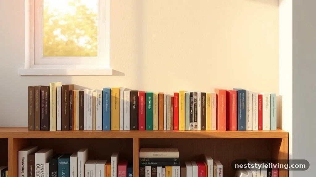
Achieving bookshelf styling ideas that look designer-curated requires a shift from viewing storage as a utility to treating it as a gallery space. By balancing negative space with intentional groupings, you transform a cluttered mess into a cohesive focal point that anchors your room. This approach relies on curated objects and thoughtful arrangements rather than filling every available inch with paperbacks.
Whether you are working with built-in cabinetry or a freestanding unit, the following techniques will help you achieve a professional, polished aesthetic. These strategies focus on visual weight, texture, and color, ensuring your home reflects a high-end, intentional design sensibility that feels both accessible and sophisticated.
1. Monochromatic Color Blocking
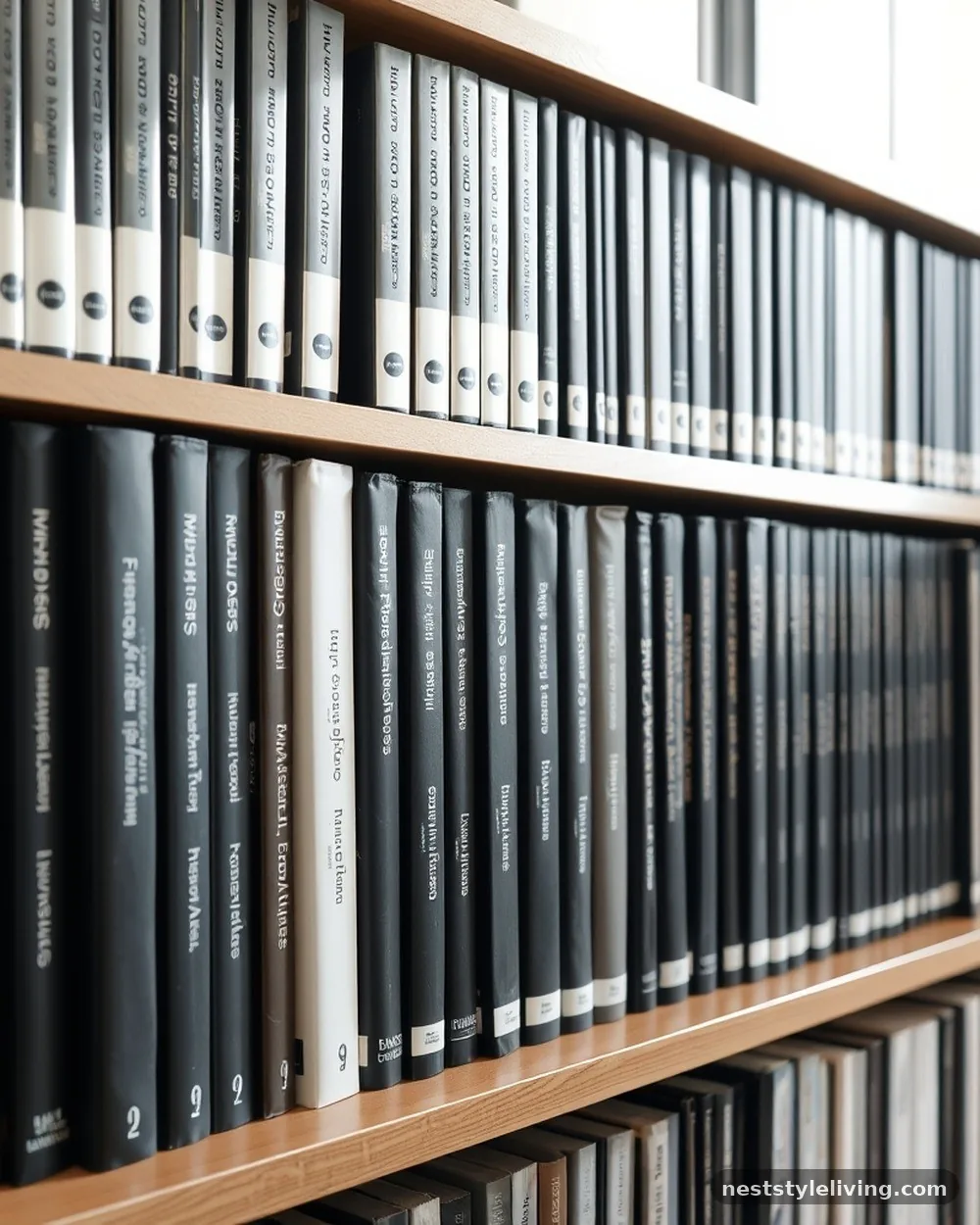
Grouping your books by spine color creates an immediate sense of order and high-end intentionality. By clustering volumes in shades of blue, white, or charcoal, you eliminate the visual noise of contrasting jackets and turn the collection into a structured art piece.
This technique works best when you leave small gaps between color blocks to allow the eye to rest. It transforms a chaotic library into a deliberate palette that complements the surrounding decor in your room.
For the best results, start by sorting your entire library by color family on the floor before placing them back on the shelves. If you have too many books of one color, use them to anchor the bottom shelves and reserve lighter shades for the eye-level tiers to keep the display feeling airy.
2. The Rule of Three
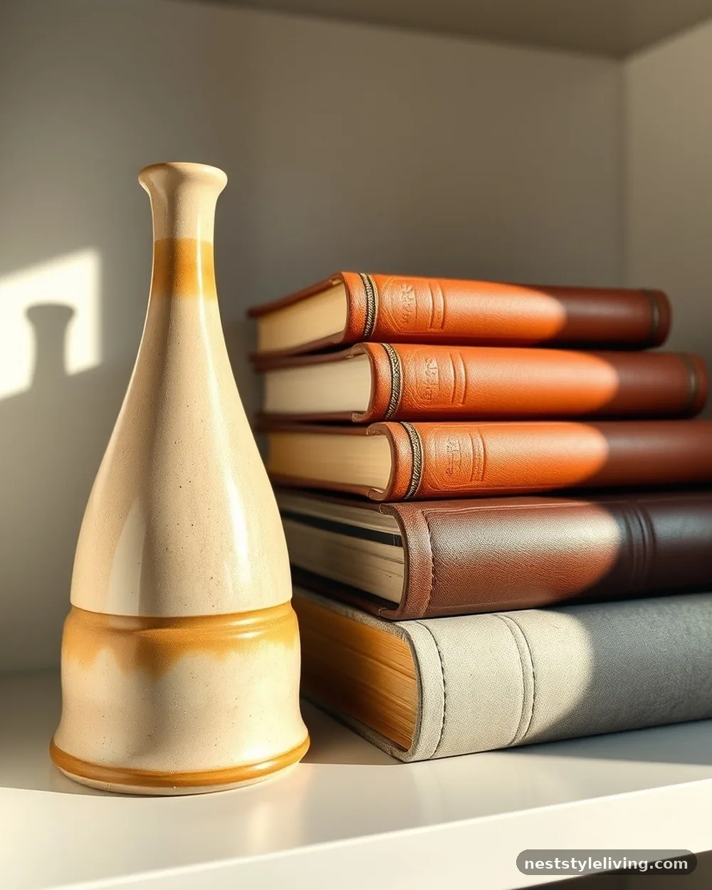
Designers frequently use odd-numbered groupings to create visual interest that feels balanced yet dynamic. When styling a shelf, place three objects of varying heights—such as a small ceramic vase, a stack of two books, and a sculptural stone bust—together as a single unit. This arrangement prevents the display from looking static and forces the viewer to scan the items rather than dismissing them as a single block.
Choose a tall, a medium, and a short item to create a triangular composition. If the objects feel too scattered, place them on a small wooden tray or a linen-wrapped book to physically bind the trio together into one cohesive visual statement.
3. Leaning Art Against Backings
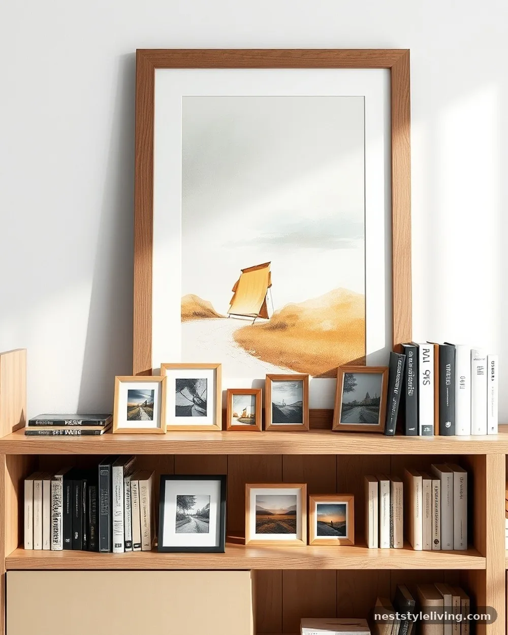
Placing framed prints or canvas art directly against the back of your bookshelves adds depth and a layer of sophistication that standard vertical book placement lacks. This technique breaks up the monotony of rows and introduces color or texture that isn’t dependent on book spines. Choose frames that vary in size to create a staggered effect, ensuring the artwork feels like an integral part of the shelving rather than an afterthought.
Use small adhesive strips or museum wax to secure the frames to the back of the shelf so they don’t slide when you remove books. Pick frames with thin, metallic, or natural wood borders to keep the focus on the art itself rather than the structure holding it.
4. Horizontal Stacking
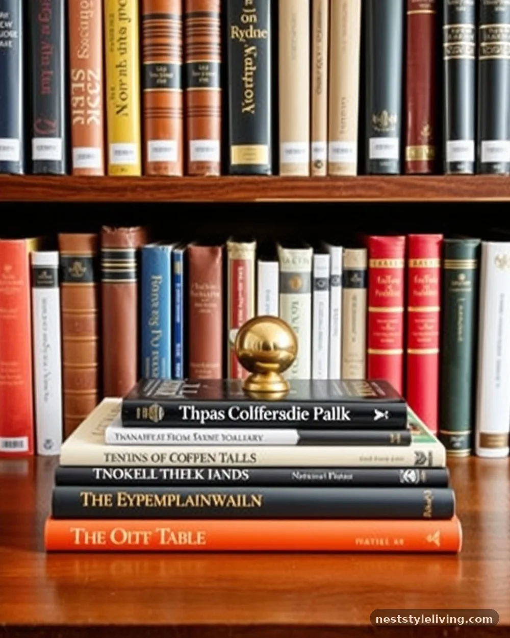
Mixing vertical book rows with horizontal stacks creates rhythmic variation that prevents the shelf from appearing like a standard library. Use a horizontal stack of three or four books as a pedestal for an interesting object, such as a brass paperweight or a small piece of pottery. This adds height and allows you to showcase individual items that might otherwise get lost in a sea of spines.
Avoid stacking more than four books at a time, as it can look heavy and eventually sag under the weight. Use larger, coffee-table-style books for the base of your stacks to ensure they provide a stable foundation for the decorative items you place on top.
5. Negative Space Integration
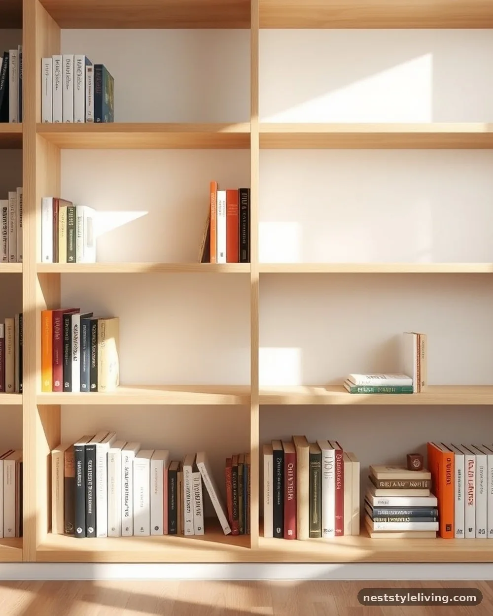
The most common mistake in home styling is overfilling every inch of available space. Leaving intentional empty gaps—negative space—allows the eye to breathe and makes each curated item feel more significant.
When you leave a shelf half-empty, you signal that the objects present were chosen for their beauty rather than just their utility. This restraint is the hallmark of a professional designer.
Try leaving at least twenty percent of your total shelf surface area completely bare. If a shelf looks too sparse, place a single, large-scale object like a tall ceramic pitcher or a singular, heavy art book in the center to command attention without cluttering the view.
6. Brass and Metal Accents
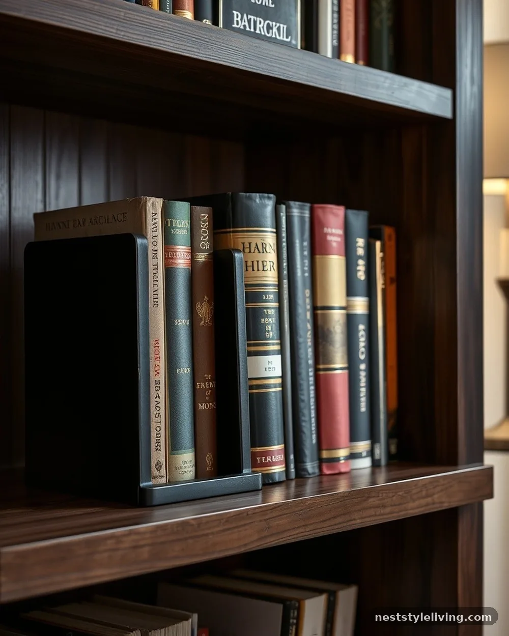
Introducing metallic elements like polished brass, matte black steel, or brushed nickel brings a touch of luxury to wooden or painted bookshelves. Use metal bookends to provide structural support while acting as sculptural anchors for your book rows. These materials reflect light and provide a sharp contrast to the matte finish of paper and wood, which elevates the overall look of your storage.
Select metal accents that match the hardware already present in your room, such as drawer pulls or light fixtures, to maintain a unified design language. If you are on a budget, look for vintage brass candlesticks or heavy metal objects at thrift stores to serve as functional bookends.
7. Botanical Elements
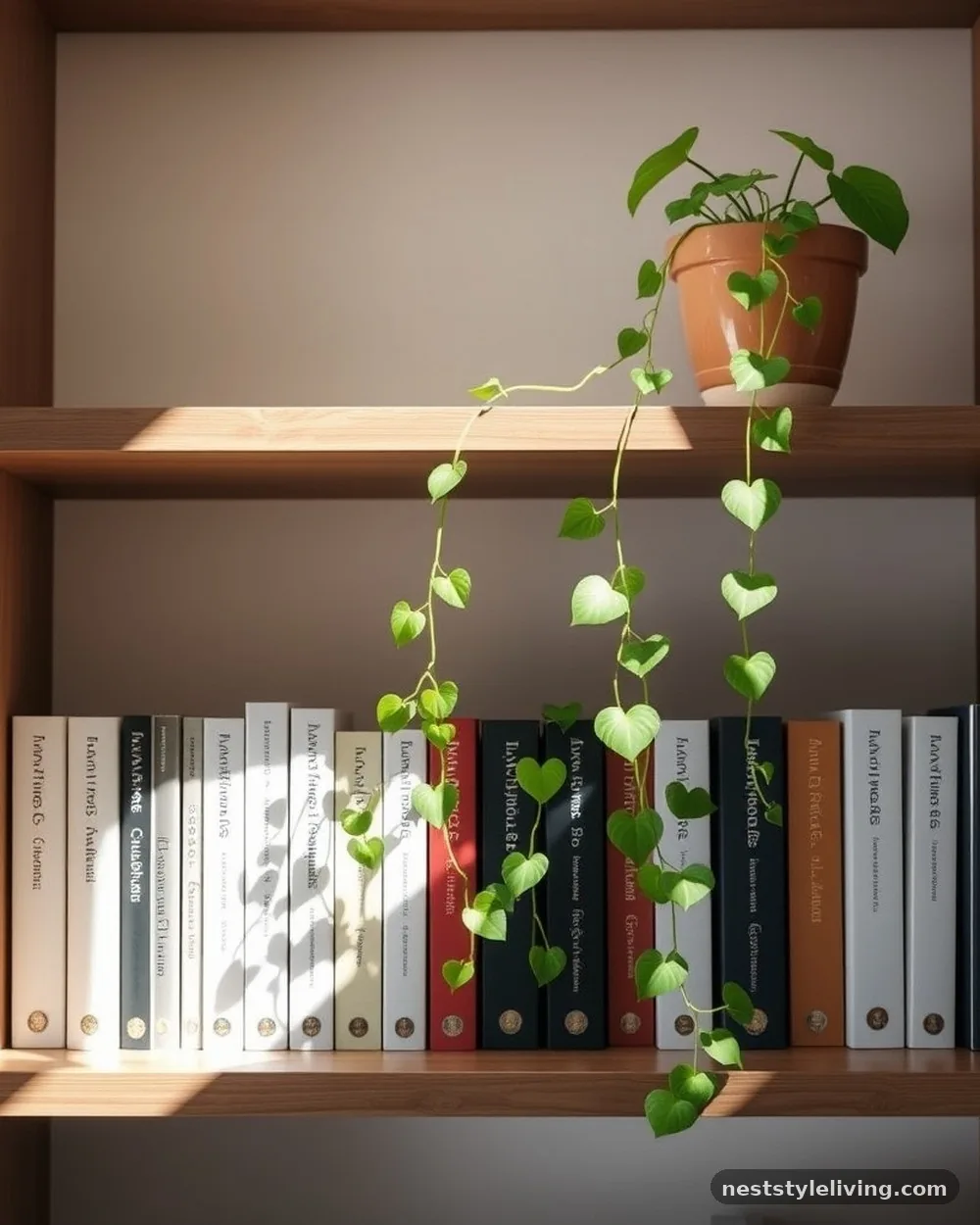
Plants breathe life into a static bookshelf, adding an organic texture that contrasts perfectly with the hard lines of cabinetry. A trailing pothos or a small, structured succulent placed on an upper shelf creates a cascading effect that draws the eye upward. The natural green hues also serve as a neutral bridge between different colors in your book collection.
Use decorative pots that match your color scheme to house the plants, and ensure they are placed where they can receive enough indirect light. If your shelves are in a dark corner, high-quality silk or dried botanicals, such as eucalyptus branches, offer the same aesthetic benefit without the need for constant maintenance.
8. Texture-Heavy Ceramics
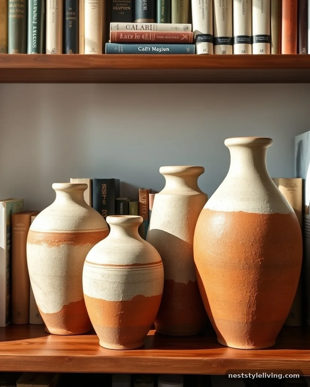
Incorporating ceramics with rough, matte, or reactive glazes adds tactile interest to your display. A collection of stoneware vases in earthy tones like terracotta, cream, or charcoal brings an artisanal quality that makes a bookshelf feel curated rather than purchased from a catalog. These items should be large enough to hold their own against the books, preventing them from looking like clutter.
Group ceramics by material or finish to create a cohesive theme, or mix a single high-impact ceramic piece with a stack of books. If you find a piece you love that is too small, lift it on a wooden riser or a stack of neutral-colored books to give it the presence it needs.
9. Uniform Book Covers
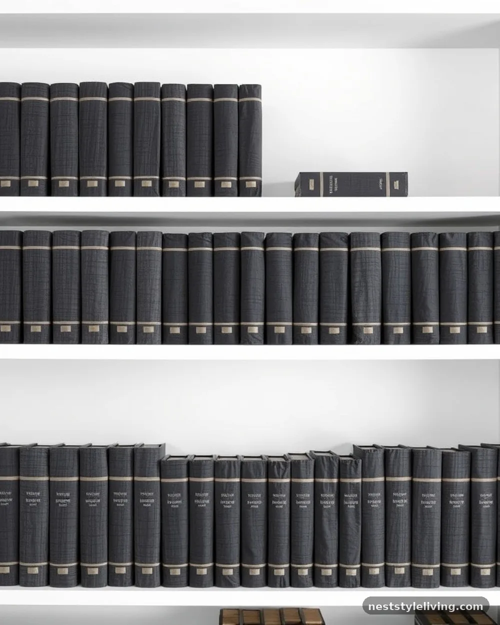
For a high-end, minimalist look, consider wrapping your books in uniform paper or purchasing sets of vintage books in matching linen bindings. This removes the distraction of varied spine colors and text, focusing the viewer entirely on the silhouette and texture of the collection. It is a popular choice for neutral-toned rooms where you want the books to recede into the background.
Use heavy-weight craft paper or linen fabric to cover your existing collection if you don’t want to replace your books. This is an affordable way to achieve a custom look, and it allows you to maintain your current library while adhering to a strict color palette.
10. Large-Scale Photography
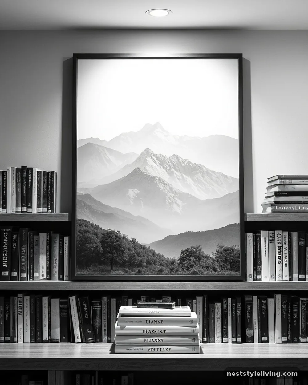
Integrating large, framed black-and-white photographs creates a sense of scale and drama. Unlike small trinkets, a single large photograph can act as the anchor for an entire section of your bookshelf. This technique is particularly effective in built-in units where you have deep shelves, as the frame provides a solid backdrop that highlights the objects placed in front of it.
Choose images with high contrast to make them stand out against the back of the shelf. Place the photo off-center to create a more dynamic and professional composition, leaving the remaining space for a stack of books or a decorative bowl.
11. Hidden Storage Boxes
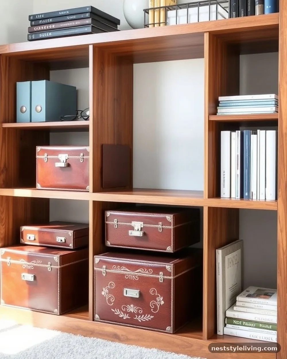
Not everything on a bookshelf needs to be a book or a sculpture. Use decorative boxes covered in leather, linen, or high-quality paper to store unsightly items like remote controls, cables, or loose papers. These boxes add a layer of texture and keep your shelves clean, which is essential for maintaining a designer-curated appearance.
Label the boxes discreetly if they hold items you use often, or keep them as purely decorative elements. Ensure the boxes are sized correctly for your shelves so they don’t look like they are squeezed into place; they should look like they belong as part of the architecture of the unit.
12. Vertical vs. Horizontal Tension

Alternating the orientation of your books creates a visual zig-zag that keeps the eye moving across the shelf. Pair a vertical row of books with a small horizontal stack at the end, using the horizontal stack as a bookend. This pattern breaks the monotony of a long, straight line and creates a more relaxed, lived-in vibe that still feels intentional.
Maintain a consistent rhythm throughout the bookshelf to prevent it from looking chaotic. For example, use a vertical-horizontal-vertical pattern on one shelf, and mirror it or shift it slightly on the next to keep the overall look balanced and professional.
13. Incorporating Sculptural Objects
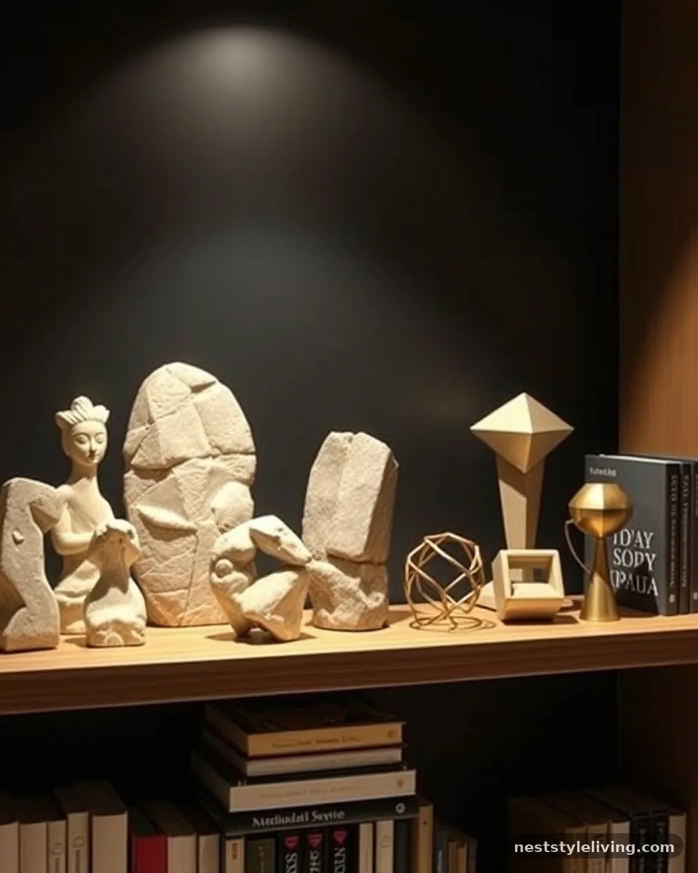
A designer-curated bookshelf often features items that have no function other than to be beautiful. Think of abstract stone carvings, wooden spheres, or geometric metal shapes.
These items should be chosen for their silhouette and how they interact with the light in the room. By treating these objects as art, you move the bookshelf away from being a storage unit and toward being a display gallery.
Look for items that have a significant weight to them, as lightweight plastic or cheap resin will look out of place against heavy books. If you are struggling to find the right pieces, check local art fairs or vintage shops for unique, one-of-a-kind items that add personality to your space.
14. Lighting as an Asset
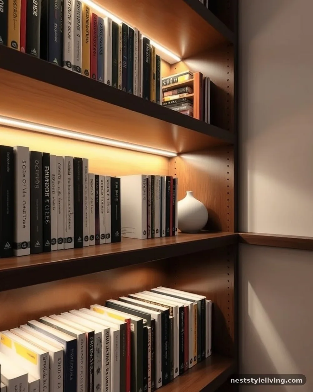
Adding battery-operated LED puck lights or thin light strips to the underside of each shelf changes the entire mood of the display. Lighting highlights the textures of your books and the craftsmanship of your objects, creating shadows that add depth. This is a common designer trick to make standard shelving look like expensive, custom-lit cabinetry.
Ensure the light temperature is warm (around 2700K to 3000K) to avoid a sterile, clinical feel. Place the lights toward the front of the shelf so they illuminate the spines and the objects, rather than just the back wall, which can create harsh glare.
15. Layering by Depth

Don’t push all your items to the back of the shelf. By pulling some books forward and keeping others back, you create a sense of depth that makes the display feel three-dimensional. This technique is especially useful on deep shelves where objects can easily get lost in the shadows.
Place your largest, most important items at the front and use smaller, secondary items to fill the gaps behind or beside them. This creates a layered effect that encourages the viewer to look closer, revealing the complexity of your collection.
16. Themed Collections
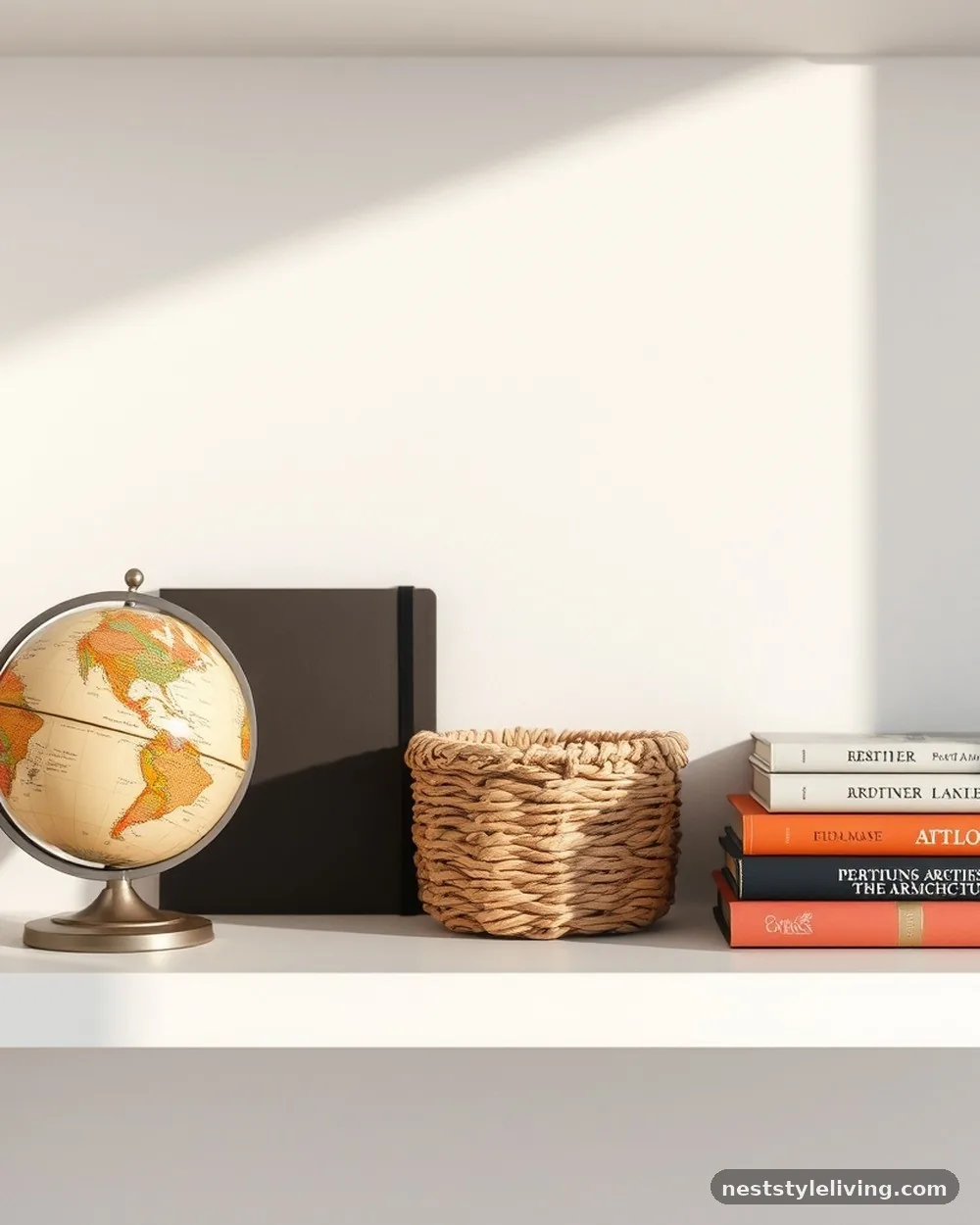
Curating a shelf around a specific theme—such as travel, art history, or vintage sea shells—gives your bookshelf a story. When the items on a shelf share a narrative, the collection feels more purposeful. This is a great way to display hobbies or interests without making the room feel like a museum of miscellaneous junk.
Keep the theme consistent but avoid making it too literal. For a travel theme, include a few books on architecture alongside a vintage globe and a piece of pottery from a specific region, rather than just filling the shelf with souvenirs.
17. Consistent Bookend Styles
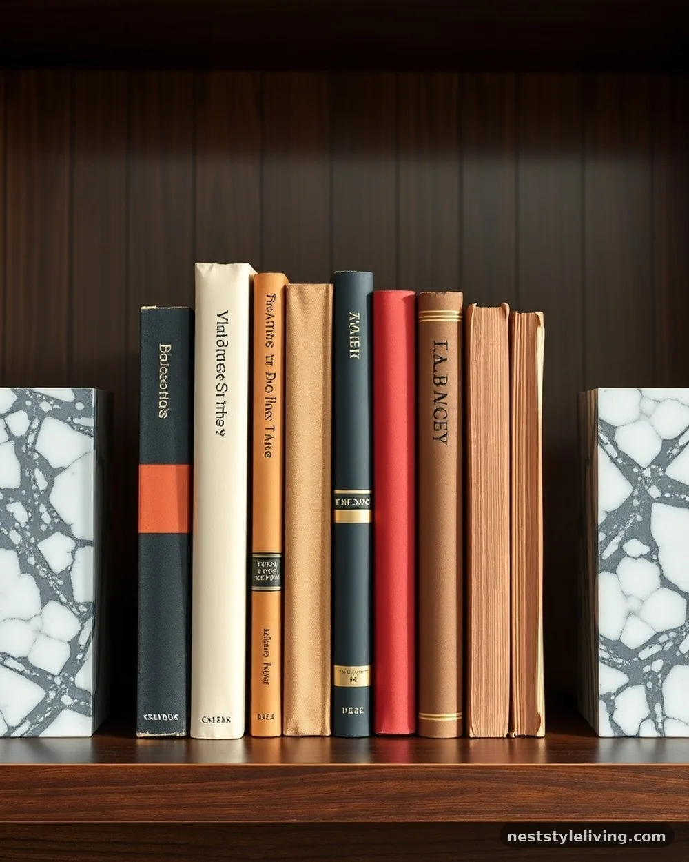
If you have a long row of books, using a pair of heavy, matching bookends can ground the entire look. Whether they are stone, marble, or heavy cast iron, matching bookends act as the frame for your collection. They signal that the books are a deliberate selection and prevent the row from looking like it just happened to end where the shelf did.
Choose bookends that have enough weight to actually hold the books in place. If you don’t have formal bookends, use heavy decorative objects like large geodes or stacked stone blocks to achieve the same functional and aesthetic result.
18. Incorporating Textiles
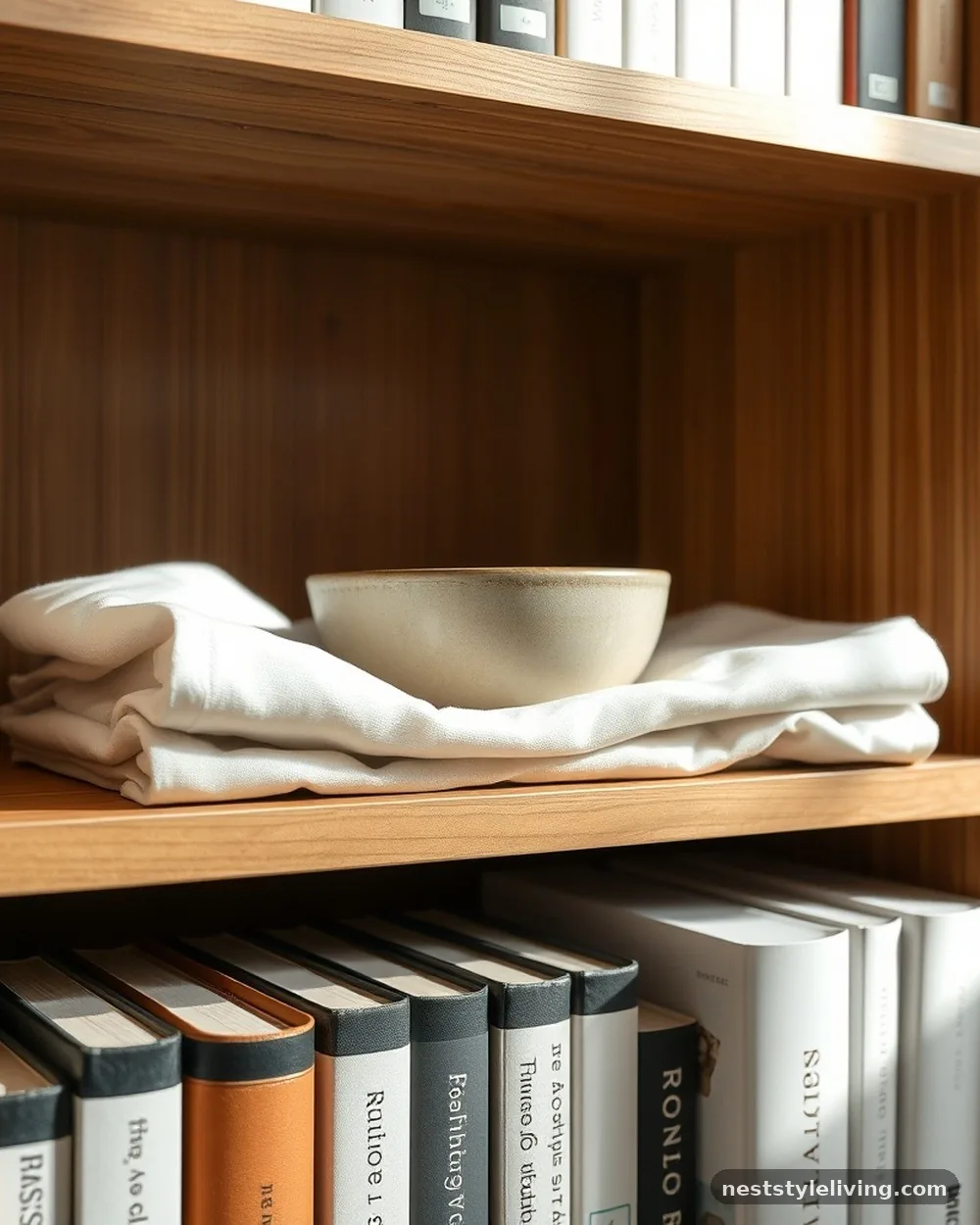
Adding a soft element like a small, folded textile, a piece of raw silk, or even a small woven basket can break up the hard surfaces of books and wood. Textiles add a layer of warmth and comfort that makes a room feel more inviting. This works particularly well on lower shelves where you want to add a bit of softness to the transition between the furniture and the floor.
Use textiles in neutral tones to ensure they don’t distract from the other items on the shelf. A neatly folded linen napkin or a small, textured fabric remnant can act as a base for a delicate ceramic piece, protecting the shelf while adding a layer of sophisticated texture.
19. Using Risers for Height
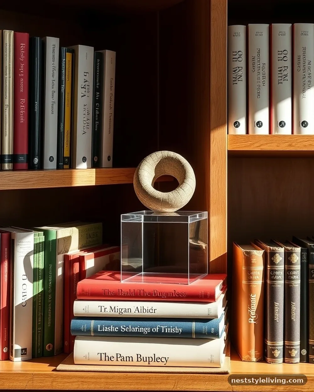
Not every item on your shelf will be the right height to make an impact. Using acrylic, wooden, or stone risers allows you to elevate smaller objects so they sit at the same visual level as your larger books. This is a professional technique for ensuring that every item you choose to display gets the attention it deserves.
Look for risers that have a clean, modern profile so they don’t draw attention away from the object they are elevating. You can even use a stack of books as a riser, provided the books themselves are visually interesting enough to serve as a pedestal.
20. Vertical Pacing
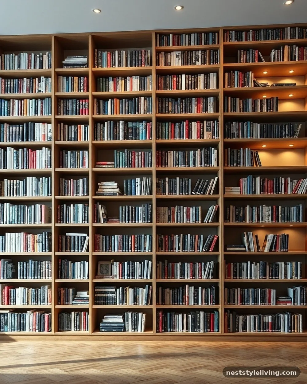
When styling a multi-shelf unit, vary the density of each shelf. If you have a very full, book-heavy shelf, place a much lighter, more open shelf directly above or below it. This creates a sense of balance and rhythm that prevents the entire unit from feeling overwhelming or top-heavy.
Plan your layout as a whole rather than shelf by shelf. Stand back frequently to assess the balance of the entire unit, ensuring that the visual weight is distributed evenly so that no single section feels like it is pulling the eye away from the rest of the display.
21. Incorporating Personal Artifacts
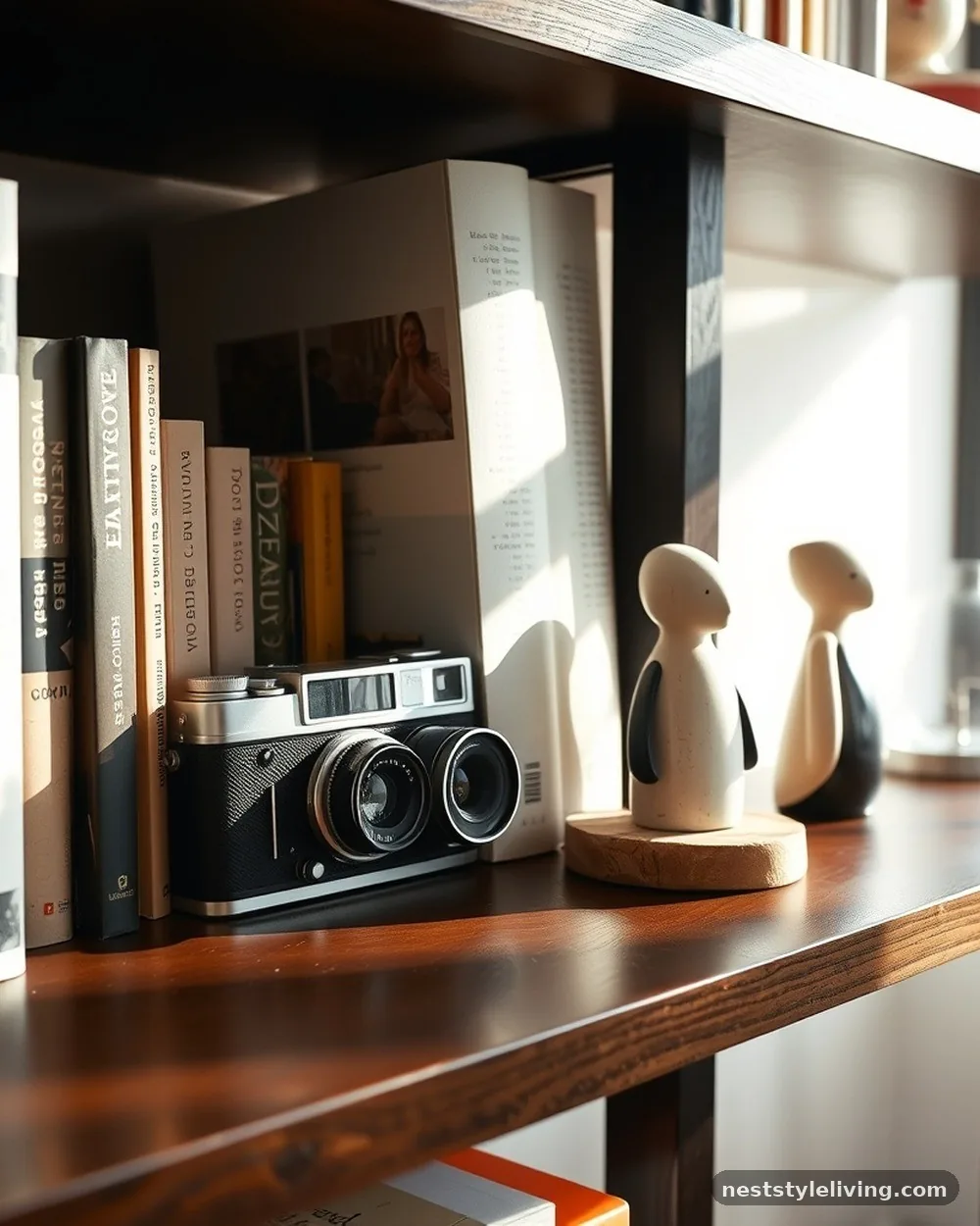
Designer-curated spaces always feel personal. Integrate unique, high-quality artifacts like a vintage camera, a family heirloom, or a piece of unique, hand-crafted art.
These items provide a point of conversation and prevent the bookshelf from looking like a staged showroom. The key is to display only one or two truly special pieces rather than a collection of random knick-knacks.
Place these items in a prominent spot, perhaps on a shelf at eye level, and surround them with simpler, more uniform items to let them shine. The goal is to make your personality visible without sacrificing the clean, professional aesthetic you are working to build.
22. Regular Editing
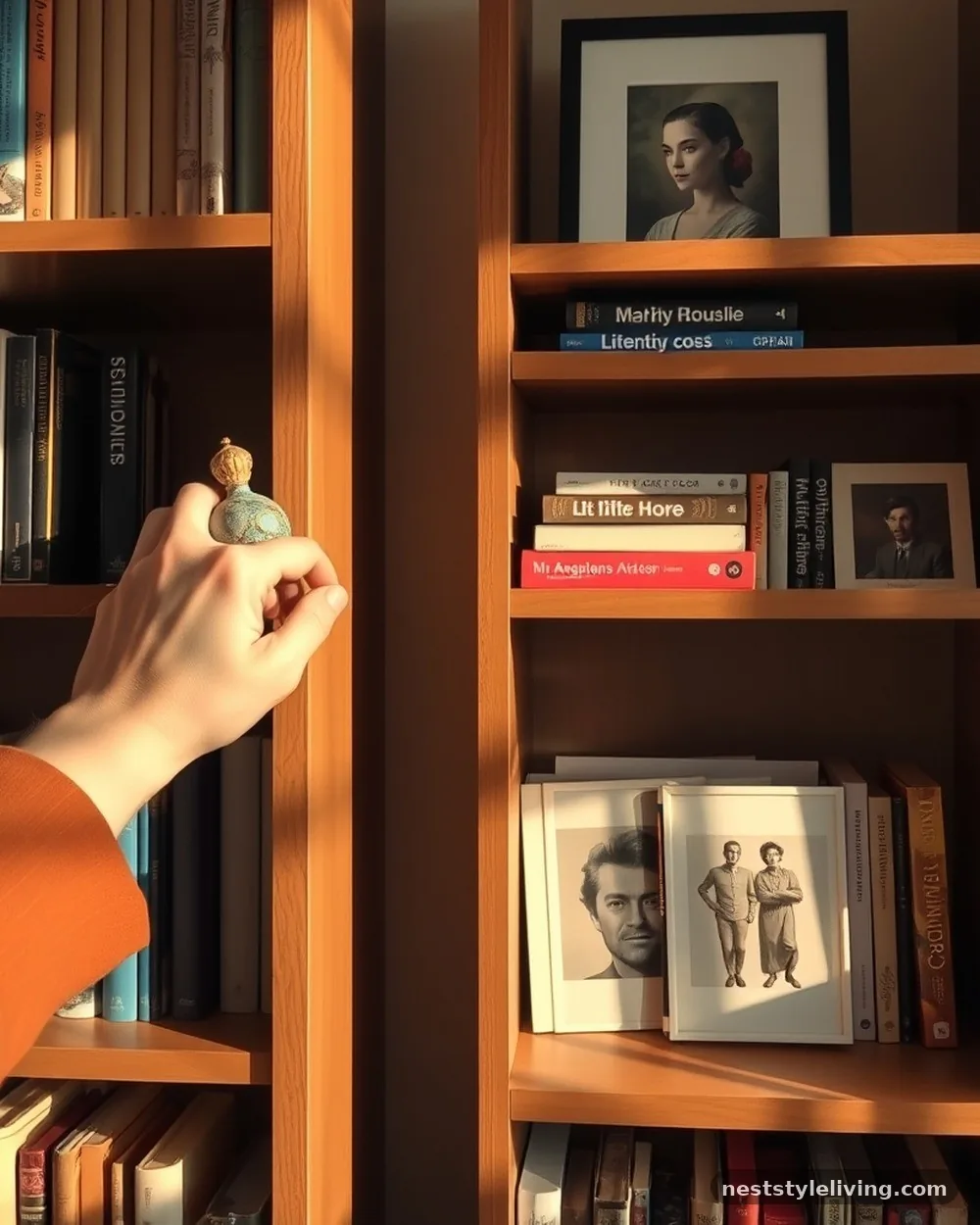
A shelf is never truly finished; it is a living display. Designers regularly edit their shelves, removing items that no longer fit the aesthetic or replacing books that have been read with new ones that match the current color scheme. This process of curation is what keeps a bookshelf looking fresh and intentional over time.
Spend ten minutes once a month rearranging a few items. If a shelf feels stale, try swapping a few books with another room or moving your decorative objects to different positions. This simple maintenance keeps your home feeling curated rather than static and allows you to enjoy your collection in new ways.
Frequently Asked Questions
How do I make my bookshelves look less cluttered?
The key to reducing clutter is to introduce more negative space. Remove items that don’t serve a clear aesthetic or functional purpose, and group smaller objects into larger, more cohesive units. By clearing at least twenty percent of your shelf surface, you allow the eye to rest and emphasize the items you truly want to showcase.
What is the best way to arrange books for a designer look?
Designers often mix vertical and horizontal orientations to create visual rhythm. Grouping books by color or by height creates a sense of order, while incorporating non-book items like sculptures, plants, or art prevents the shelf from looking like a standard library. Consistency in your color palette and the type of decorative items used is essential for a polished outcome.
Should I fill my shelves completely?
Never fill your shelves completely. A fully packed shelf looks like a storage unit rather than a curated display. Leaving gaps allows you to highlight individual pieces and creates a sophisticated, gallery-like feel. Think of each shelf as a composition where the empty space is just as important as the objects you place within it.
How do I choose the right decorative objects?
Select objects that have a sense of weight and quality, such as stone, metal, or high-end ceramics. Avoid plastic or mass-produced trinkets that look cheap. Choose items that share a common theme, color palette, or texture, and ensure they vary in height to create a dynamic, professional display.
How often should I restyle my shelves?
There is no set rule, but restyling every few months keeps your home feeling fresh and allows you to rotate items you might have in storage. Regular editing is the hallmark of a designer-curated space, as it ensures that your shelves remain intentional and reflective of your current style and collection.
Conclusion
Developing bookshelf styling ideas that look designer-curated is a rewarding exercise in balance and restraint. By treating your shelves as a curated gallery rather than a simple storage solution, you create a focal point that adds genuine character to your home. Focus on incorporating high-quality materials, maintaining negative space, and ensuring your arrangements reflect a cohesive vision.
Whether you choose to color-block your library or introduce sculptural accents, the key lies in the intentionality of every placement. Take the time to edit your collection, rotate your pieces, and let your personality shine through in a refined, sophisticated way.
With these techniques as your guide, you can easily transform any shelf into a stunning display that feels both professional and deeply personal. We invite you to experiment with these ideas and see how they change the energy of your space.