22 Two Tone Kitchen Cabinets Ideas to Try at Home
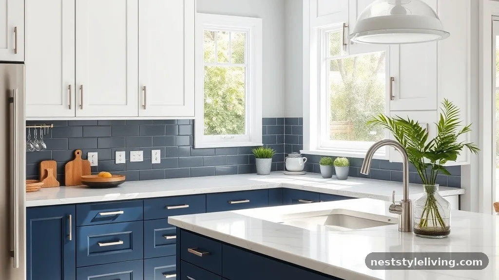
Incorporating two tone kitchen cabinets ideas to try at home offers a sophisticated way to break up the visual monotony of a single-color space. By pairing contrasting shades or textures between upper and lower units, you create a dynamic focal point that grounds the room while adding depth. Whether you prefer the timeless appeal of a monochromatic blend or a bold, high-contrast shift, these design choices transform standard cabinetry into custom architectural features.
Choosing the right palette allows you to manipulate the perceived size and light levels of your room, making it feel both intentional and curated. These strategies provide a practical framework for anyone looking to update their culinary workspace with lasting style.
1. Navy Blue and Crisp White
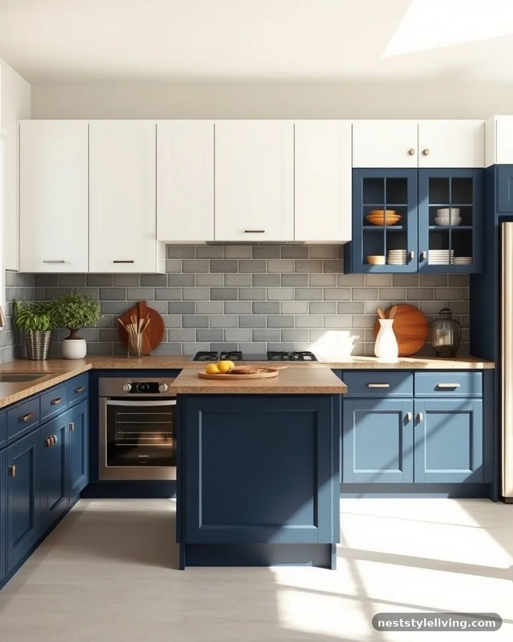
The most reliable way to anchor a room is by placing a deep, saturated navy blue on your lower cabinets while keeping the uppers in a bright, crisp white. This design mimics the horizon line, grounding the kitchen with the weight of the dark base while ensuring the upper portion feels airy and expansive. It works exceptionally well in kitchens with lower ceilings, as the white uppers draw the eye upward, preventing the space from feeling cramped. The contrast is sharp enough to feel modern but classic enough to avoid looking dated in a few years.
To execute this, use a high-quality oil-based enamel for the navy sections to ensure a durable, chip-resistant finish. When painting, ensure the transition between the two colors happens strictly at the countertop line or the bottom of the upper cabinets to maintain a clean, professional aesthetic.
2. Charcoal Lower and Natural Oak Uppers
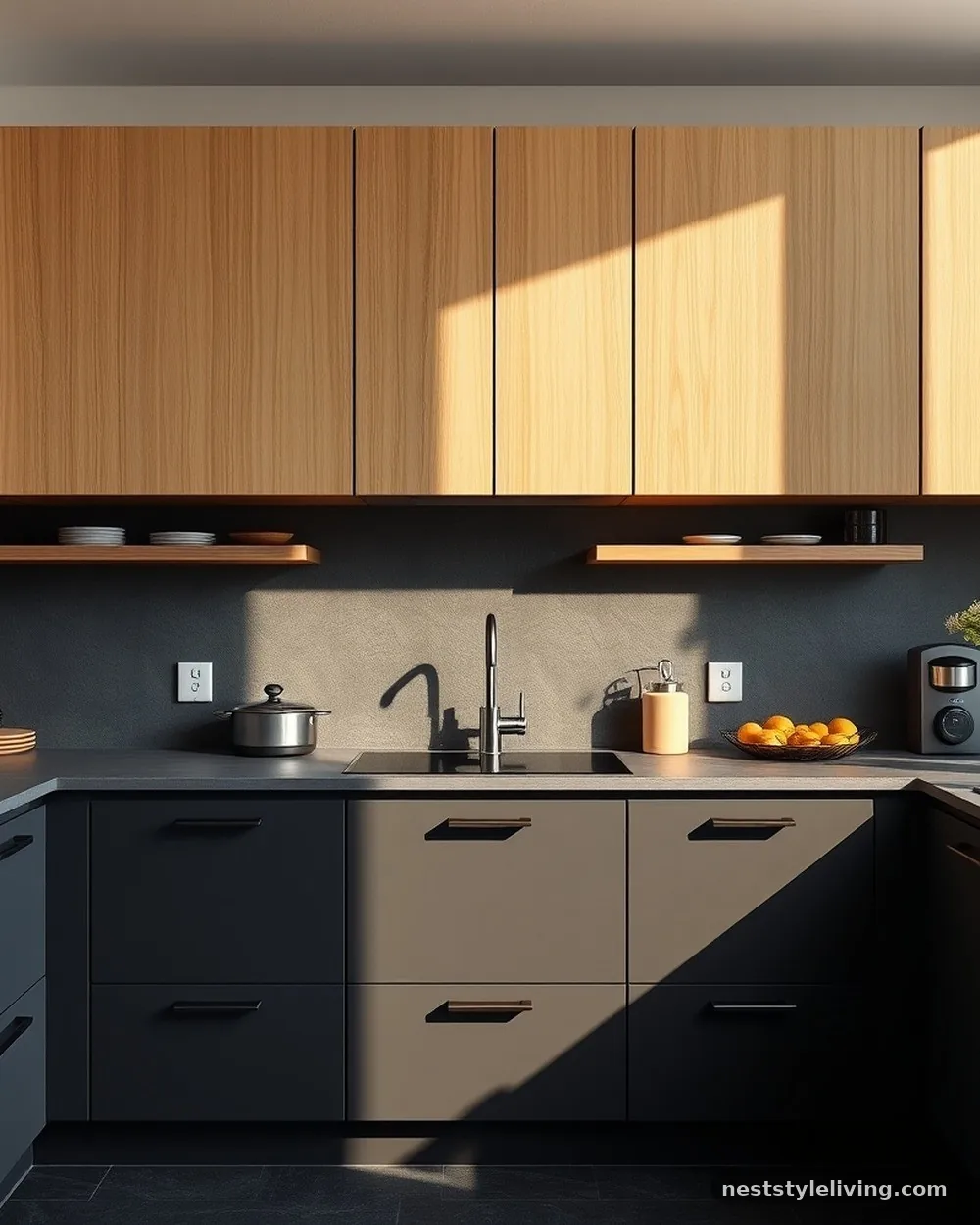
Blending a dark, moody charcoal with the warmth of natural oak creates a sophisticated, organic feel that leans into modern Scandinavian design. The charcoal provides a matte, grounded base that hides scuffs easily, while the wood grain of the oak uppers introduces texture and warmth, preventing the kitchen from feeling cold or clinical. This combination is particularly effective in open-concept layouts where the kitchen needs to harmonize with wooden furniture in an adjacent living area.
Use a matte finish for the charcoal paint to emphasize the depth of the color, and apply a low-sheen polyurethane or hard-wax oil to the oak to highlight its natural grain. This pairing holds up well over time because the wood is less prone to showing fingerprints than high-gloss painted surfaces.
3. Sage Green and Creamy Off-White
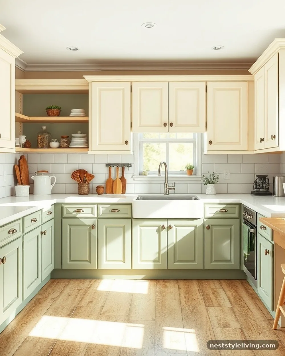
Sage green lower cabinets paired with creamy off-white uppers offer a soft, muted look that feels both earthy and bright. This combination is ideal for a cottage or transitional-style home, as it relies on subtle color variation rather than harsh contrast. The sage green acts as a neutral, allowing you to incorporate brass or copper hardware without overwhelming the visual space.
When selecting your sage, test a sample on the base units first, as natural light can cause green tones to shift significantly throughout the day. Opt for a satin finish on both colors to ensure a consistent sheen that reflects light gently across the room.
4. Matte Black and Warm Walnut
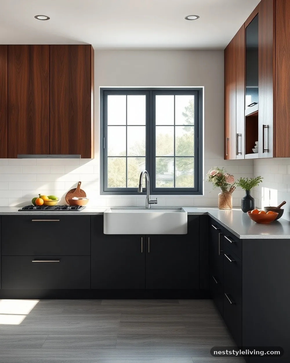
For a high-end, contemporary aesthetic, try using matte black on the base cabinets combined with walnut wood cabinetry for the uppers or a central island. The black provides a sharp, sleek foundation, while the rich, chocolatey tones of the walnut inject a sense of luxury and warmth. This pairing is bold, so it functions best in kitchens with plenty of natural light or under-cabinet task lighting.
Keep the cabinet hardware minimal—think matte black pulls or hidden touch-latches—to maintain the clean lines of the design. Walnut is a premium material, so if you are working on a budget, consider using walnut veneer for the upper doors rather than solid hardwood to achieve the same visual impact for less.
5. Slate Grey and Soft Grey
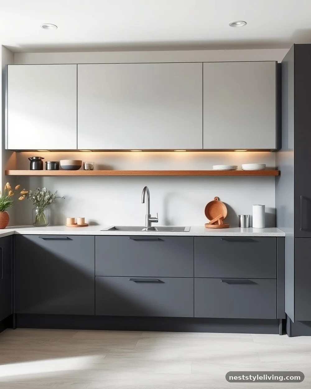
If you prefer a monochromatic approach, using two different shades of grey creates a subtle, layered effect that is incredibly versatile. By placing the darker slate grey on the bottom and a lighter, ethereal grey on the top, you create a sense of height and sophistication without the jarring impact of a high-contrast palette. This is a safe, stylish choice that pairs beautifully with marble or quartz countertops featuring grey veining.
Ensure the undertones of both greys match—if the slate has a blue undertone, the lighter grey should as well. This prevents the two colors from clashing, which is the most common mistake when layering neutral tones in a kitchen space.
6. Emerald Green and White Shaker
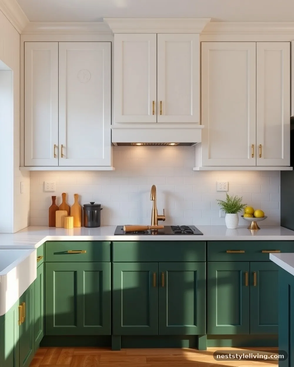
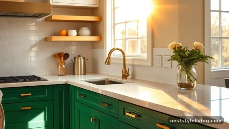
Emerald green is a daring choice for lower cabinets that brings a sense of opulence and drama to the kitchen. When paired with classic white Shaker-style upper cabinets, the green becomes the star of the show while the white ensures the room remains functional and bright. This combination works best with gold or brass hardware, which pops beautifully against the deep, jewel-toned green.
Since emerald green is a high-pigment color, use a high-quality primer before painting to ensure the color is vibrant and uniform. If you are painting existing cabinets, invest in a sprayer rather than a brush to achieve a smooth, factory-like finish that won’t show streaks.
7. Terracotta and Cream
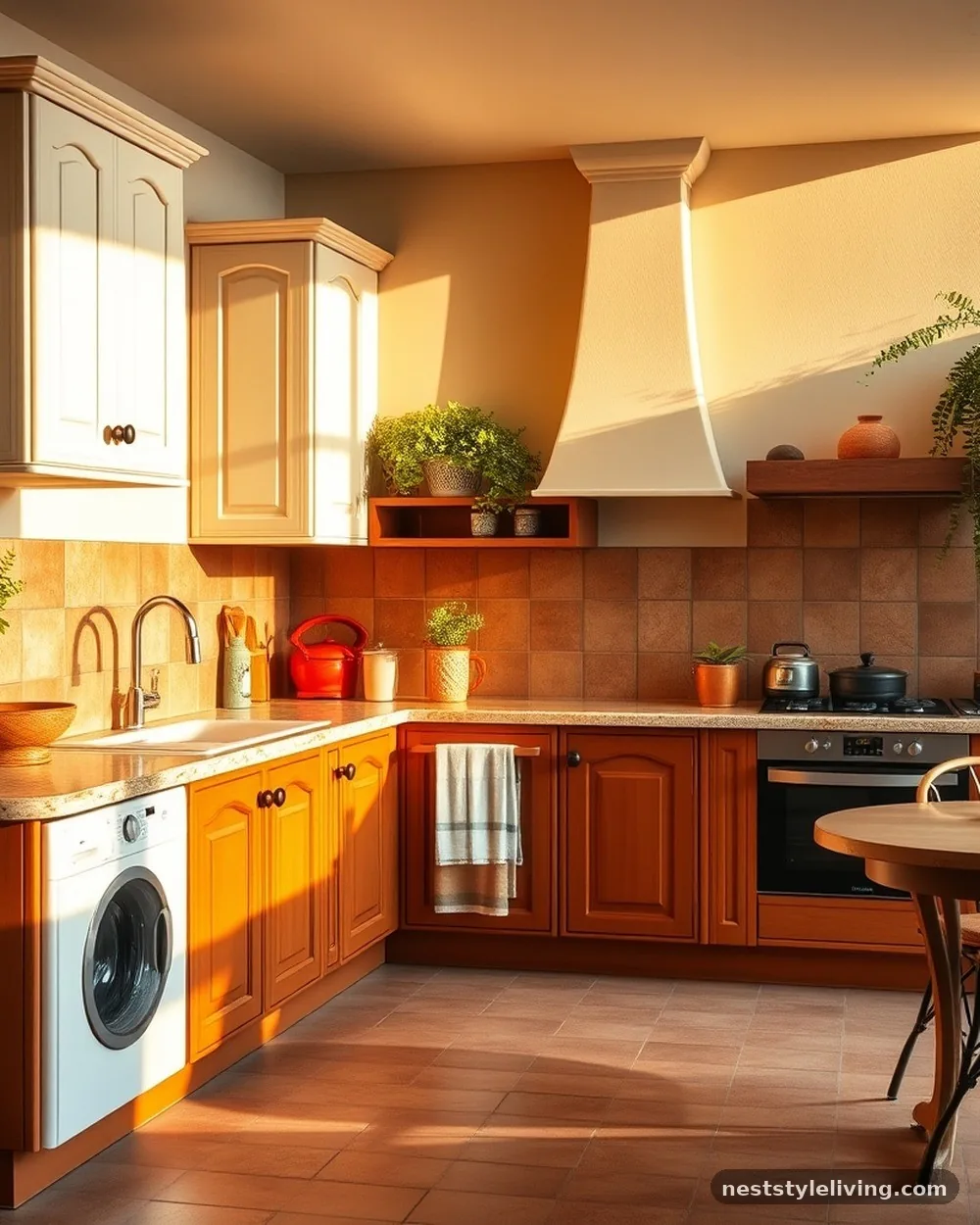
Terracotta lower cabinets bring a warm, Mediterranean-inspired energy into the kitchen that feels inviting and unique. By keeping the upper cabinets a soft, neutral cream, you prevent the space from becoming too intense. This look is perfect for homeowners who want to move away from the standard grey or white palettes and embrace a more textured, organic design language.
Terracotta works best in spaces with natural stone flooring or terracotta tiles, creating a cohesive, rustic vibe. Use a flat or eggshell finish on the terracotta to lean into the earthy, raw quality of the color, which hides minor surface imperfections better than semi-gloss.
8. Deep Plum and Light Grey
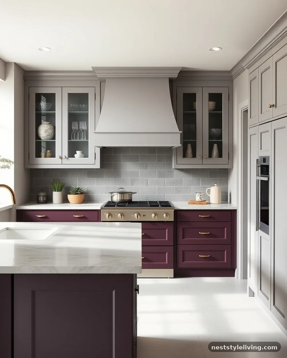
For a design that feels editorial and unexpected, deep plum lower cabinets offer a sophisticated alternative to blue or black. When balanced with light grey uppers, the kitchen feels grounded yet airy, creating a moody, upscale atmosphere. This combination is particularly effective in smaller kitchens where you want to make a statement without closing off the space.
Pair this color scheme with cool-toned metal finishes like polished nickel or chrome. Because plum is a complex color, ensure you view your paint samples at different times of the day to ensure the purple doesn’t lean too brown or too red under your specific lighting conditions.
9. Navy and Natural Wood Island
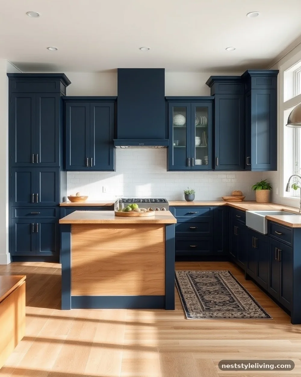
If you are hesitant to commit to two-toned wall cabinets, keep your perimeter cabinets one solid color and use the kitchen island as the second tone. Navy blue base cabinets on the perimeter with a natural wood island creates a focal point that is both functional and stylish. The wood island adds a warm, organic texture that breaks up the painted surfaces of the rest of the kitchen.
Ensure the wood stain on the island coordinates with the undertones of your flooring. If your floor is a light ash, choose a warm oak or walnut for the island to provide enough contrast so the pieces don’t bleed into each other.
10. Black and White Open Shelving
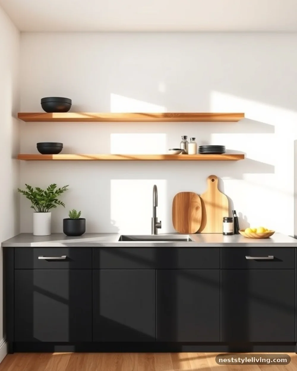
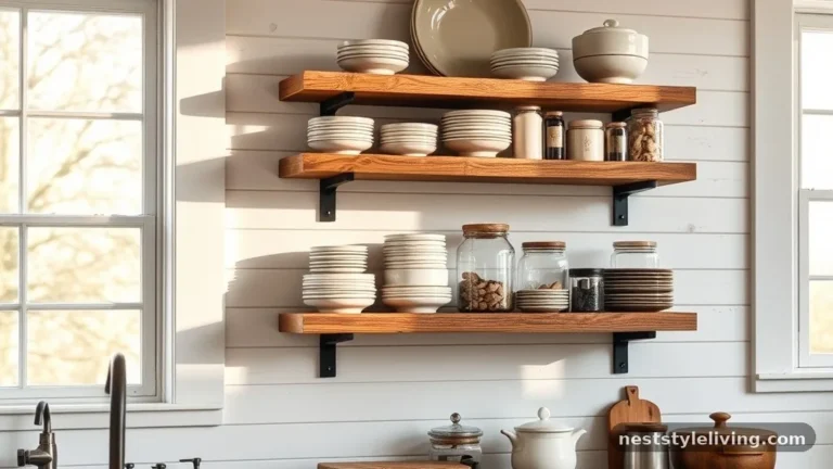
Instead of traditional upper cabinets, use black lower cabinets and replace the uppers with natural wood open shelving against a white wall. This creates a two-tone effect through material contrast rather than just paint. The open shelving keeps the kitchen feeling open and accessible, while the black bases provide the necessary storage and visual weight.
This style requires a commitment to organization, as your dishware will be on display. Choose matching, neutral-toned dinnerware to keep the look clean and intentional, preventing the open shelves from looking cluttered or chaotic.
11. Mustard Yellow and Charcoal
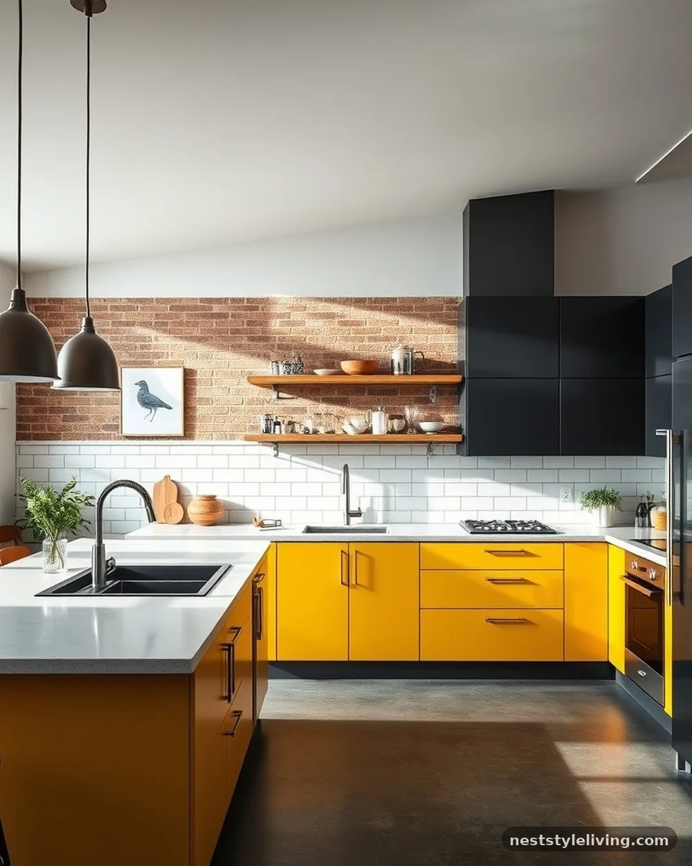
Mustard yellow is a bold, energetic choice for lower cabinets, especially when contrasted with charcoal or near-black upper cabinets. This pairing is mid-century modern at its best, providing a playful yet grounded aesthetic. The charcoal keeps the yellow from feeling too vibrant or overwhelming, while the yellow adds a much-needed pop of personality.
Use this combination in a kitchen with industrial elements, such as concrete countertops or stainless steel appliances. The contrast between the industrial, cold elements and the warm, sunny yellow creates a balanced, professional-grade look that feels curated rather than whimsical.
12. Forest Green and Pale Wood
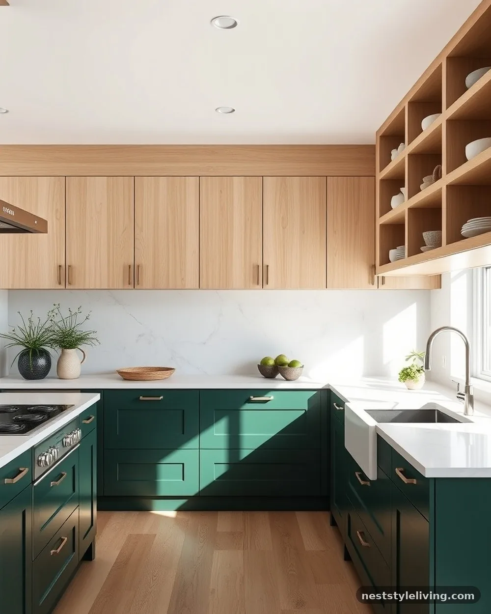
Forest green is an enduringly popular choice for lower cabinets because it feels like an extension of nature. When paired with pale, light-colored wood upper cabinets, it creates a calming, biophilic design that is perfect for a serene home environment. This look is highly compatible with white marble or quartz countertops, which tie the light wood and dark green together.
If you are replacing your doors, consider using a light ash or white oak for the uppers. These woods have a subtle grain that looks expensive and provides a beautiful tactile contrast to the smooth, painted surface of the green base cabinets.
13. Sky Blue and White
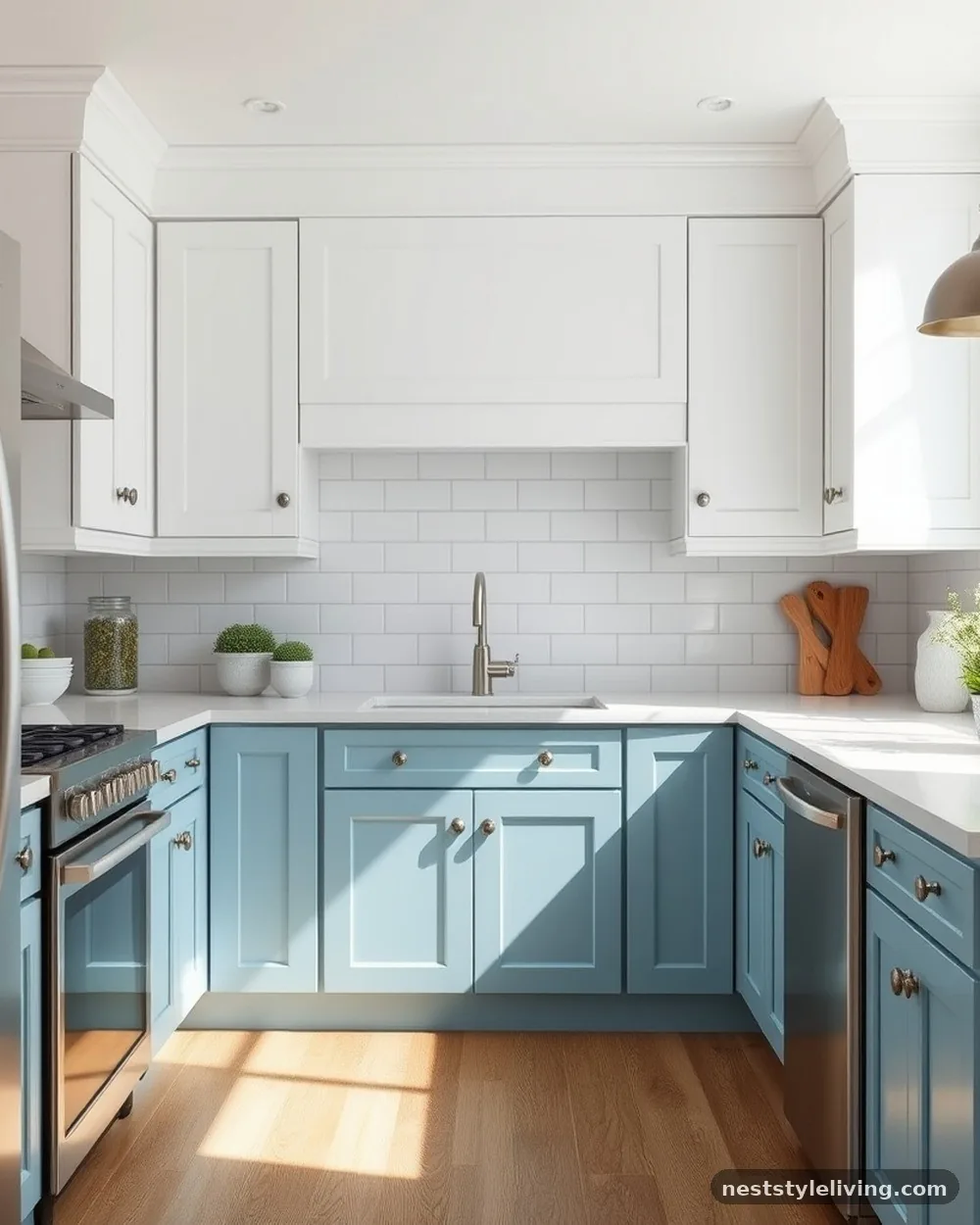
A soft, sky blue lower cabinet set provides a coastal, airy feel that is light and welcoming. By keeping the uppers white, you maintain the brightness of the kitchen, making it feel larger than it actually is. This is an excellent choice for a beach house or any home where you want to create a relaxed, vacation-like atmosphere.
Pair sky blue with white subway tile backsplashes and brushed nickel hardware to enhance the clean, crisp feel of the space. This is a very forgiving color scheme that resists showing dust, making it a practical choice for busy family kitchens.
14. Two-Tone Shaker with Glass Inserts
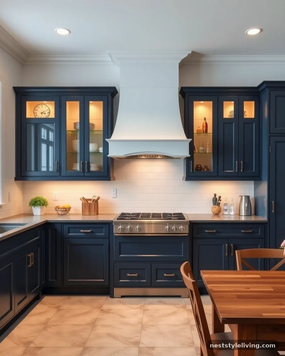
Combine two colors on your Shaker-style cabinets by using one color for the frames and another for the panels, or by using a dark color for lower units and a lighter color for uppers that feature glass inserts. The glass inserts in the upper cabinets make the space feel more open and allow you to showcase decorative items, which helps balance the visual weight of the darker lower cabinets.
When using glass, consider adding interior cabinet lighting. This illuminates the contents of the uppers at night, providing a soft, ambient glow that highlights the two-tone transition and adds a layer of luxury to the kitchen design.
15. Burgundy and Greige
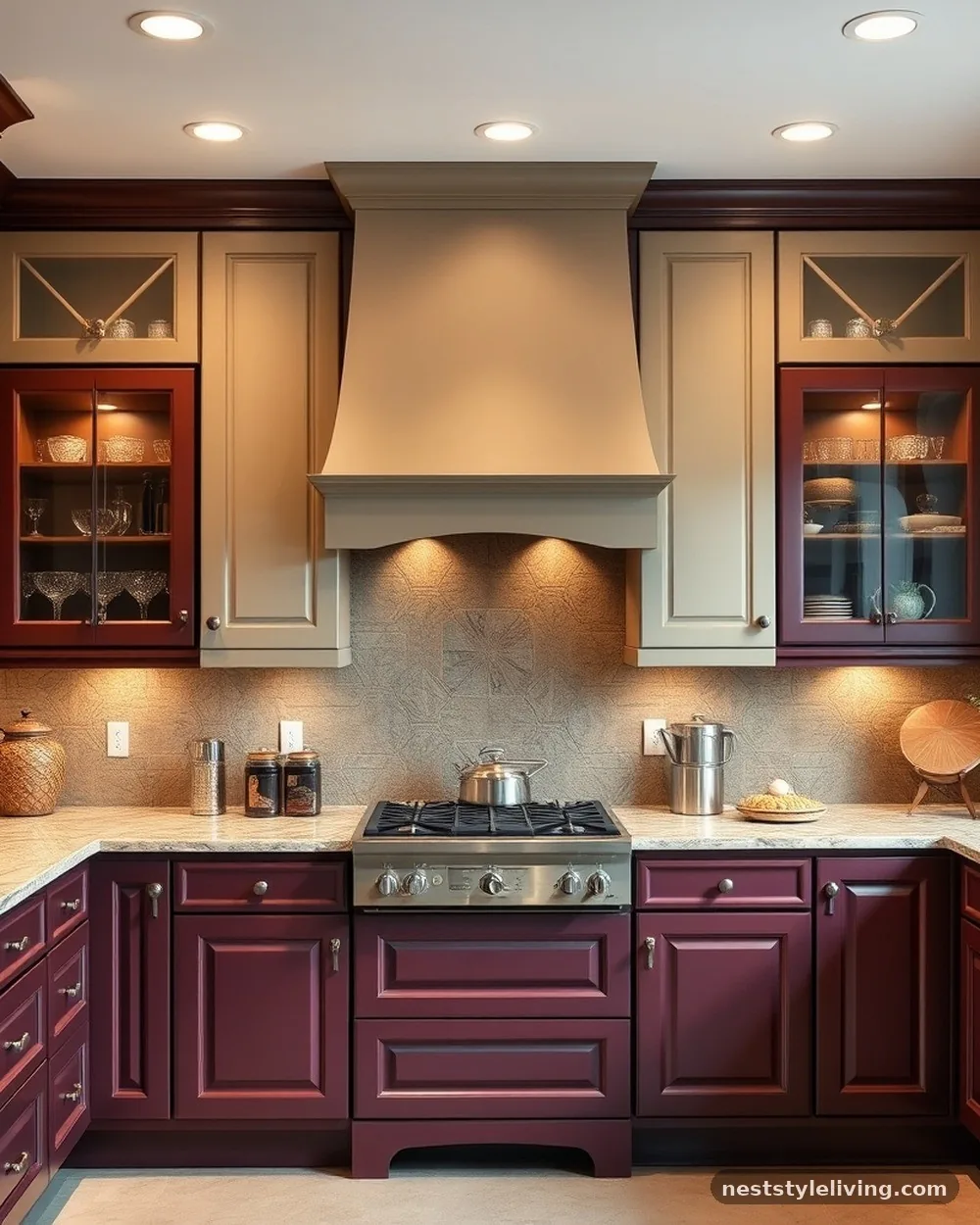
Burgundy is a rich, sophisticated color that works surprisingly well in the kitchen when paired with a neutral greige (grey-beige). The burgundy provides the depth, while the greige acts as a bridge between warm and cool tones, keeping the kitchen feeling balanced. This combination is ideal for traditional or craftsman-style homes where you want to add a touch of drama.
To keep the look modern, opt for a matte finish on the burgundy paint. Pair it with antique brass or unlacquered brass hardware, which will develop a patina over time that complements the deep, rich tones of the burgundy.
16. Dark Teal and Light Grey
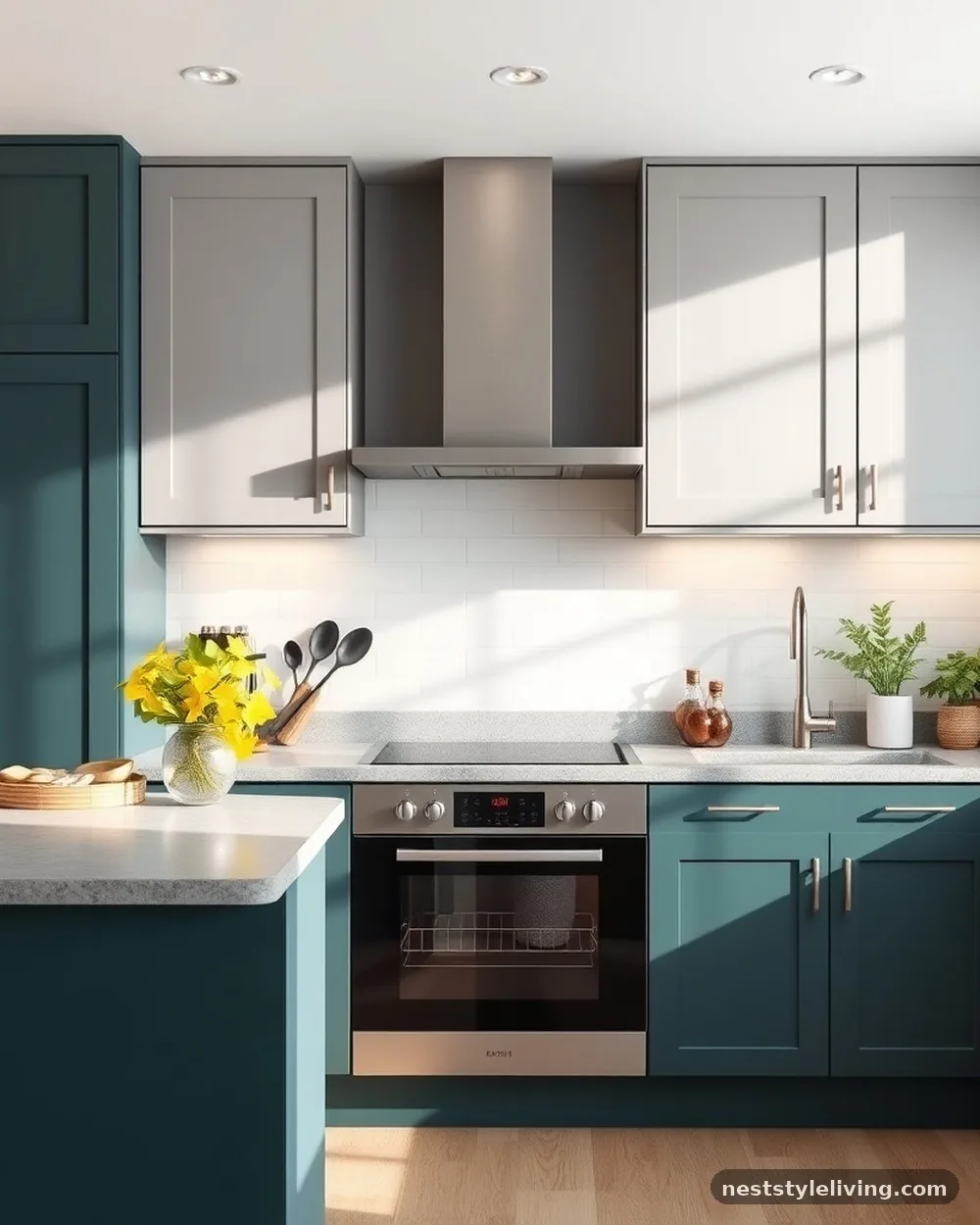
Dark teal is a vibrant, moody color that feels fresh and modern, especially when balanced by light grey uppers. This pairing is excellent for those who love color but want to avoid the intensity of a primary shade. The grey softens the teal, making it feel more like a neutral, while the teal adds just enough personality to make the room feel unique.
Because teal can lean either blue or green, choose your grey carefully. A cool-toned, blue-grey will emphasize the blue in the teal, while a warm, greige-grey will pull out the green, allowing you to customize the mood of the room.
17. Navy Lower and Open Wood Shelving
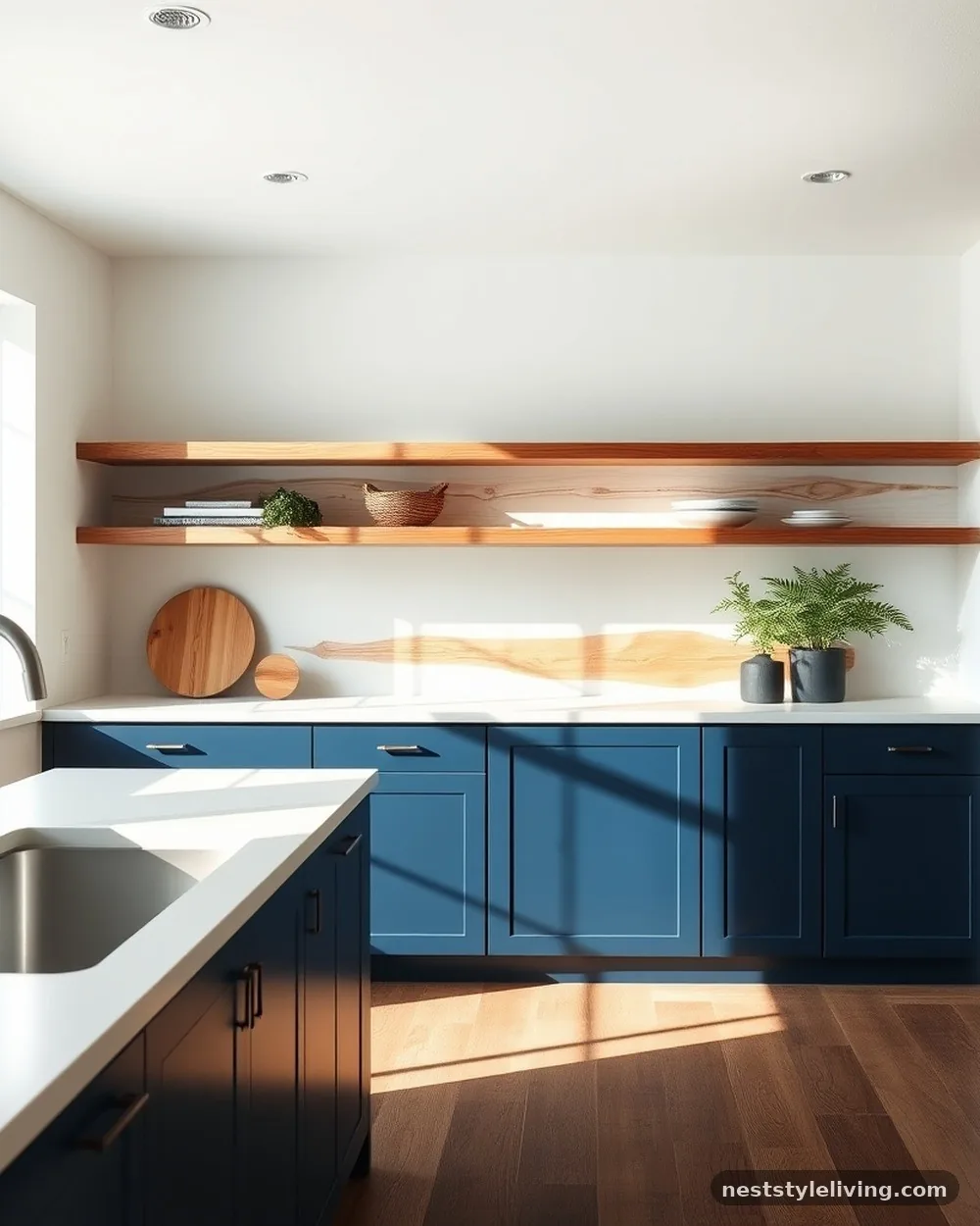
For a truly minimalist approach, use navy blue on all lower cabinets and eliminate upper cabinets entirely, replacing them with long, floating wood shelves. This creates a striking two-tone look between the painted base and the natural wall. It is the ultimate way to make a small kitchen feel expansive, as the wall space is left largely clear.
Ensure your floating shelves are installed with heavy-duty hidden brackets to support the weight of heavy stoneware or plates. This design relies on the visual impact of the wood, so choose a high-quality, solid-wood shelf rather than a hollow-core alternative.
18. High-Gloss White and Grey Wood
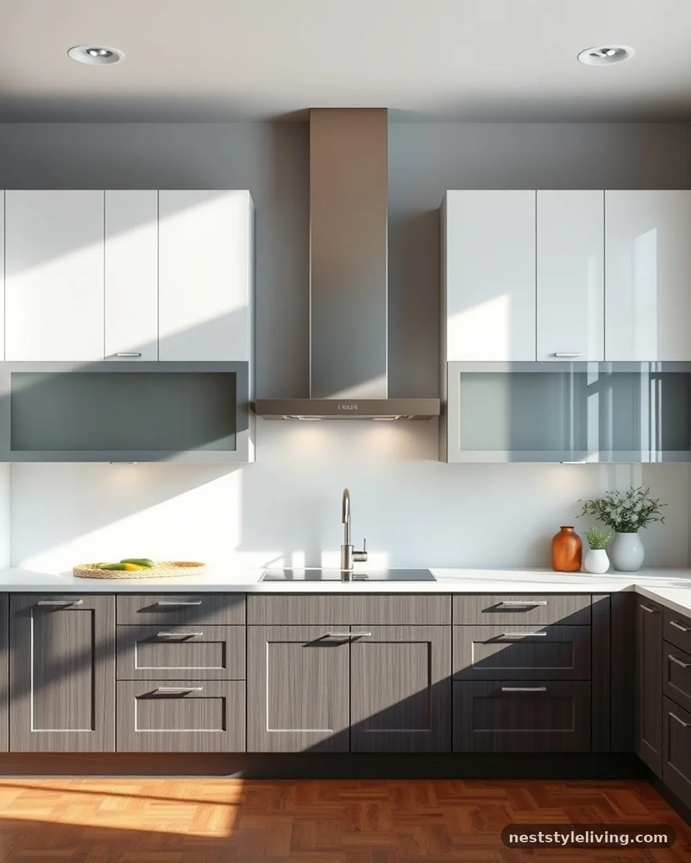
If you prefer a sleek, contemporary look, use high-gloss white on your upper cabinets and a grey-stained wood for the lower cabinets. The gloss finish on the white reflects light, while the wood grain on the bottom adds warmth and texture. This creates a sophisticated, high-contrast look that is very easy to clean.
High-gloss finishes are prone to showing fingerprints, so select hardware that doesn’t require you to touch the cabinet face, such as long, edge-mounted pulls. This keeps the glossy surface pristine and reduces the frequency of cleaning needed to maintain the look.
19. Soft Pink and Dark Grey

Don’t be afraid of blush or soft pink for your lower cabinets; it creates a surprisingly sophisticated and modern look when paired with dark charcoal or black upper cabinets. The dark uppers prevent the pink from feeling too “sweet” or childish, turning it into a bold, fashion-forward design choice. This works exceptionally well in urban apartments where you want to add a touch of whimsy.
Pair this with matte black hardware for a sharp, modern contrast. The key to making this work is ensuring the pink has a dusty, muted undertone rather than a bright, bubblegum quality, which keeps the palette grounded.
20. Mismatched Cabinet Styles
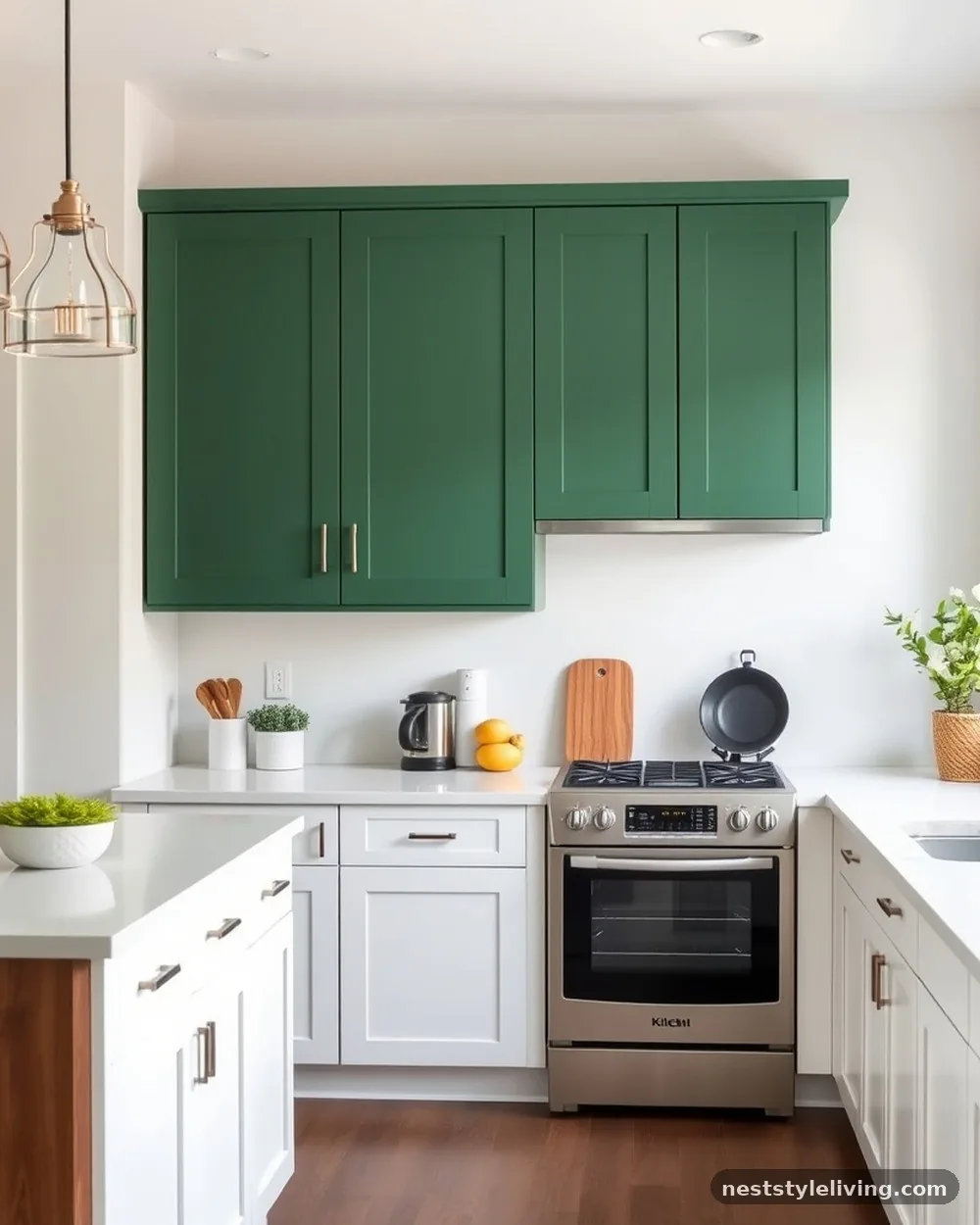
You can create a two-tone kitchen by using different cabinet styles entirely—for example, shaker-style for the lower units and flat-panel, handleless doors for the uppers. Pair this with a two-tone color scheme, such as white for the shaker units and a bold color like forest green for the flat-panel units. This adds a layer of architectural interest that goes beyond simple color changes.
This approach is best suited for modern or eclectic kitchens. Because you are mixing styles, keep the color palette limited to two main tones to ensure the design feels intentional and cohesive rather than disjointed.
21. Teal and Copper Accents
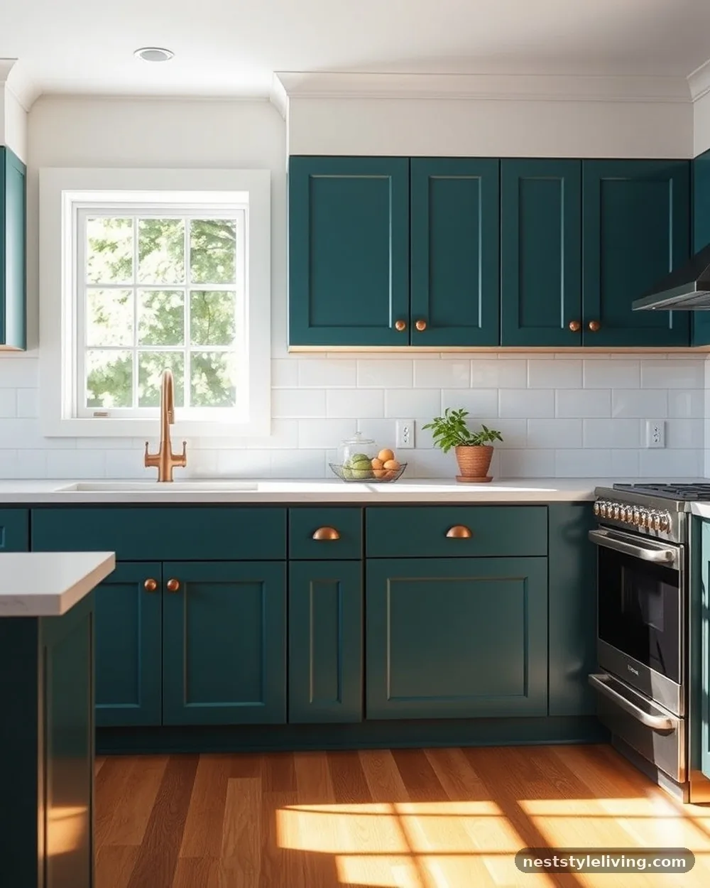
If you want to focus on metal finishes as part of your two-tone strategy, pair deep teal lower cabinets with copper or rose-gold hardware and light-colored uppers. The metal acts as a third tone that ties the dark lower and light upper cabinets together. The metallic sheen adds a level of reflection that makes the dark cabinets feel less heavy.
Copper is a living finish, meaning it will darken and develop character over time. Use this to your advantage in a kitchen that you want to feel lived-in and authentic, rather than a sterile, showroom-perfect space.
22. Navy and White with Patterned Tile
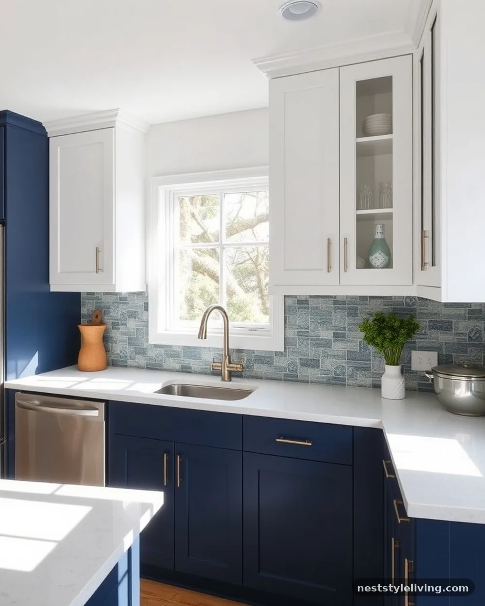
Use navy lower cabinets and white uppers as a backdrop for a bold, patterned backsplash tile. The two-tone cabinetry acts as a neutral frame for the tile, which becomes the artistic centerpiece of the kitchen. This is a great way to incorporate a favorite pattern without it feeling overwhelming, as the clean lines of the two-tone cabinets provide a necessary visual break.
Choose a tile that incorporates both the color of your lower cabinets and the color of your uppers. This creates a visual bridge, making the design feel unified and professional, and ensures that the two-tone scheme looks like a deliberate, artistic choice.
Frequently Asked Questions
Are two-tone cabinets still in style for 2025?
Yes, two-tone kitchen cabinetry remains a staple in modern design because it offers a way to personalize a space without relying on trends that expire quickly. It is considered a classic technique for adding character to a room.
Does having two-tone cabinets make a small kitchen look smaller?
Not necessarily, provided you place the lighter color on the upper cabinets. This trick draws the eye upward and keeps the upper reaches of the room feeling light, which actually helps small kitchens feel more open.
Should the island count as part of the two-tone design?
Absolutely. Many people choose to keep their wall cabinets one color and use the island as the second tone. This is an excellent, low-risk way to experiment with two-tone kitchen cabinet ideas to try at home without painting every single unit in the room.
Which color should go on the bottom and which on the top?
Generally, darker colors are placed on the bottom to provide visual weight and ground the room, while lighter colors are placed on top to prevent the kitchen from feeling enclosed. However, you can reverse this for a more dramatic, avant-garde look.
How do I choose hardware for two-tone cabinets?
Look for a finish that complements both colors. Brushed brass, matte black, or polished nickel are versatile choices that look intentional against almost any two-tone palette.
Conclusion
Exploring these two tone kitchen cabinet ideas to try at home provides an effective roadmap for transforming your space into something truly distinctive. By balancing light and dark or pairing contrasting textures, you shift the kitchen from a utilitarian zone into a curated design statement. The success of this look relies on maintaining a cohesive connection between the two colors, often bridged by your choice of backsplash or hardware.
Start by identifying the mood you want to achieve—whether that is a moody, sophisticated retreat or an airy, coastal kitchen—and select a palette that reflects that intent. With careful planning and high-quality finishes, your updated cabinetry will serve as the heart of your home for years to come.