20 Exterior House Color Trends to Try This Year
Selecting the right palette for your home’s facade is a significant commitment that defines its curb appeal for years to come. Staying informed about the latest exterior house color trends to try this year helps ensure your property remains both timeless and contemporary in a shifting design landscape.
Whether you are aiming for a dramatic transformation or a subtle refresh, the hues you choose interact with natural light, landscaping, and architectural features in complex ways. This collection focuses on high-impact finishes and palettes that balance modern longevity with personal expression, giving you a clear path toward a home exterior that feels intentional and expertly curated.
1. Deep Forest Green
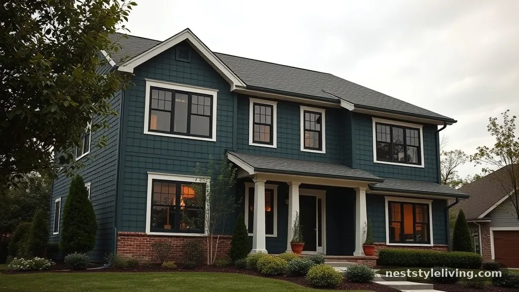
Deep, saturated forest green is moving away from the traditional hunter green of the nineties and toward a more muted, organic aesthetic. This shade works exceptionally well on wood siding or board-and-batten textures, providing a sophisticated backdrop that blends into natural surroundings. Unlike brighter greens, this dark, moody pigment creates a sense of depth and stability, making a house feel grounded in its environment. It pairs beautifully with natural wood accents or brass hardware, which pop against the dark canvas. Because of its high pigment load, this color tends to resist fading better than lighter pastel greens, though it does require a high-quality, UV-resistant exterior paint to maintain its richness over time.
To achieve this look, opt for a matte or eggshell finish to minimize glare and highlight the natural texture of your siding. Test a large sample on the north and south sides of your home, as the green will shift significantly depending on direct sunlight exposure.
2. Warm Greige
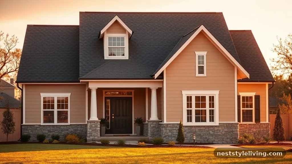
Greige, the perfect marriage of gray and beige, remains a staple for those seeking a neutral that isn’t sterile. This year, the focus is on warmer undertones, leaning closer to sand or light clay. It provides a soft, welcoming appearance that feels less industrial than a stark cool gray. This color is incredibly versatile and works on almost any architectural style, from suburban Craftsman homes to modern farmhouses. It effectively bridges the gap between stone foundations and roof shingles, creating a cohesive look that doesn’t overwhelm the neighborhood aesthetic. It is a low-risk, high-reward choice for resale value.
When selecting your shade, look for options that contain a hint of yellow or brown rather than blue or purple. Apply a full-size color swatch near your windows to ensure the undertones harmonize with your existing window trim and roof color.
3. Soft Off-White
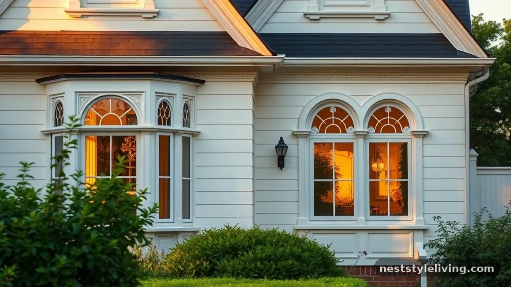
Moving away from the clinical, high-contrast bright whites of recent years, soft off-white is gaining ground for its warmth and approachability. This shade features subtle cream or peach undertones that prevent the home from appearing too stark under harsh midday sun. It creates a clean, classic, and elegant exterior that allows landscaping to take center stage. This choice is particularly effective for homes with intricate architectural details, such as ornate moldings or gables, as the softness of the white highlights the shadows and depth of the trim without creating a jarring visual break.
Choose a high-quality acrylic latex paint with excellent self-cleaning properties to keep the white looking fresh. Use a satin finish for the trim to provide a slight sheen contrast against a flat or eggshell body, which adds visual interest without needing multiple colors.
4. Charcoal Slate
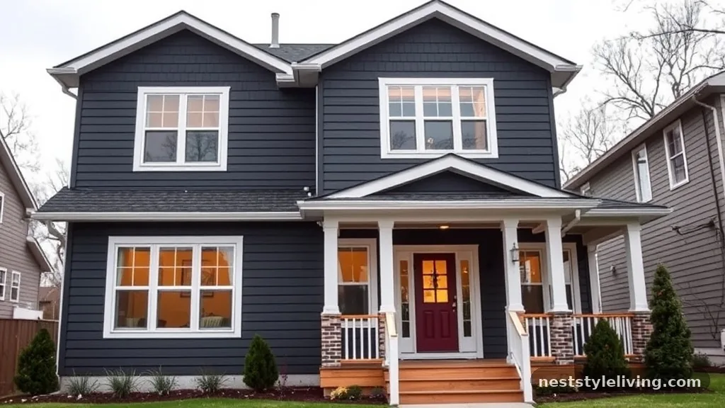
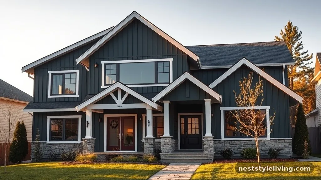
Charcoal slate is a deep, sophisticated gray that leans slightly toward blue, offering a modern edge that remains grounded. It is an excellent choice for homeowners looking to make a bold statement without resorting to pure black. This color provides a dramatic contrast against white trim or natural wood porches, and it looks particularly stunning on homes with stone or brick elements. Its dark nature helps to hide dirt and water spots, making it a practical choice for houses in dusty or humid climates. The depth of this color can make a smaller home feel more significant and imposing.
Because dark colors absorb heat, ensure your home has adequate ventilation and consider using heat-reflective paint technology to reduce the thermal load on your siding. Pair it with lighter-colored stone accents to prevent the exterior from feeling too heavy or closed off.
5. Dusty Terracotta
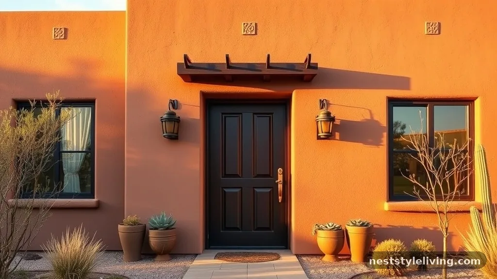
Earthy, sun-baked terracotta is making a comeback as homeowners seek to add personality and warmth to their exteriors. This muted, clay-like hue works exceptionally well in dry, sunny climates and brings a Mediterranean or desert-modern vibe to any structure. It pairs beautifully with dark bronze hardware and warm-toned wood doors. Unlike bright orange, this dusty version is sophisticated and subtle, blending well with stone and gravel landscaping. It adds a vibrant, welcoming energy to the home that stands out in neighborhoods dominated by grays and whites.
If you are nervous about painting the entire house this color, use it as an accent for the front door or window shutters first. Otherwise, ensure you choose a high-quality, fade-resistant exterior paint, as red-based pigments are naturally more prone to UV degradation over several years.
6. Navy Blue
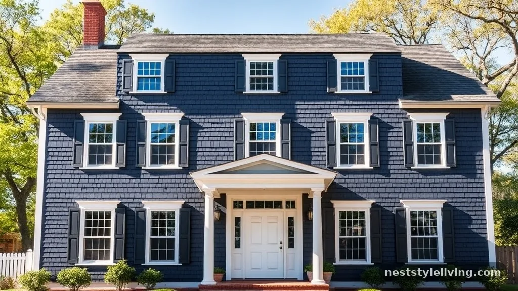
Navy blue continues to hold its status as a timeless classic, offering a nautical yet modern appeal that never goes out of style. This deep, rich color creates a strong contrast against white window frames and trim, resulting in a crisp, clean appearance. It works well on shingle-style homes, colonial houses, and modern box designs alike. Navy blue feels authoritative and calm, and it pairs perfectly with brass lighting fixtures or natural cedar porch ceilings. It is a bold choice that feels established and permanent.
Keep in mind that very dark blues can show dust or pollen more clearly than lighter shades. Plan for a regular power wash schedule to keep the pigment looking sharp, and ensure your paint has a strong UV-blocking additive to prevent the deep blue from “chalking” or fading into a dull gray over time.
7. Sage Green
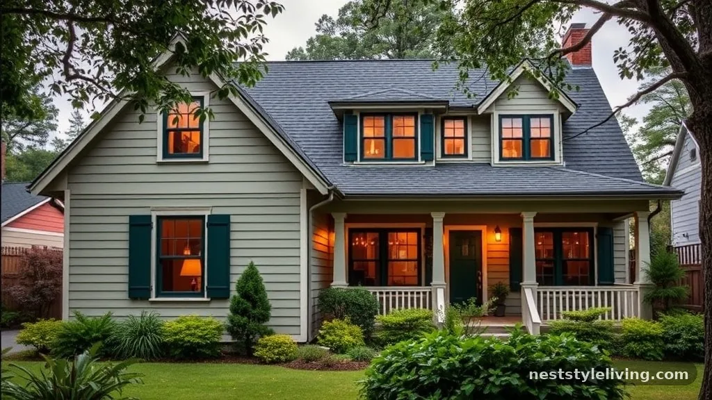
Sage green offers a serene, natural connection that feels both updated and historically appropriate for many home styles. This muted, gray-green is less aggressive than forest green and feels more like an extension of the garden. It is an excellent choice for homes surrounded by trees or lush landscaping, as it creates a seamless transition between the built structure and the natural environment. Sage works well with both light and dark trim, making it a flexible option for those who want to experiment with different accent colors over time.
Use a flat or matte finish for the main siding to emphasize the soft, organic nature of the color. To create a cohesive palette, pull a darker version of the same green for the shutters or front door, which adds dimension without introducing a competing color family.
8. Warm Taupe
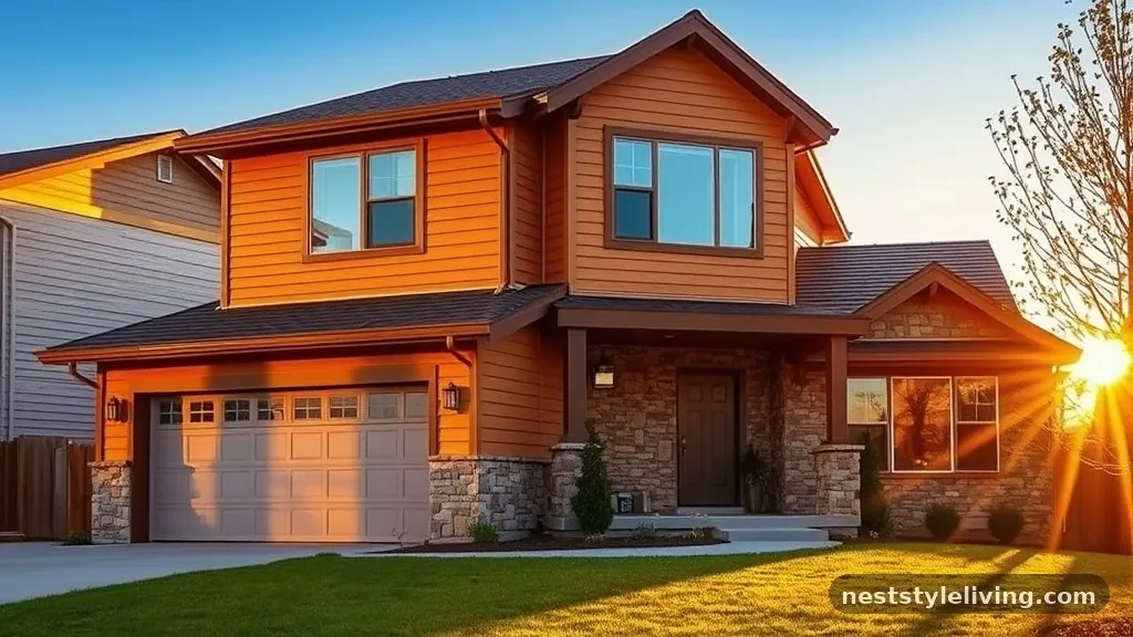
Taupe has evolved into a richer, more complex color that bridges the gap between gray and earthy brown. It is a sophisticated, neutral choice that feels grounded and permanent, especially on homes with stone veneers or brick foundations. Unlike lighter grays, taupe has a depth that makes it feel substantial and high-end. It works well in almost any light condition, maintaining its character from sunrise to sunset. It is a particularly strong choice for modern homes that want to feel cozy rather than cold.
When picking your specific taupe, be wary of “purple” undertones that can appear in certain lights. Always view your sample boards in both early morning and late afternoon light to see how the color behaves as the sun moves across your property.
9. Soft Charcoal
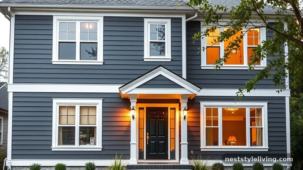
Soft charcoal is a lighter, more approachable version of the traditional dark gray palette. It offers the same sleek, modern look as deep charcoal but feels less imposing and more integrated into its surroundings. This color is ideal for homes with large windows, as the contrast between the dark frame and the softer siding creates a balanced, artistic look. It is also a very forgiving color that hides imperfections in siding material, such as minor dents or uneven textures, better than lighter, high-sheen paints.
If you choose this color, pair it with light stone or white trim to keep the house from looking too monochromatic. Use a semi-gloss finish on the front door to create a subtle point of interest that breaks up the soft charcoal field.
10. Muted Plum
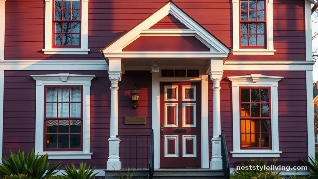
For those looking to depart from the standard neutral palette, muted plum is a sophisticated and unexpected choice. This deep, dusky purple is subtle enough to look like a neutral from a distance, revealing its complexity only as you get closer. It works remarkably well on Victorian homes or cottages, where it can lean into the architectural charm of the building. It pairs beautifully with cream or antique white trim and dark, oil-rubbed bronze hardware, creating a look that is both historic and fashion-forward.
Use this color selectively if you are worried about trends, perhaps on a front door or as a secondary color for porch railings. Because this is a high-chroma color, invest in the highest-quality exterior paint available to ensure the pigment remains stable and vibrant for years, as cheaper paints may fade unevenly.
11. Warm Stone
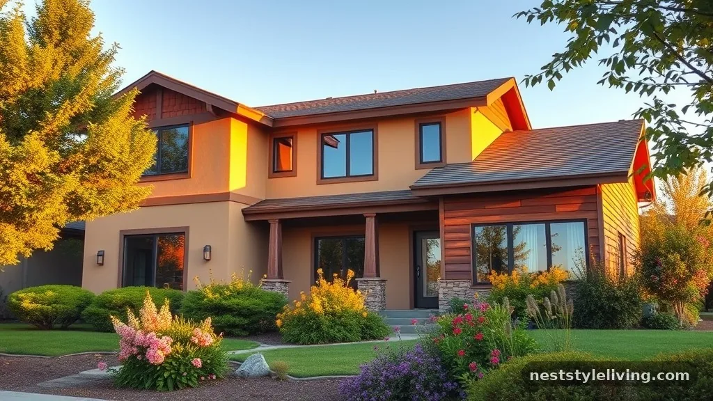
The color of raw, natural stone—ranging from soft oatmeal to light tan—is becoming a popular choice for entire home exteriors. This look mimics the appearance of natural materials and creates a very tactile, grounded aesthetic. It is especially effective on homes with varied textures, such as those that mix stucco and wood. Warm stone colors are inherently calming and provide a blank canvas for colorful landscaping, such as bright flowers or deep green bushes, to pop against the facade.
To keep this look from appearing flat, use varying textures on the house, such as rough-hewn siding paired with smooth trim. Ensure the color you select has enough warm pigment to avoid looking like plain concrete or gray cement, which can feel cold and uninviting.
12. Deep Espresso
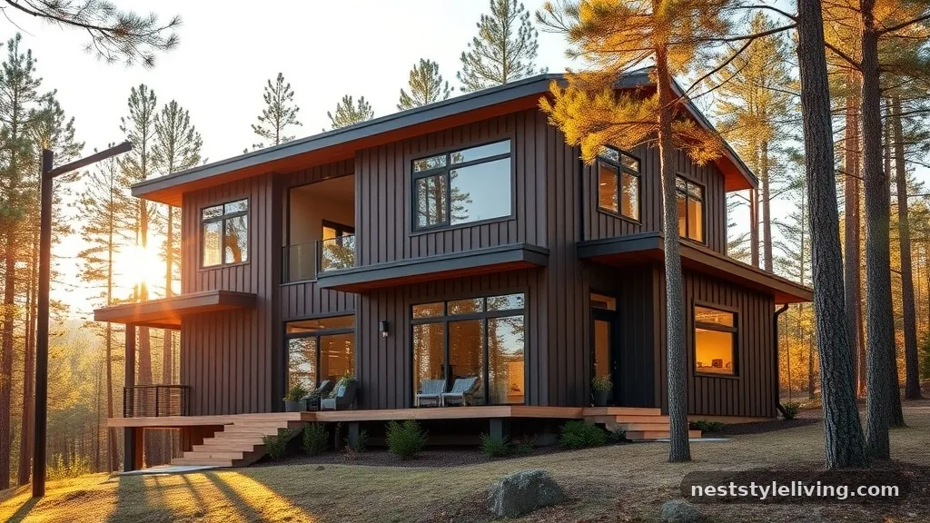
Deep, dark brown or espresso is replacing black as the go-to “moody” exterior color for modern architecture. It feels warmer and more natural than black, especially when used on homes with natural wood siding or cedar accents. Espresso creates a high-contrast look when paired with lighter wood tones or gold-toned metal accents. It is a dramatic choice that makes a house look like it belongs in the forest or mountains, blending seamlessly with bark and tree trunks.
Apply this color with a high-durability finish designed for dark pigments, as they are prone to heat absorption. If you live in a very hot climate, prioritize a paint with cool-roof or high-reflectivity technology to prevent the siding from overheating and causing structural expansion.
13. Slate Blue
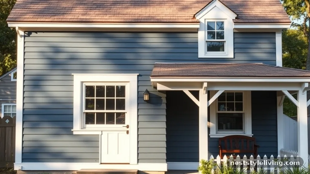
Slate blue is a muted, gray-toned blue that feels classic and coastal. It provides a cool, calming presence that is less intense than navy but more interesting than standard gray. This color is perfect for homes near water or those aiming for a relaxed, cottage-style aesthetic. It looks beautiful when combined with crisp white trim and natural wood shingles. Slate blue is a very forgiving color that ages gracefully, as it does not show dust or water streaking as aggressively as darker shades.
If you want to lean into the coastal vibe, use a light, sandy-colored trim to complement the blue. For a more modern feel, pair it with charcoal or black window frames to give the house a sharper, more defined outline.
14. Olive Green
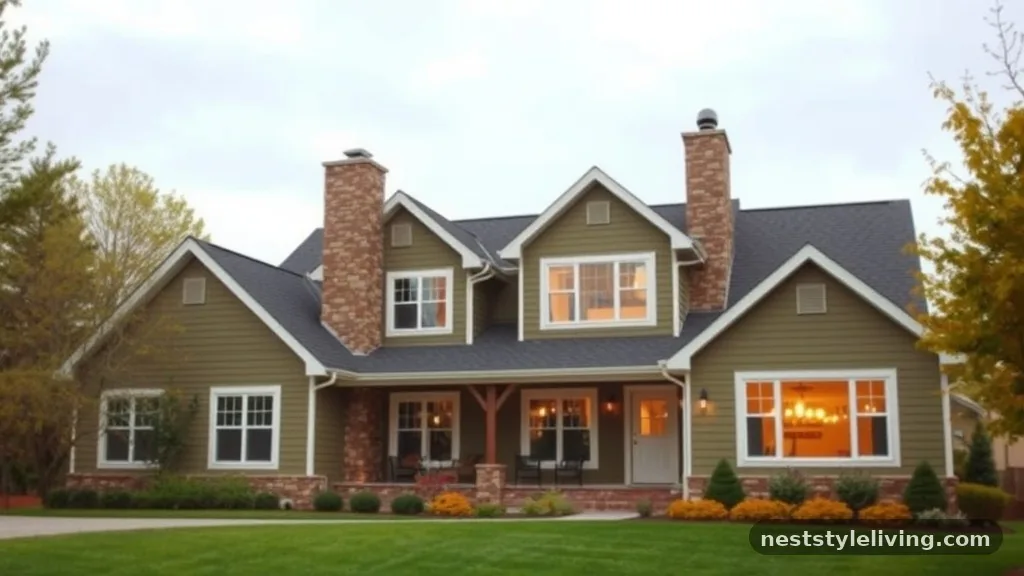
Olive green is an earthy, sophisticated neutral that feels intentional and curated. It is a darker, more yellow-toned alternative to sage, providing a richer, more grounded look. Olive works exceptionally well on homes with brick accents or stone chimneys, as the green naturally complements the warm tones in the masonry. It is a color that feels timeless and rarely goes out of style, making it a safe choice for those who want to avoid the “trendy” trap.
Because olive is a complex color, ensure you check the sample under overcast skies, where it can sometimes lean too yellow. Pair it with dark bronze or black hardware to ground the color and prevent it from feeling too light or washed out against the landscape.
15. Classic Black
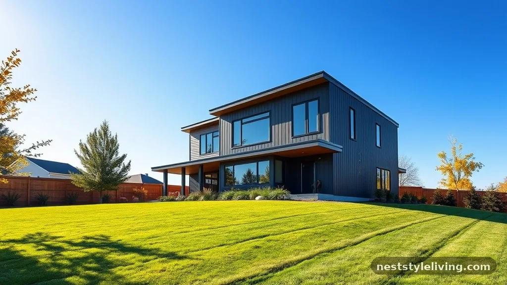
Black exteriors continue to be a dominant force in modern home design, offering a sharp, minimalist aesthetic that defines the shape of the house. A black exterior is the ultimate statement, turning the home into a silhouette that contrasts beautifully against green grass and blue skies. It is particularly effective on modern homes with clean lines and large windows. While bold, a well-executed black exterior feels high-end, architectural, and deliberate.
Use a matte or low-sheen finish to prevent the house from looking like a giant mirror in the sun. If you go with black, make sure your landscaping is clean and well-manicured, as a messy yard will be highlighted by the starkness of the dark exterior.
16. Soft Clay
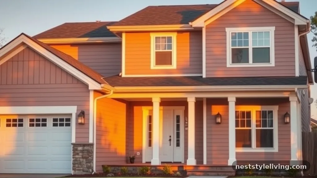
Soft clay is a lighter, more muted version of terracotta that feels like sun-bleached earth. It is a warm, inviting color that makes a house feel like it has been part of the landscape for decades. This color is excellent for homes with a lot of natural wood, as it bridges the gap between the wood tones and the surrounding earth. It is a very friendly, approachable color that doesn’t feel as formal as gray or as intense as navy.
Pair this color with creamy white trim to keep it looking fresh and bright. Since this is a light-to-medium tone, it is relatively easy to maintain and does not show dust or pollen as much as dark colors, making it a practical choice for rural or dusty areas.
17. Cool Silver
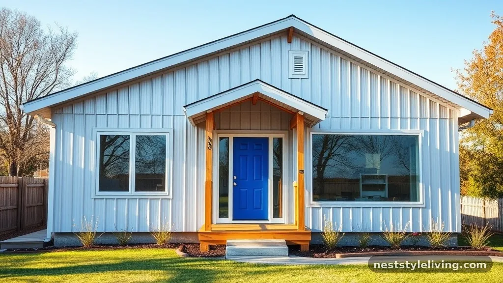
Cool silver or light gray is a crisp, clean choice for those who prefer a modern, industrial, or minimalist look. This color reflects light rather than absorbing it, which can help keep the home cooler in hot climates. It looks particularly stunning on homes with metal roofing or glass-heavy designs. Cool silver provides a sophisticated, gallery-like backdrop for vibrant front door colors, such as cobalt blue or bright yellow.
To prevent the home from feeling too sterile, incorporate natural wood elements into the porch or front entry area. This warmth will ground the cool silver and prevent the exterior from feeling like an office building or a commercial space.
18. Deep Burgundy
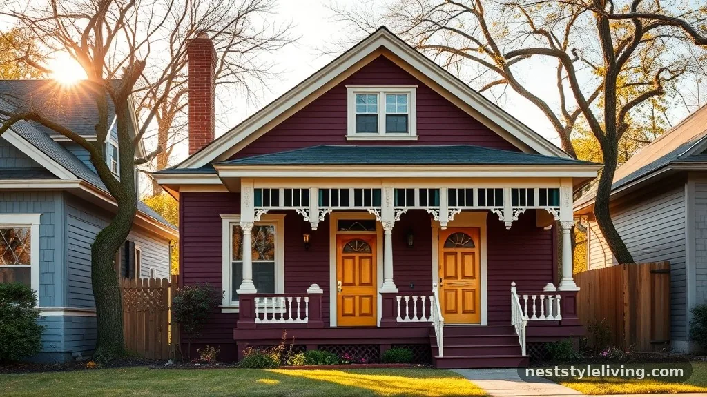
Deep burgundy is a bold, historic color that adds a sense of drama and elegance. It is a classic choice for traditional homes, bungalows, or houses with historical significance. When used as a main body color, it makes a house feel warm, inviting, and substantial. It pairs beautifully with cream, gold, or even forest green accents. This is a color that feels permanent and stately, perfect for those who want their home to stand out in a traditional neighborhood.
Because reds are notoriously difficult to keep vibrant, invest in a premium, high-fade-resistance paint. You may need to touch up the south-facing side of the house every few years to maintain the depth and richness of the pigment.
19. Warm Sand
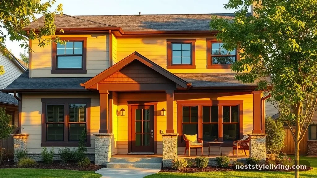
Warm sand is a light, neutral tan that feels like a beach house, even in the suburbs. It is a very forgiving color that works well with almost any roof shingle and landscaping style. This hue provides a clean, bright, and airy look that feels welcoming. It is an excellent choice for homeowners who want to keep their options open for future decor changes, as sand acts as a perfect neutral base for seasonal wreaths, porch furniture, and landscaping updates.
If you choose a sand-colored exterior, use a darker brown or espresso for the trim to add contrast and definition. This prevents the house from looking washed out and gives the exterior a professional, finished appearance.
20. Blue-Gray
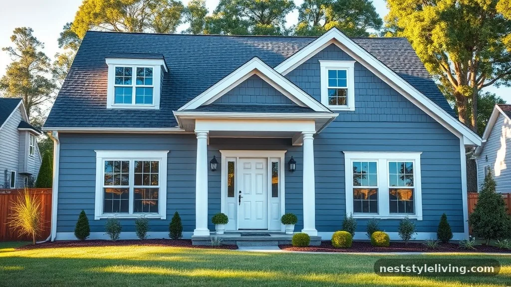
Blue-gray is a versatile hybrid that changes character depending on the time of day. In the morning, it can appear more blue, while in the evening, it leans toward a cool gray. This shifting quality makes it a dynamic and interesting choice for any home exterior. It is popular for its ability to look both modern and classic, fitting into a wide variety of architectural styles. It is a safe but stylish pick for those who want a bit of color without committing to a full-blown primary shade.
Pair this with white trim to create a crisp, nautical look. If you want a more modern, moody aesthetic, use a darker charcoal for the trim and door, which will draw out the gray undertones and make the house feel more contemporary.
Frequently Asked Questions
How do I choose the right paint finish for my exterior?
The finish you choose affects both the look and the durability of your home. Flat or matte finishes are excellent for hiding imperfections in siding but can be harder to clean. Satin and eggshell finishes offer a slight sheen that is easier to wipe down and provides more depth, making them popular for the main body of the house. Semi-gloss is almost always reserved for trim, shutters, and doors because it stands up best to moisture and provides a crisp, reflective contrast to the flatter body color.
Should I paint my brick if it is currently unpainted?
Painting brick is a permanent decision that significantly changes the maintenance requirements of your home. Once brick is painted, it requires regular repainting and can trap moisture if the wrong type of paint is used, leading to spalling or masonry damage. If you choose to do it, always use a high-quality, breathable masonry paint designed specifically for brick surfaces. Consider staining the brick instead if you want to change the color without creating a thick, plastic-like film that prevents the material from breathing.
How do I test paint colors on my home exterior?
Never choose a color based on a small paper swatch or a digital image. Purchase sample pots of your top three choices and paint them onto large poster boards or directly onto a sample piece of siding. Move these samples around the house to see how they look on the north, south, east, and west sides at different times of the day. A color that looks beautiful in the morning sun may look drab or overly dark under the intense afternoon heat, and you need to see that transition before committing.
Does the roof color dictate my exterior paint options?
Yes, the roof is one of the largest visual components of your home and must be considered. If you have a brown or tan roof, you should gravitate toward warm-toned exterior paints like beige, taupe, or warm green. If your roof is gray, black, or blue, you have more flexibility with cool-toned colors like charcoal, navy, or cool gray. Always look at your roof and siding samples together in the natural light to ensure the undertones do not clash, as a mismatch here is the most common reason for an exterior color disappointment.
How can I make my home look more modern without changing the architecture?
Color is the most powerful tool for updating the feel of a home. Switching to a monochromatic or high-contrast palette—such as all-black or a deep charcoal with white trim—can instantly modernize a dated structure. Additionally, replacing old hardware, updating light fixtures to something with a matte black or brass finish, and removing ornate, unnecessary trim can streamline the look. By choosing a sophisticated, muted palette from the latest exterior house color trends to try this year, you can shift the entire aesthetic profile of your home without expensive structural renovations.
Conclusion
Finding the right palette for your home is a rewarding process that significantly boosts curb appeal and personal satisfaction. By exploring the diverse range of exterior house color trends to try this year, you can identify a look that balances your personal style with the architectural heritage of your property. Remember that testing samples in varying light conditions is the most important step in preventing regret, as color is never static.
Whether you opt for a moody charcoal, a timeless navy, or a warm, earthy clay, the right paint will protect your investment while elevating the overall character of your residence. Take your time, focus on quality materials, and enjoy the transformative power of a well-chosen exterior color update.