22 Living Room Color Psychology Ideas to Try
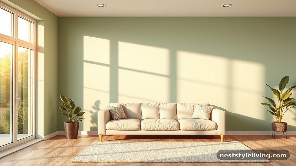
Exploring various living room color psychology ideas to try allows you to transform a standard area into a space that actively influences your mood and daily experience. By understanding how specific hues interact with human perception, you can curate an environment that promotes relaxation, social engagement, or focused energy depending on your needs.
Whether you prefer deep, moody tones or light, airy palettes, selecting the right colors for your walls, furniture, and textiles creates a cohesive atmosphere. This collection focuses on practical applications that help you design a home that feels both intentional and profoundly restorative.
1. Soft Sage Green Focal Walls
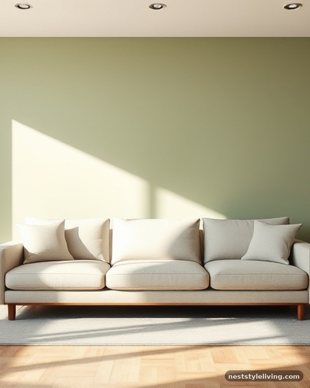
Applying a soft sage green to a primary wall introduces a sense of natural equilibrium and grounding to your living room. Sage is a desaturated, cool-toned green that mimics the calming properties of nature without the overwhelming vibrancy of forest or emerald tones. To achieve this look, opt for a matte finish to prevent glare, which keeps the wall looking velvety and soft under natural light.
This color works exceptionally well in rooms with hardwood floors or light wood accents, as the organic undertones complement the natural grain of the wood. Maintain the look by using a high-quality, washable paint that resists scuffs, ensuring the wall remains pristine in high-traffic areas.
Psalm 23:2 — He makes me lie down in green pastures; he leads me beside quiet waters.
The imagery of green pastures in this verse aligns perfectly with the psychological effect of sage green, which is often used to lower cortisol levels and encourage a state of restfulness. By incorporating this shade, you create a visual sanctuary that invites the mind to slow down.
2. Navy Blue Velvet Upholstery
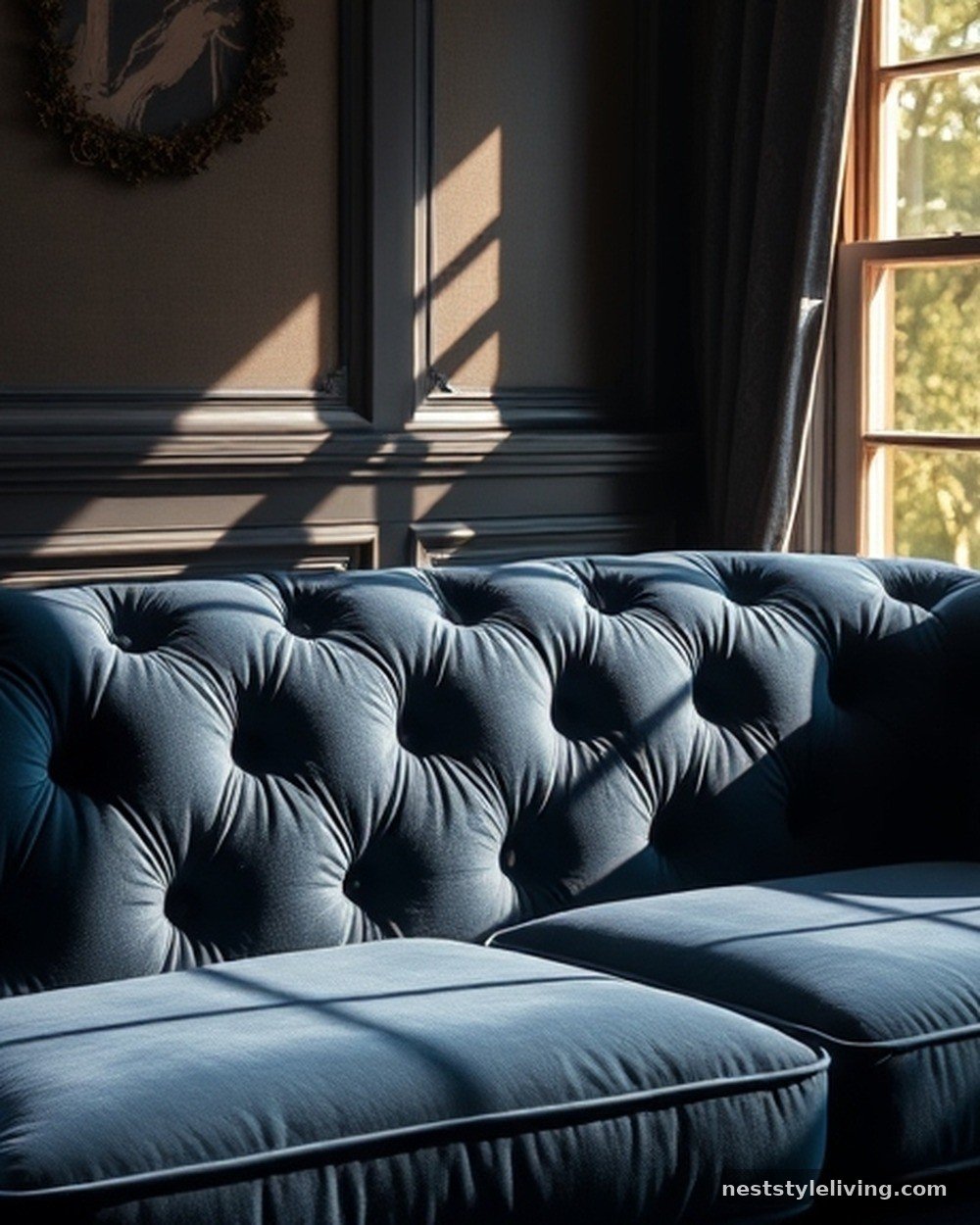
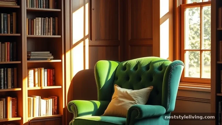
Deep navy blue serves as a sophisticated anchor, bringing a sense of stability and intellectual calm to your space. When rendered in a plush material like velvet, the color absorbs light, creating a rich, cocoon-like feel that is perfect for formal living areas or reading nooks.
Navy is highly versatile, pairing beautifully with metallic accents like brass or brushed gold, which prevent the deep color from feeling too cold or austere. Ensure that you vacuum the velvet regularly to prevent dust accumulation, and use a specialized fabric cleaner to spot-treat spills immediately to preserve the fabric’s deep, saturated pigment.
Exodus 24:10 — And they saw the God of Israel; and there was under his feet as it were a paved work of a sapphire stone, and as it were the body of heaven in his clearness.
The deep, celestial association of sapphire—or dark blue—evokes a sense of vastness and divine order. Using navy in your home design taps into this psychological feeling of depth and permanent structure, providing a backdrop that feels both expansive and secure.
3. Warm Terracotta Accent Pillows
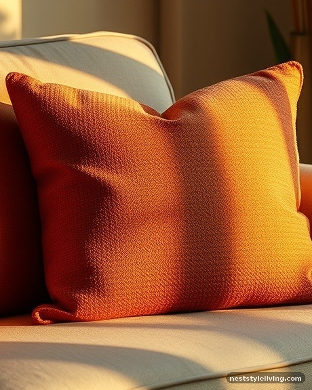
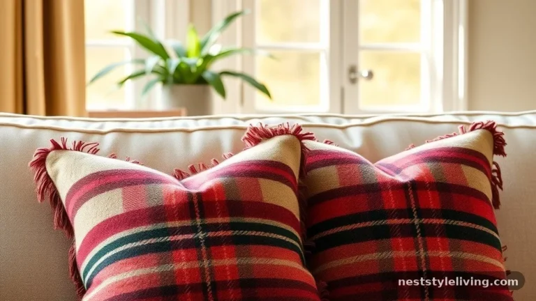
Incorporating terracotta through accent pillows or throw blankets adds a layer of earthy warmth that stimulates conversation and physical comfort. This burnt-orange shade is grounded in clay and soil tones, making it an excellent choice for balancing cooler wall colors like grey or crisp white.
You can introduce this color through linen or wool textures, which enhance the organic feel of the hue. Terracotta is particularly effective in spaces that lack natural sunlight, as it radiates a sense of artificial warmth that makes a room feel instantly more inviting and hospitable to guests.
Genesis 2:7 — And the Lord God formed man of the dust of the ground, and breathed into his nostrils the breath of life; and man became a living soul.
Terracotta is literally the color of the earth or dust from which life was formed. Psychologically, this color connects inhabitants to the physical world, fostering a sense of belonging and comfort that reflects the foundational relationship between humanity and the ground.
4. Crisp White Architectural Trim
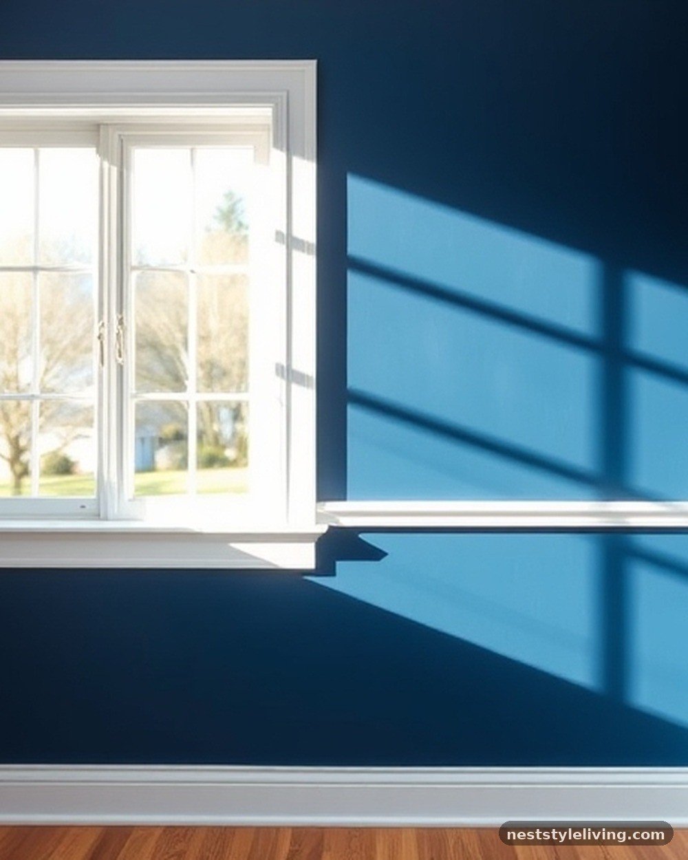
Using a high-contrast, crisp white for your baseboards, crown molding, and door frames provides a clean, psychological break that defines the boundaries of your living room. White represents clarity and simplicity, acting as a visual reset button for the eye when paired with more intense wall colors.
Use a semi-gloss or high-gloss paint for these elements, as the sheen reflects light and highlights the structural details of your room. This application is durable and easy to wipe down, which is essential for areas that collect dust or experience frequent foot traffic near the floor.
Matthew 17:2 — And was transfigured before them: and his face did shine as the sun, and his raiment was white as the light.
White is consistently associated with light, purity, and truth. By utilizing bright white trim, you leverage the psychological association of light to create an environment that feels orderly, honest, and free of visual clutter.
5. Muted Mustard Yellow Armchairs
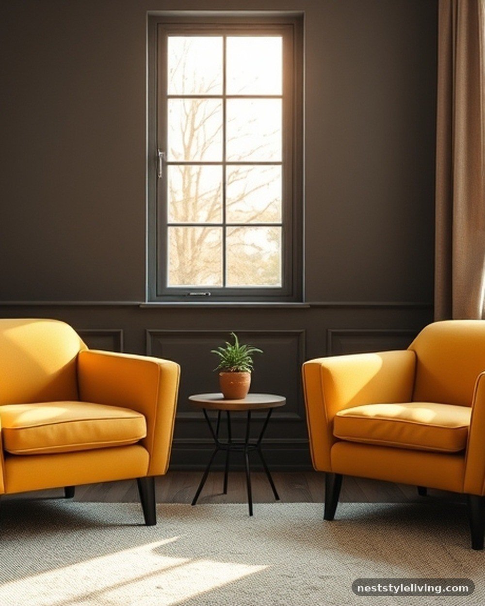
Mustard yellow brings a touch of optimism and creative energy to a living room without the jarring intensity of primary yellow. When used on a statement piece like an armchair, it draws the eye and encourages social interaction by creating a focal point for seating.
Mustard pairs exceptionally well with charcoal grey or navy blue, creating a balanced palette that feels modern yet approachable. Choose a durable performance fabric for the upholstery to ensure the chair maintains its vibrant hue despite daily use, as mustard can sometimes show wear if the weave is too loose.
Psalm 119:105 — Thy word is a lamp unto my feet, and a light unto my path.
Yellow is the color of illumination and guidance. Having a bright, warm chair in your living room acts as a metaphorical “lamp,” providing a cheerful psychological boost that encourages clarity of thought and a positive outlook during daily activities.
6. Charcoal Grey Media Console
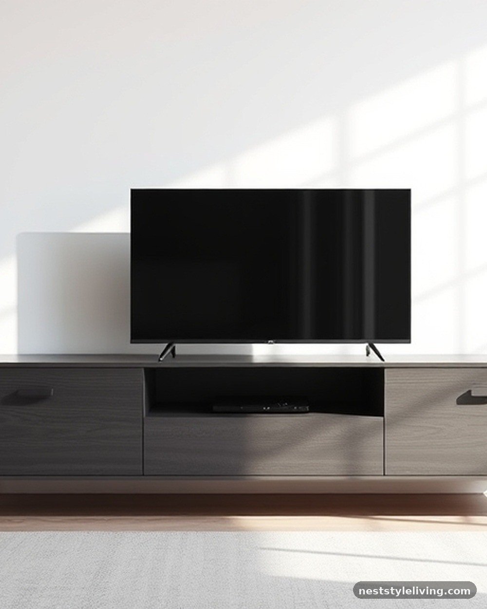
Charcoal grey provides a sophisticated, modern alternative to black, offering a sense of mystery and depth that doesn’t feel as harsh. Placing a charcoal media console against a lighter wall creates a strong contrast that grounds the technology in the room.
This color is excellent for hiding fingerprints or minor scratches, making it a highly practical choice for furniture that houses electronics and cables. The dark, neutral tone allows other decorative elements in the room to stand out while maintaining an overall aesthetic of professional refinement and structural integrity.
Isaiah 1:18 — Come now, and let us reason together, saith the Lord: though your sins be as scarlet, they shall be as white as snow; though they be red like crimson, they shall be as wool.
The transition from intense colors to neutral, muted tones like grey represents a state of calm and resolution. Charcoal acts as a neutral space where the mind can rest from the visual noise of the day, facilitating focus and quiet contemplation.
7. Pale Blush Pink Curtains
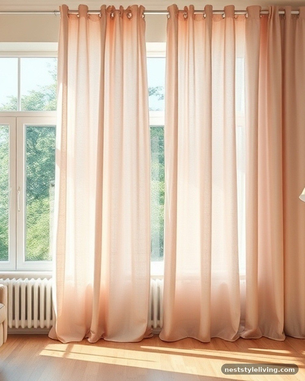
Pale blush pink adds a subtle touch of softness and compassion to a living room, breaking up the severity of sharp lines or darker furniture. When used for floor-to-ceiling curtains, the fabric filters natural light, casting a gentle, warm glow throughout the space that feels inherently welcoming.
This color works well in rooms with brass or gold hardware, as the metallic tones enhance the romantic, soft nature of the pink. Ensure the curtains are lined with a blackout or thermal fabric to improve their longevity and prevent the delicate color from fading due to direct sun exposure.
Philippians 4:8 — Finally, brethren, whatsoever things are true, whatsoever things are honest, whatsoever things are just, whatsoever things are pure, whatsoever things are lovely, whatsoever things are of good report; if there be any virtue, and if there be any praise, think on these things.
Blush pink is often categorized as a “lovely” or gentle color. It invites the mind to dwell on soft, virtuous, and peaceful thoughts, creating an atmosphere that promotes grace and interpersonal harmony within the home.
8. Deep Forest Green Velvet Throw
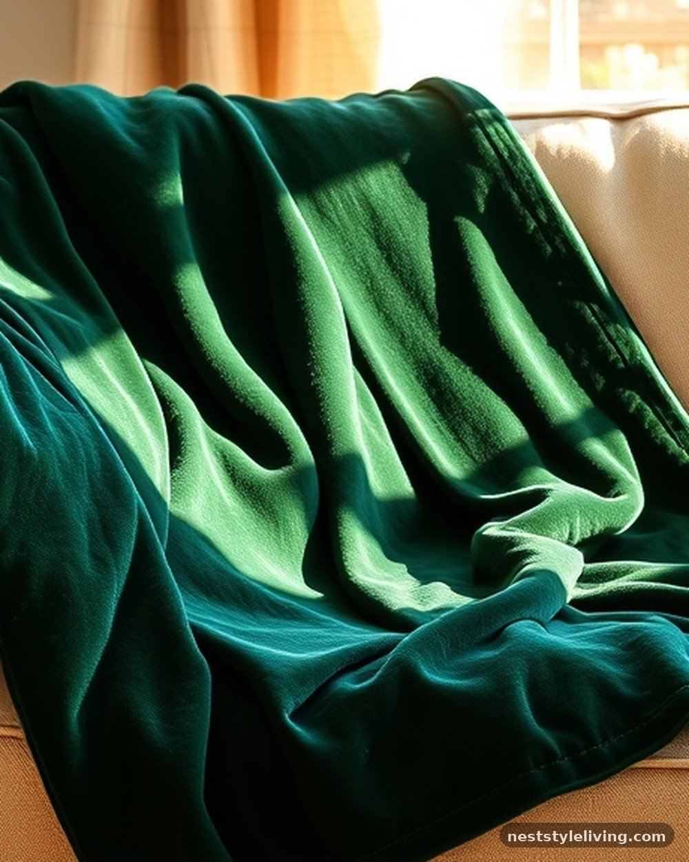
Deep forest green evokes the dense, quiet stillness of a woodland, making it an ideal color for promoting deep relaxation and stress reduction. A velvet throw in this shade adds both tactile comfort and a visual layer of luxury to your sofa.
This color is incredibly forgiving, as the dark, saturated tone hides minor stains or pet hair, making it a practical addition for a busy household. Use it to drape over a neutral-colored couch to provide an instant pop of rich, saturated color that feels expensive yet cozy and grounded.
Psalm 1:3 — And he shall be like a tree planted by the rivers of water, that bringeth forth his fruit in his season; his leaf also shall not wither; and whatsoever he doeth shall prosper.
Forest green is the color of vitality and endurance. Having this color in your living room serves as a reminder of stability and growth, encouraging a psychological state of being “planted” and secure despite the stresses of the outside world.
9. Warm Cream Wall Paint
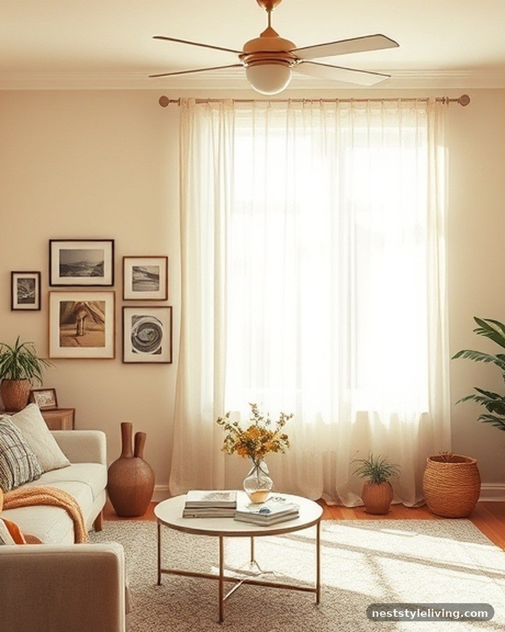
Cream is a versatile, warm-toned neutral that avoids the sterility of pure white, creating an environment that feels lived-in and comfortable. It is the perfect backdrop for gallery walls or eclectic decor, as it provides a cohesive, soft canvas that ties disparate elements together.
When selecting a cream paint, look for one with slight yellow or red undertones to ensure it doesn’t look grey or sickly under artificial lighting. This color is highly adaptable to changing seasons; you can easily shift the room’s mood by swapping out accessories in warmer or cooler tones.
Song of Solomon 2:1 — I am the rose of Sharon, and the lily of the valleys.
The lily is often associated with purity and delicate beauty. A cream-colored room mimics the soft, natural hues of these flowers, promoting a sense of gentle hospitality and clean, welcoming comfort that is essential for a home’s primary gathering space.
10. Burnt Orange Velvet Ottomans
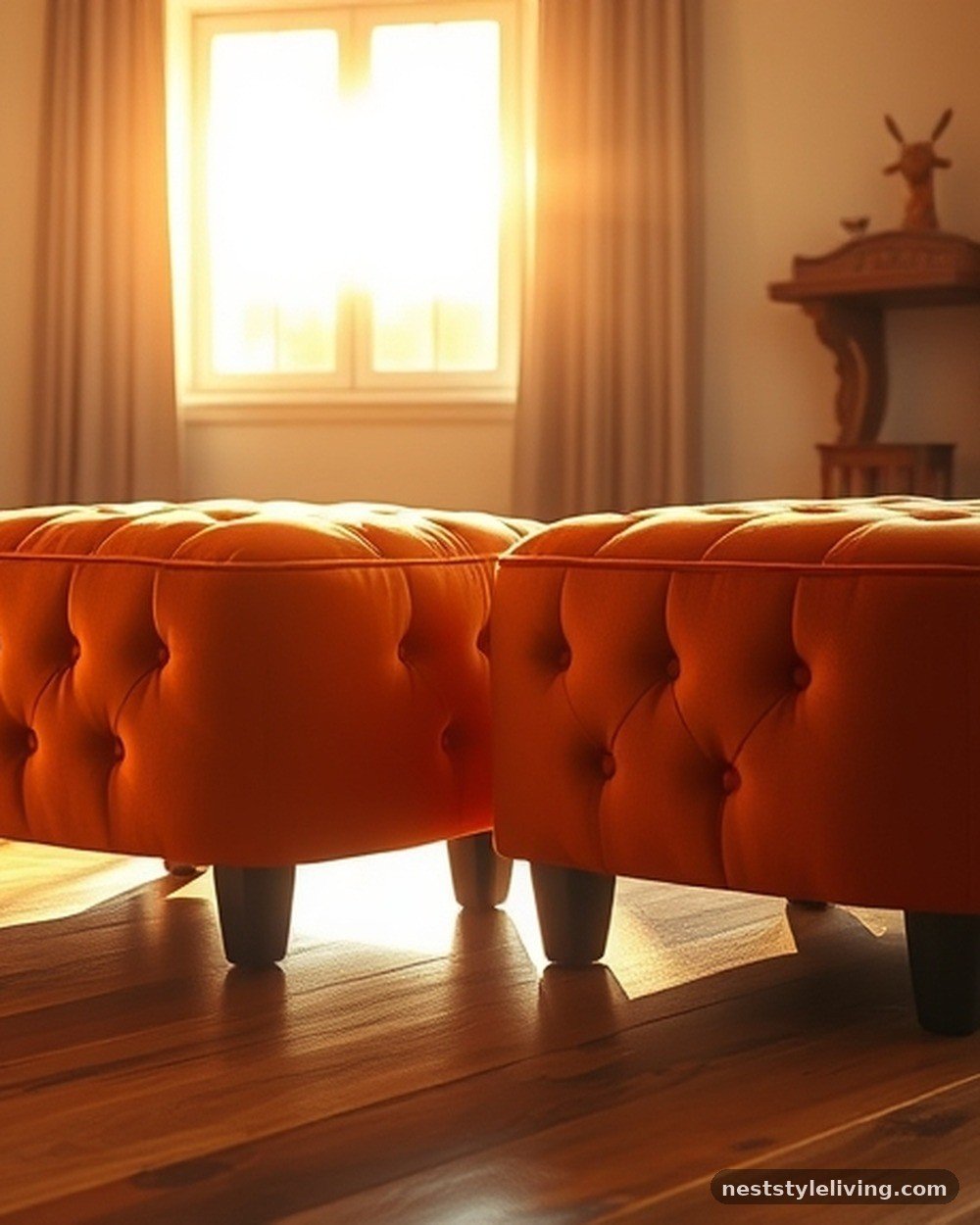
Burnt orange introduces a high-energy, adventurous element to your living room without requiring a permanent commitment like wall paint. Ottomans in this shade serve as flexible, portable seating that adds a burst of warmth and playfulness to the room’s layout.
This color stimulates social interaction and excitement, making it ideal for hosting gatherings. Because these pieces are small, you can easily maintain their appearance by using upholstery protectors and keeping them away from direct heat sources that might cause the fabric to stiffen or fade over time.
Numbers 21:9 — And Moses made a serpent of brass, and put it upon a pole, and it came to pass, that if a serpent had bitten any man, when he did repent, he looked upon the serpent of brass, and lived.
The color of brass—a metallic, burnt orange—is associated with healing and life. Integrating this hue into your furniture provides a psychological boost that feels restorative and vibrant, reminding the senses of warmth and active recovery.
11. Soft Sky Blue Ceiling
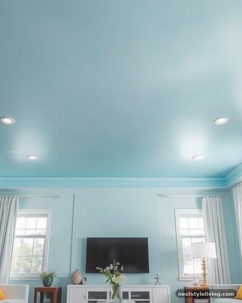
Painting the ceiling a soft, pale sky blue can make a living room feel larger and more connected to the outdoors. This technique, often called “ceiling tinting,” draws the eye upward and creates an expansive, airy feel that mimics the open horizon.
It works particularly well in rooms with low ceilings, as the light blue shade prevents the space from feeling cramped or oppressive. Use a flat or matte finish to avoid distracting reflections, and ensure the wall color is a complementary neutral to maintain a balanced, cohesive look throughout the room.
Psalm 19:1 — The heavens declare the glory of God; and the firmament sheweth his handywork.
The sky is the ultimate symbol of the infinite and the peaceful. By bringing this color into your living space, you invite a sense of awe and limitless possibility, helping to alleviate feelings of confinement and fostering a more expansive, optimistic mindset.
12. Rich Plum Velvet Curtains
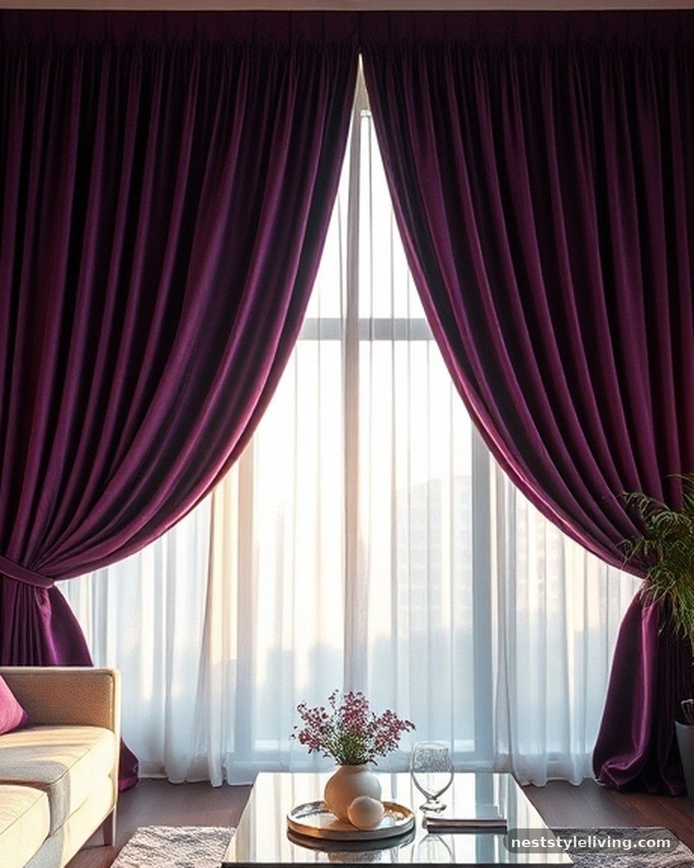
Plum is a sophisticated, royal shade that adds depth and a touch of drama to a living room. When used as curtains, the fabric creates a sense of luxury and seclusion, perfect for creating a cozy evening atmosphere.
Plum pairs beautifully with metallic accents like silver or chrome, which highlight the cool, purple undertones of the color. To keep these curtains looking their best, vacuum them with an upholstery attachment to remove dust and ensure the velvet pile remains upright and vibrant rather than flattened or dull.
Proverbs 31:22 — She maketh herself coverings of tapestry; her clothing is silk and purple.
Purple has historically been associated with royalty, wisdom, and dignity. Incorporating this color into your home’s textiles provides a psychological sense of value and refinement, encouraging a more thoughtful and composed atmosphere within your living environment.
13. Terracotta Clay Planters
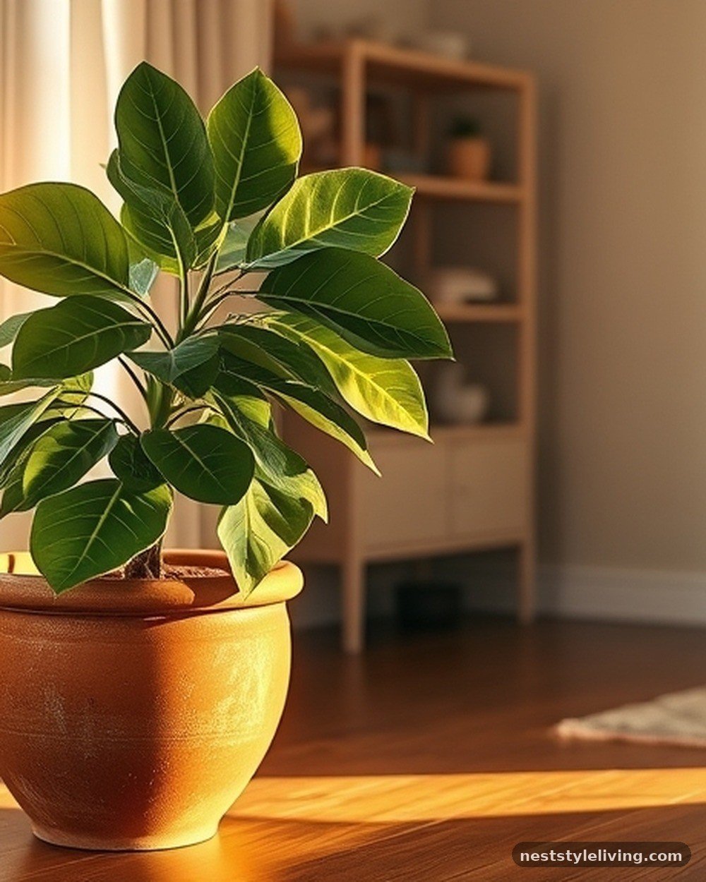
Terracotta clay planters provide a raw, organic texture that adds warmth and an earthy connection to your living room plants. The natural, porous material allows for healthy root growth and adds a rustic charm that contrasts beautifully with modern furniture.
Use these for large floor plants to create a vertical anchor in the room. Over time, the clay may develop a natural patina or white mineral deposits, which only adds to the authentic, aged character of the decor, requiring very little maintenance other than occasional cleaning.
Genesis 1:12 — And the earth brought forth grass, and herb yielding seed after his kind, and the tree yielding fruit, whose seed was in itself, after his kind: and God saw that it was good.
The presence of living plants in terracotta pots connects the indoor space to the act of creation described in Genesis. This promotes a psychological sense of “goodness,” growth, and life, which is essential for maintaining a vibrant and healthy home environment.
14. Light Grey Linen Sofa
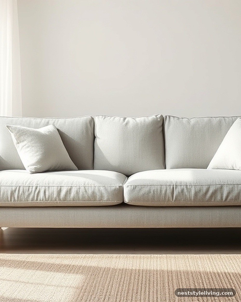
A light grey linen sofa is the ultimate neutral foundation, offering a clean, calm aesthetic that never goes out of style. The texture of the linen adds a casual, tactile element that makes the room feel approachable and comfortable.
Light grey is highly versatile, allowing you to change your room’s color scheme entirely just by swapping out throw pillows or rugs. Maintain the sofa by using a fabric protector spray to repel liquids, and be prepared to steam the fabric occasionally to keep the linen looking crisp and tailored rather than excessively wrinkled.
Psalm 51:7 — Purge me with hyssop, and I shall be clean: wash me, and I shall be whiter than snow.
Grey, when it leans toward white, represents a state of cleansing and renewal. A clean, light-colored sofa provides a psychological sense of freshness and purity, encouraging a tidy and peaceful mindset that helps residents feel refreshed whenever they sit down to relax.
15. Warm Honey Wood Coffee Table
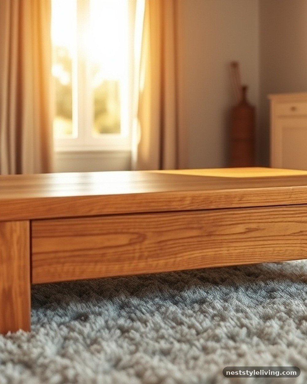
A honey-toned wood coffee table adds a sense of tradition and natural warmth to the center of your living room. The golden hues of the wood grain create a welcoming focal point that anchors the seating area and complements almost any color palette.
To protect the finish, use coasters to prevent water rings and wipe the surface with a wood-safe polish to maintain the luster. This piece is a classic investment that ages beautifully, developing a deeper character over time that enhances the “homey” feel of your space.
Proverbs 16:24 — Pleasant words are as an honeycomb, sweet to the soul, and health to the bones.
Honey is associated with sweetness and healing. A honey-toned wood table brings a visual “sweetness” to the room, promoting a sense of physical comfort and emotional health that makes the living room a place of true restoration and joy.
16. Soft Lavender Throw Blankets
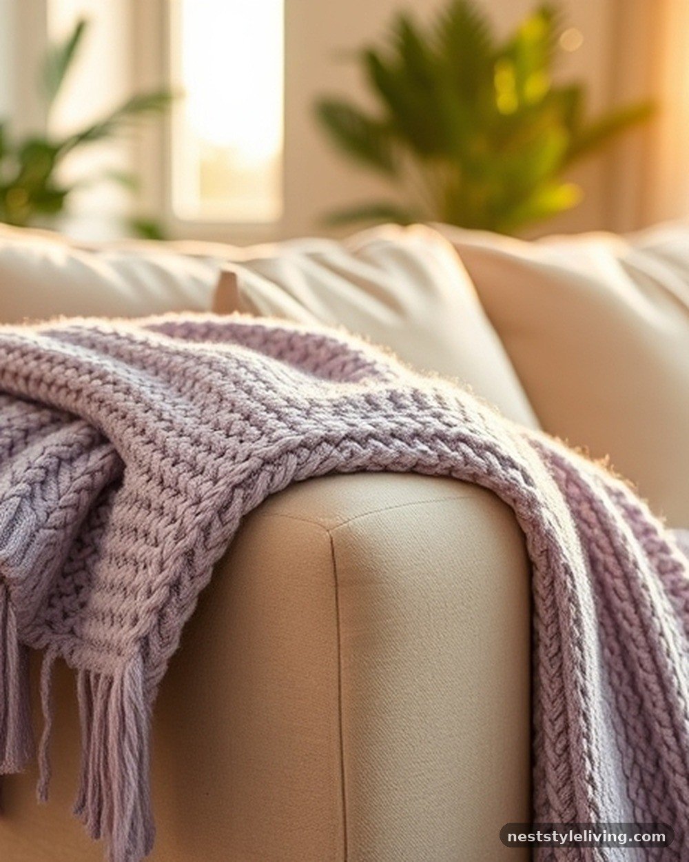
Lavender is a gentle, calming color that is often associated with relaxation and sleep, making it perfect for a living room intended for winding down. A throw blanket in this shade adds a subtle, soothing pop of color that pairs well with neutrals like grey, white, or cream.
Because it is a light color, ensure the blanket is machine washable to keep it looking fresh. The presence of lavender in the room encourages a slower pace, helping to transition your mind from the stress of the day to a more meditative, peaceful state.
Numbers 6:26 — The Lord lift up his countenance upon thee, and give thee peace.
Lavender is a color of peace and quiet. By adding this hue to your home, you are creating a visual environment that mimics the feeling of tranquility, inviting the mind to settle and receive a sense of calm that is similar to the peace mentioned in this blessing.
17. Matte Black Picture Frames
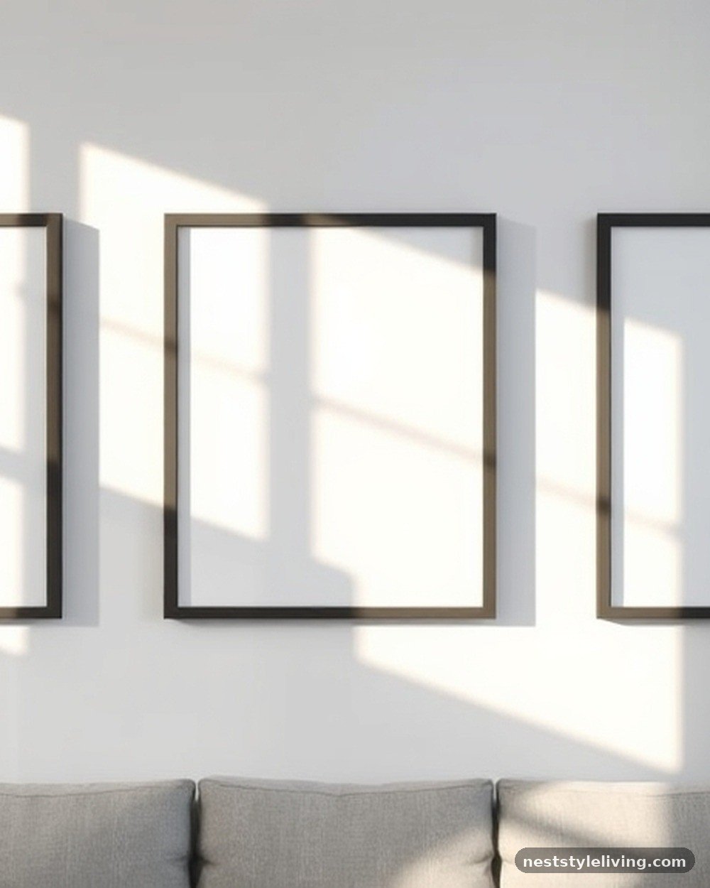
Using matte black frames for your photos or art creates a sharp, graphic contrast that makes your imagery pop against the wall. Black is a grounding color that adds a sense of structure and seriousness to your decor, preventing a room from feeling too airy or disorganized.
Matte finishes are preferred over glossy ones as they don’t reflect light, ensuring the focus remains entirely on the artwork. These frames are easy to maintain—simply wipe them with a microfiber cloth to keep them free of dust and fingerprints.
Ecclesiastes 7:13 — Consider the work of God: for who can make that straight, which he hath made crooked?
Black frames represent clarity, straight lines, and the acknowledgment of structure. They help to frame your memories and art with a sense of definition, encouraging you to “consider” the important elements of your life with focus and intentionality.
18. Soft Peach Wall Accents
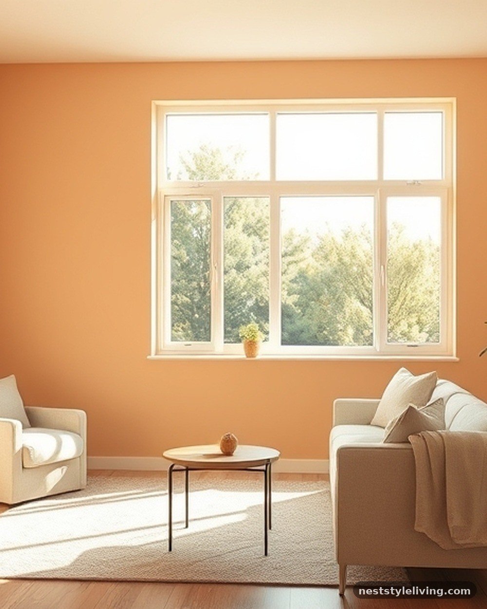
Peach is a warm, inviting color that bridges the gap between orange and pink, creating a friendly and optimistic atmosphere. Using it as an accent wall or in small doses through decor adds a playful, sunset-inspired glow to the room.
Peach works exceptionally well in spaces with plenty of natural light, as it catches the sun and radiates a gentle warmth. This color is particularly effective for encouraging social interaction and a lighthearted mood, making it a great choice for family rooms where you want to foster a sense of shared happiness.
Psalm 104:15 — And wine that maketh glad the heart of man, and oil to make his face to shine, and bread which strengtheneth man’s heart.
The imagery of a shining face and a glad heart aligns with the uplifting nature of peach. This color promotes a psychological state of joy and vitality, making your living room feel like a place where hearts are gladdened and spirits are lifted.
19. Cool Slate Grey Rugs
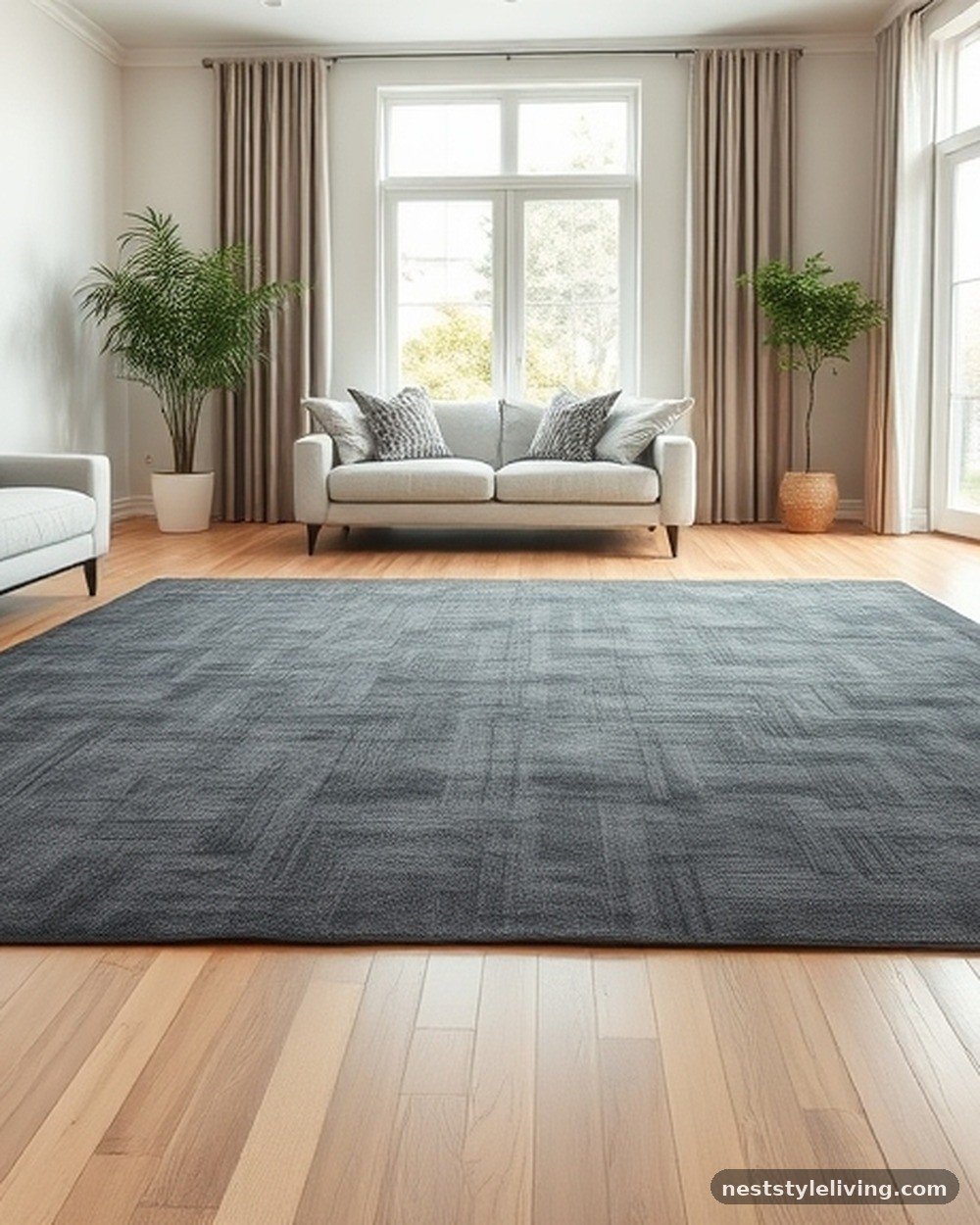
A slate grey rug provides a sophisticated, cool-toned anchor for your furniture, hiding dirt and wear better than lighter carpets. The cool undertones of slate grey create a balanced environment, especially when paired with warmer wood tones or metallic accents.
Choose a low-pile or flat-weave rug for high-traffic areas to ensure it remains durable and easy to vacuum. This color choice is excellent for creating a modern, streamlined look that feels both professional and comfortable, providing a stable base for the rest of your living room decor.
Job 38:30 — The waters are hid as with a stone, and the face of the deep is frozen.
Slate, a form of stone, is associated with solidity and endurance. A slate-colored rug provides a psychological foundation that feels permanent and unshakeable, helping to ground the inhabitants of the room and provide a sense of stability during chaotic times.
20. Vibrant Red Accent Vases
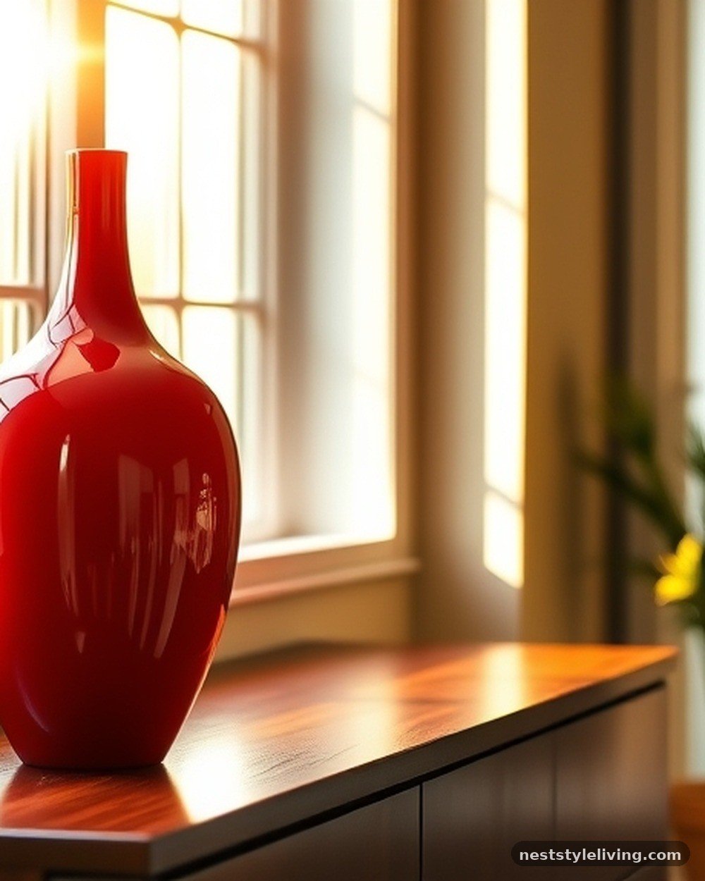
Red is a high-energy color that stimulates the senses and increases the heart rate, making it a powerful tool for adding excitement to your living room. Because it is so intense, use it sparingly through small accessories like vases.
A red vase creates an immediate focal point that draws the eye and injects passion into the space. Ensure the vase is placed on a stable surface where it won’t be easily knocked over, as red demands attention and any damage to it would be highly noticeable.
Isaiah 1:18 — Though your sins be as scarlet, they shall be as white as snow.
Scarlet, or red, is a color of intensity and significance. While it can be overwhelming, it also symbolizes energy and life. Using it in small doses allows you to harness that vibrant energy without letting it dominate the room’s overall sense of peace.
21. Crisp Mint Green Throw Pillows
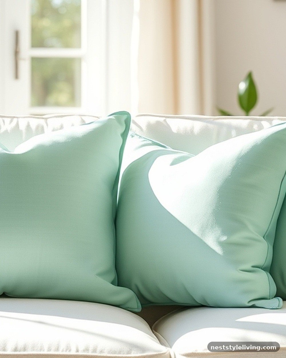
Mint green offers a refreshing, cooling effect that is perfect for balancing out hot, sun-drenched living rooms. This light, airy color feels clean and revitalizing, making the space feel more open and breathable.
Mint pairs perfectly with white or light wood furniture, creating a crisp and modern look that is easy to maintain. These pillows are an affordable way to refresh your room’s energy for the spring and summer months, providing a subtle psychological nudge toward cleanliness and new beginnings.
Matthew 23:23 — Woe unto you, scribes and Pharisees, hypocrites! for ye pay tithe of mint and anise and cummin, and have omitted the weightier matters of the law.
Mint is associated with freshness and precise care. While the verse warns against focusing only on small things, the imagery of mint itself reminds us of the value of refreshing, clean details that contribute to a well-ordered and pleasant home environment.
22. Deep Espresso Brown Side Tables
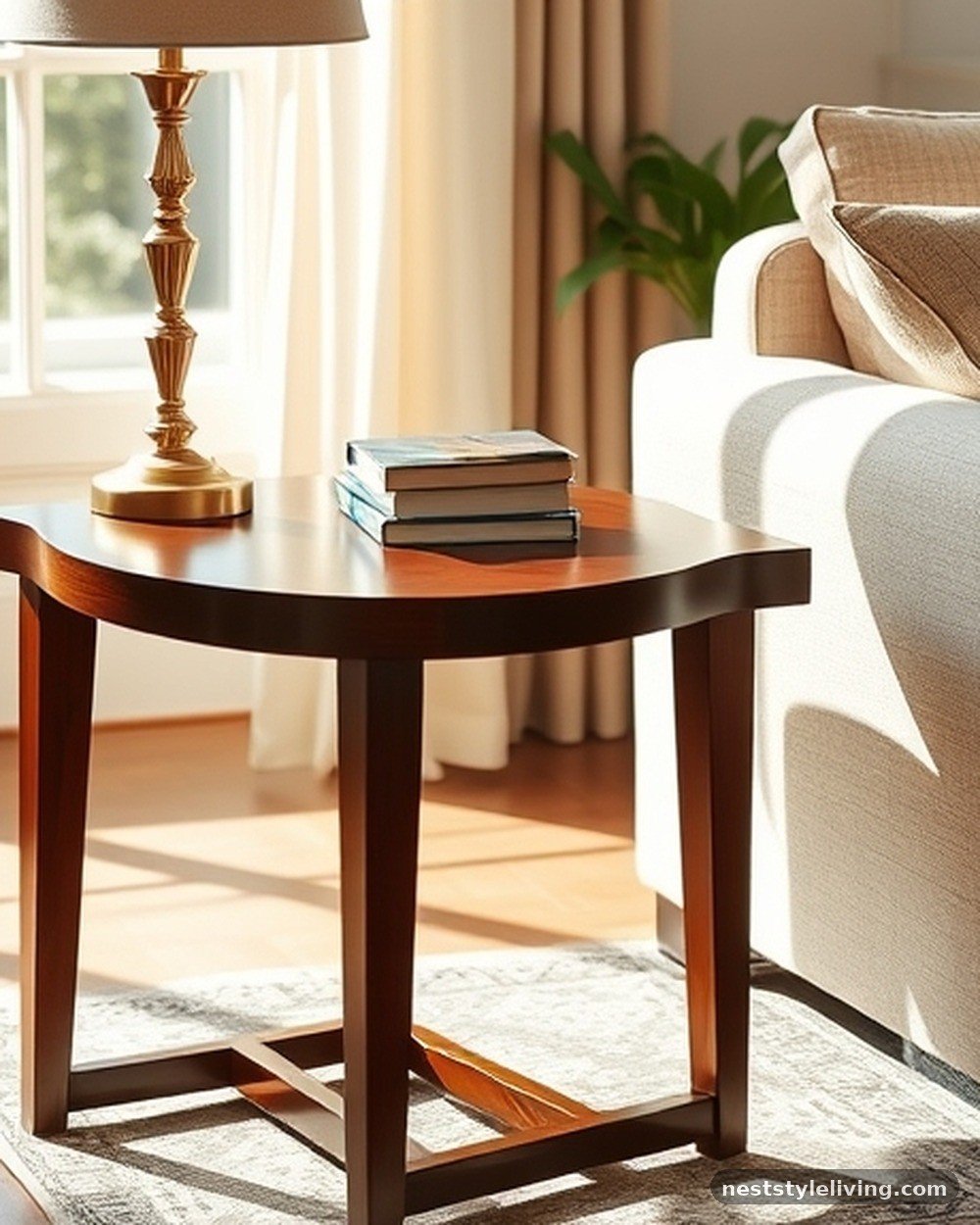
Espresso brown is a dark, warm neutral that adds a sense of maturity and traditional comfort to your living room. These tables provide a deep contrast against lighter walls, grounding the space with a sense of history and permanence. Espresso is a very practical color for furniture, as it hides dust and scratches well.
Pair these tables with brass lamps or cream-colored accessories to prevent the room from feeling too dark. The dark wood creates a cozy, library-like atmosphere that encourages reading and quiet, contemplative relaxation.
Psalm 92:12 — The righteous shall flourish like the palm tree: he shall grow like a cedar in Lebanon.
Cedar and other deep woods are symbols of strength and flourishing. Using espresso-toned furniture brings this psychological sense of wood-based strength into your home, fostering an environment where you feel supported, established, and ready to flourish.
Frequently Asked Questions
What is the best color for a living room color theory?
There is no single “best” color, as color theory relies on the balance between cool and warm tones to achieve your desired mood. Generally, cool colors like blue or green promote relaxation, while warm colors like yellow or terracotta encourage energy and social interaction.
What is the 3-5-7 rule in interior design?
The 3-5-7 rule is a guideline for grouping decorative items. It suggests that odd numbers—like three, five, or seven—create a more visually appealing and balanced arrangement on shelves or tabletops, as they force the eye to move around the display rather than resting on a single, static point.
What are the color trends for living rooms in 2026?
Trends for 2026 are shifting toward organic, earth-inspired palettes that prioritize comfort and sustainability. Expect to see more muted greens, warm clay tones, and deep, saturated neutrals that create a sense of sanctuary and connection to the natural world.
What is the most psychologically calming color?
Blue is widely considered the most psychologically calming color, as it is associated with the sky and water. Soft, muted shades of blue are frequently used in home design to lower blood pressure and heart rate, making them ideal for spaces where you want to unwind.
Conclusion
Applying these living room color psychology ideas to try is a rewarding way to influence the atmosphere of your home. By selecting hues that align with your emotional goals—whether that is finding deep rest in greens or fostering social warmth with terracotta—you create a space that supports your well-being. Start by identifying one area of your living room that feels disconnected or stagnant, then introduce a single color change through textiles or wall paint to observe the shift in mood.
As you experiment with these palettes, remember that your home should be a place of restoration. We invite you to begin your transformation today, watching how intentional color choices turn your living area into a truly purposeful retreat.