18 Luxury Living Room Color Palette Ideas to Copy
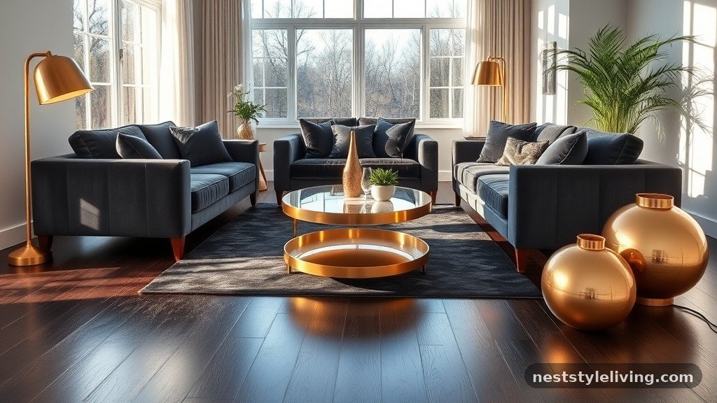
Finding the right luxury living room color palette ideas to copy requires an eye for balance, texture, and light. Whether you want to ground your space with deep, moody pigments or open it up with airy, sophisticated neutrals, the goal is to create a cohesive atmosphere that feels curated rather than accidental. High-end design relies on layering different shades within the same family to add depth, ensuring that every wall color complements the furniture and textiles.
By exploring these distinct combinations, you can transform your home into a refined sanctuary that reflects both personal taste and timeless style. These selections offer a roadmap for achieving a designer look through intentional, expert-approved color pairings.
1. Charcoal and Burnished Gold
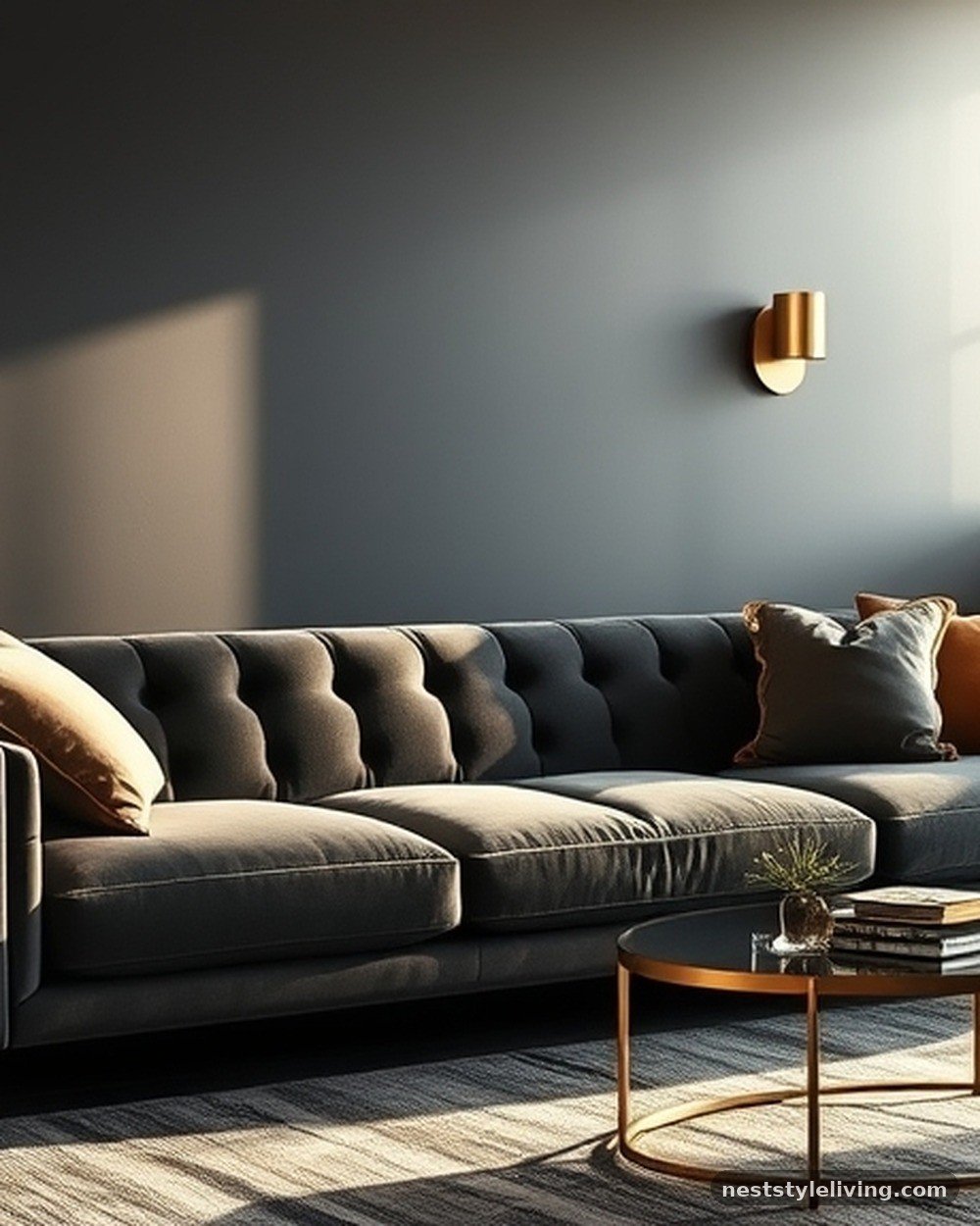
This palette creates a dramatic, high-contrast environment that feels inherently expensive. Apply a deep, matte charcoal paint to all four walls, ensuring the finish is velvet-smooth to avoid harsh light reflection. Introduce burnished gold through metallic hardware, sconces, and the legs of a velvet sofa.
The gold acts as a warm anchor against the coolness of the charcoal, preventing the room from feeling like a cave. This look works best in spaces with high ceilings or large windows where natural light can strike the walls, creating subtle gradients throughout the day. It is a bold move that requires commitment but pays off with a sophisticated, club-like aesthetic.
Psalm 104:2 — The gold in this palette mimics the radiance of light, reminding us that beauty is often found in the contrast between darkness and brilliance.
2. Creamy Off-White and Cognac Leather
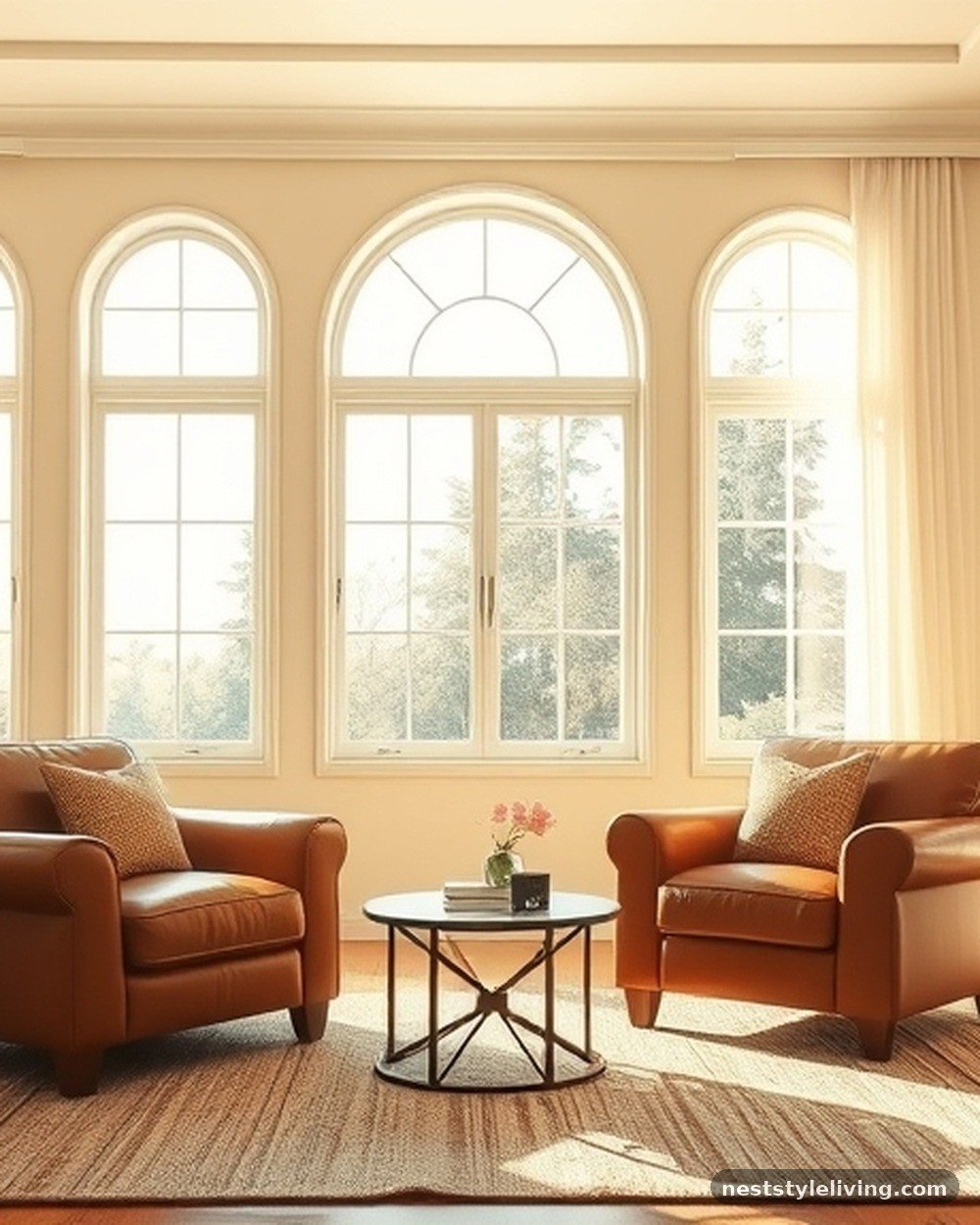
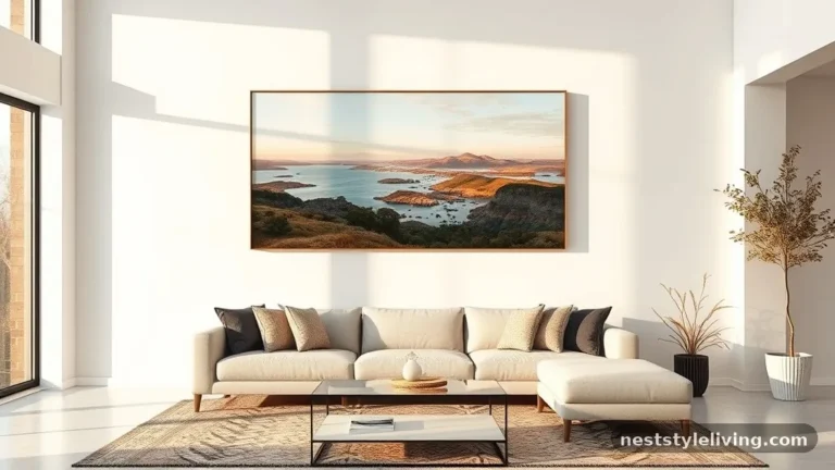
Achieve an effortless, airy luxury by painting walls in a warm, creamy off-white that avoids the sterile feel of pure white. Pair this backdrop with cognac-colored leather armchairs or a large sectional. The leather provides a rich, tactile element that grounds the space, while the light walls keep the room feeling expansive and clean.
Use heavy linen curtains in a matching off-white to maintain a monochromatic flow. This combination is highly durable, as leather wears beautifully over time, developing a patina that only enhances the luxury feel. It is an ideal choice for a transitional or modern farmhouse living room that prioritizes comfort.
Psalm 147:16 — Just as snow covers the earth in a clean blanket, this palette uses light tones to create a sense of peace and purity in the home.
3. Dusty Blue and Antique Brass
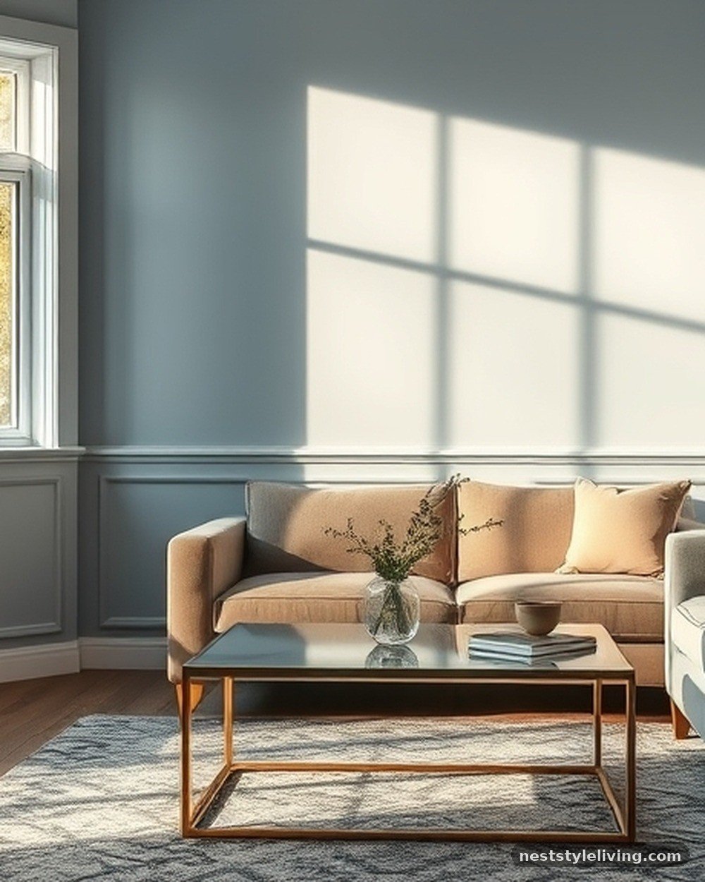
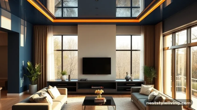
Dusty blue, a muted shade with gray undertones, provides a calming foundation that feels both traditional and modern. Use this color on the walls to create a serene environment, then layer in antique brass accents through coffee table frames and lighting fixtures. The warmth of the brass cuts through the coolness of the blue, adding a touch of metallic sophistication.
This palette is particularly effective in rooms meant for relaxation, as the blue promotes a sense of stillness. Ensure that your fabrics, such as throw pillows or curtains, incorporate varied textures like velvet or wool to prevent the blue from looking flat.
Psalm 23:2 — The blue tones evoke the imagery of still waters, reflecting a place of rest and restoration for the soul.
4. Deep Forest Green and Terracotta
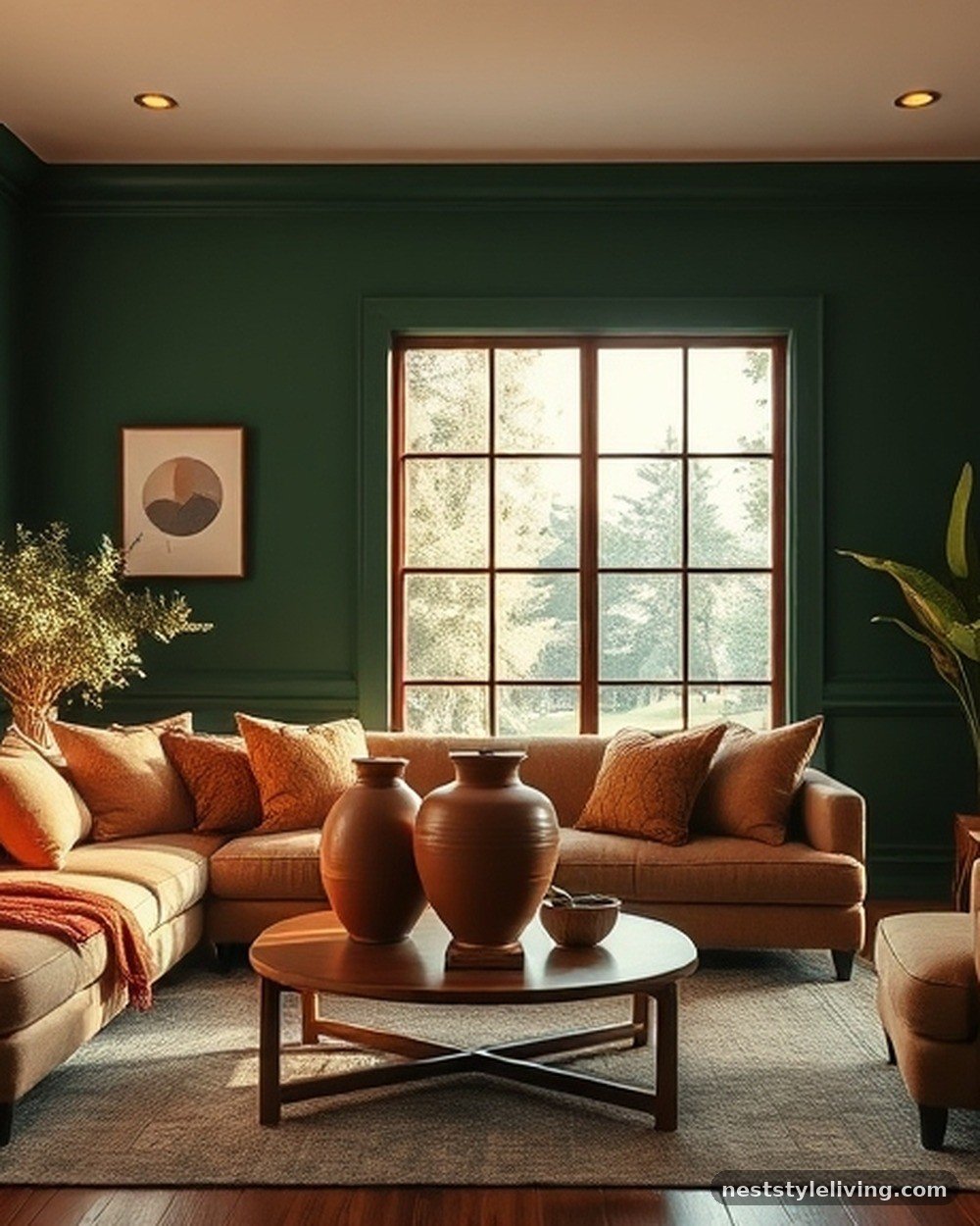
For a nature-inspired luxury look, pair a rich, forest green on the walls with terracotta accents. The green creates a cocooning effect, while the earthy, burnt-orange tones of the terracotta bring in a sense of warmth and vitality. Use terracotta in the form of ceramic vases, throw blankets, or even a statement area rug.
This palette is grounded and earthy but feels elevated due to the depth of the green pigment. It is a fantastic choice for libraries or cozy living rooms where you want to emphasize comfort. Keep the ceiling white to maintain a sense of height and prevent the room from feeling too enclosed.
Psalm 96:12 — The lush green and earthen terracotta mirror the vibrancy of the fields and forests, celebrating the natural world within your living space.
5. Slate Gray and Pale Blush
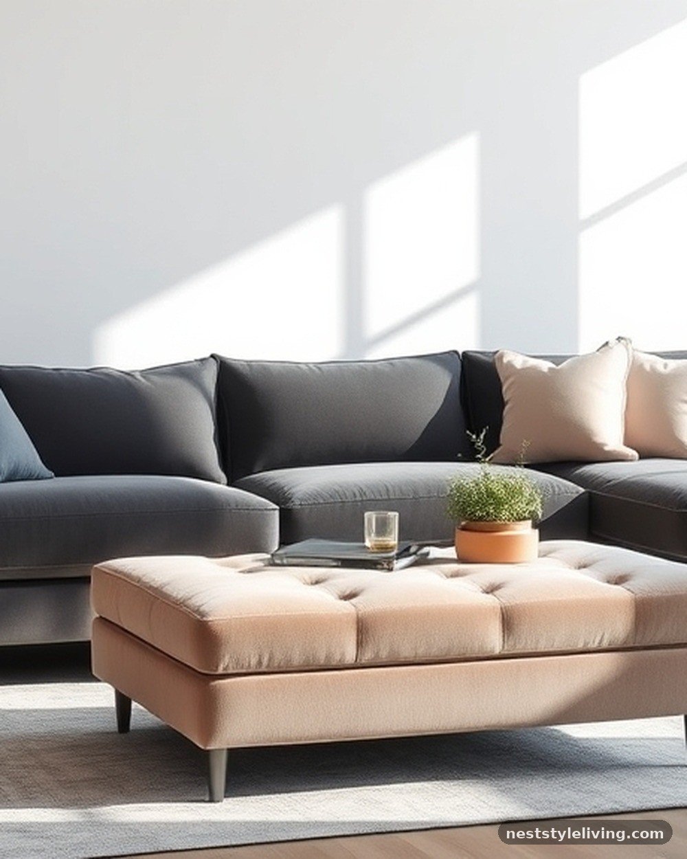
Slate gray serves as a sophisticated, neutral base that allows softer colors to shine without feeling overwhelming. Introduce pale blush through upholstered ottomans, silk cushions, or abstract artwork. The contrast between the cool, serious gray and the soft, romantic blush creates a balanced, gender-neutral luxury.
This palette is perfect for those who want a touch of softness in a modern home. Use high-quality matte paint for the gray walls to ensure they absorb light evenly. The key here is to keep the blush tones muted—think dusty rose or mauve—rather than bright or bubblegum pink to maintain a high-end, mature appeal.
Psalm 139:14 — The subtle blend of strong gray and delicate blush reflects the complex, beautiful design found in the human experience.
6. Navy Blue and Crisp White
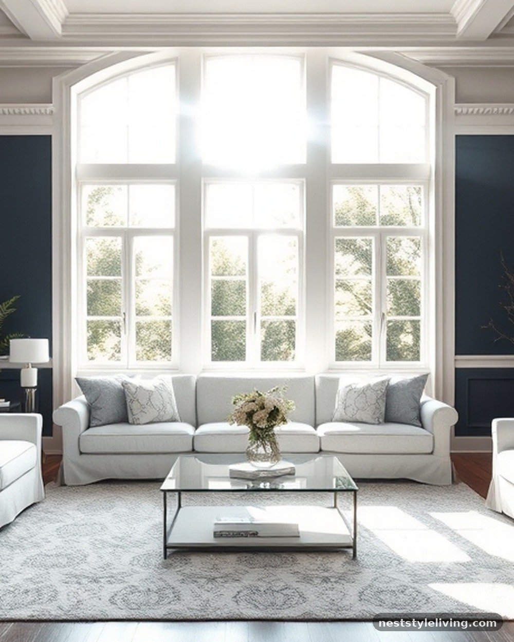
This classic, nautical-inspired luxury palette relies on sharp contrast to create a clean, crisp look. Paint the walls a deep, saturated navy blue and use bright white for all trim, moldings, and ceilings. This highlights the architectural details of the room and makes the blue walls appear even deeper.
Incorporate white furniture or light-colored rugs to balance the heavy pigment on the walls. This look is timeless and holds up well over time, as it is a staple of traditional design. Use brass or silver hardware to add a touch of sparkle against the navy, which acts as a perfect backdrop for artwork or mirrors.
Psalm 19:1 — The expansive navy blue brings to mind the night sky, declaring the majesty of the heavens within your own four walls.
7. Sage Green and Greige
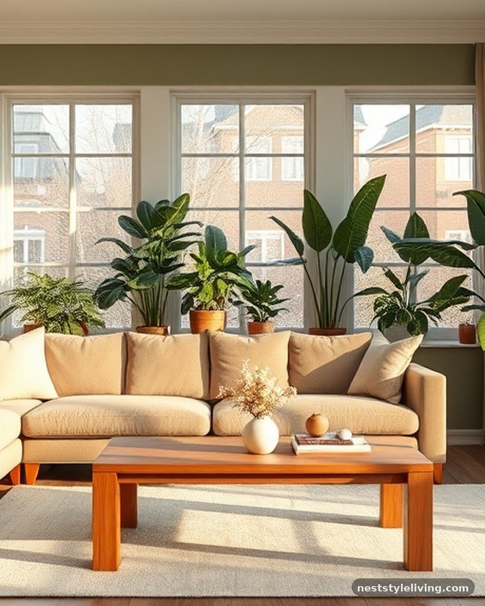
Sage green is a sophisticated, understated color that works exceptionally well with greige—a mix of gray and beige. By painting the walls sage and using greige for the furniture and drapery, you create a soft, monochromatic look that feels like a high-end spa. This palette is incredibly versatile and works in almost any lighting condition.
It is a low-maintenance choice because both colors are forgiving regarding dust and wear. Use natural wood tones for your shelving or coffee table to complete the organic feel. This combination excels in rooms with lots of indoor plants, as the colors harmonize perfectly with natural foliage.
Psalm 23:3 — The gentle, restorative nature of sage green and greige serves as a visual reminder of the refreshing paths we are led along.
8. Chocolate Brown and Cream
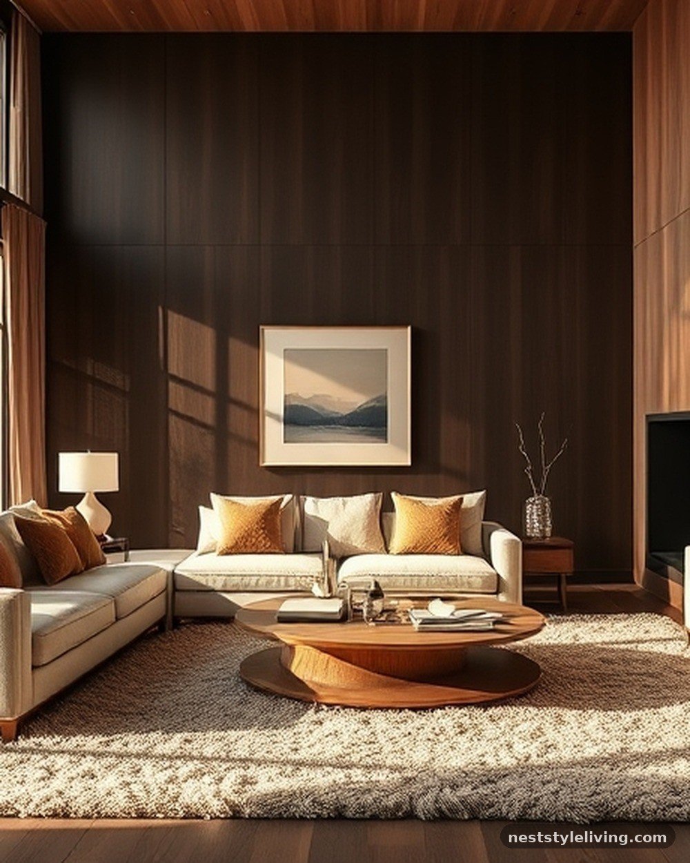
Chocolate brown is making a comeback as a luxurious, grounding neutral. By pairing dark, rich brown walls with creamy, off-white furniture, you create an environment that feels like a high-end boutique hotel. The depth of the brown adds a sense of intimacy and security.
Use cream-colored textiles, such as boucle or heavy wool, to add texture and break up the solid brown walls. This palette is exceptionally cozy in the winter months.
Incorporate dark wood furniture to stay within the tonal family, or use gold accents to add a bit of brightness. It is a bold, sophisticated choice for a formal living room.
Psalm 104:14 — The deep browns of the earth provide a stable foundation for the beauty of the harvest, much like this color palette grounds a home.
9. Soft Lilac and Charcoal
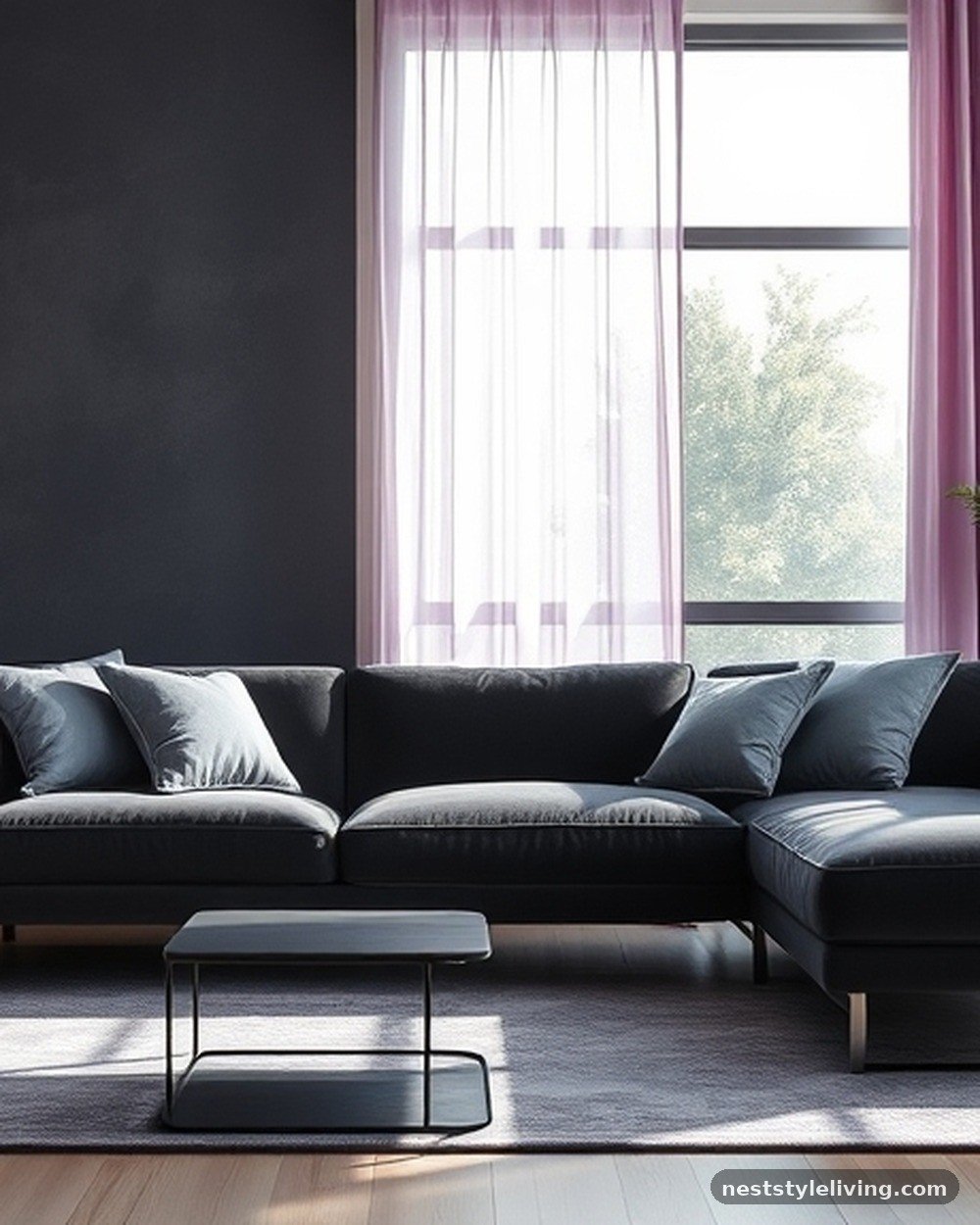
If you want a unique, artistic touch, try pairing soft lilac with charcoal. The charcoal acts as a dark, moody anchor, while the lilac adds an unexpected, ethereal quality. Use charcoal for the main seating or a large accent wall, and bring in lilac through velvet curtains or art pieces.
This combination feels incredibly modern and fashion-forward. It is best suited for a living room that serves as a creative hub or a space for entertaining. Because lilac can easily look juvenile, keep the shade gray-leaning and muted to ensure it retains a luxury, sophisticated edge that feels intentional and curated.
Psalm 145:5 — The beauty of light, airy lilac reflects the splendor of creation, adding a touch of wonder to the solid, grounded charcoal base.
10. Terracotta and Sand
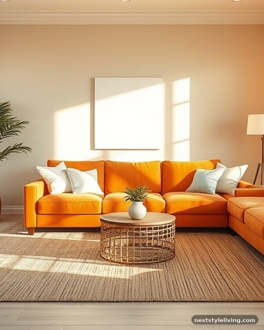
Embrace a warm, Mediterranean-inspired luxury with a palette of deep terracotta and light, sandy beige. Paint the walls in a soft sand color and use terracotta as an accent through textiles, pottery, or a statement piece of furniture. This combination creates a sense of warmth and sun-drenched comfort.
It is an excellent choice for open-concept living rooms that need to feel inviting and bright. Use natural materials like sisal rugs, rattan, and linen to enhance the earthy vibe. This look is timeless and feels particularly appropriate for homes in warmer climates, but it also brings a welcome sense of heat to colder regions.
Psalm 104:24 — The richness of the earth is displayed in the warm, sandy tones of this palette, showcasing the wisdom of natural design.
11. Plum and Metallic Silver
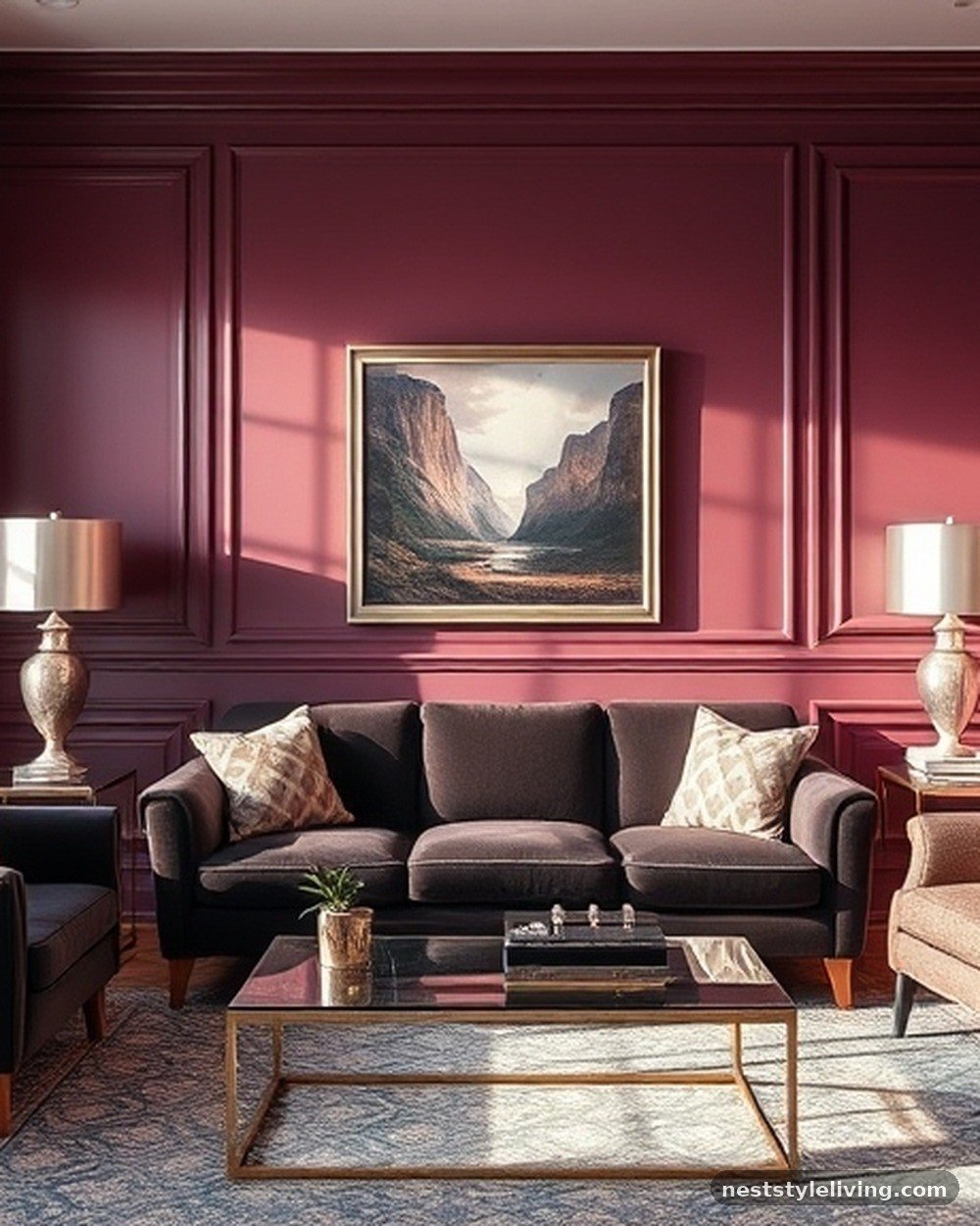
For a truly opulent, dramatic space, consider deep plum walls paired with metallic silver accents. The richness of the plum feels regal and sophisticated, while the silver adds a cool, modern edge. Use silver in picture frames, lamps, and even metallic-thread throw pillows to catch the light.
This palette works beautifully in rooms with low ambient light, where the plum can take on a velvet-like depth. It is a bold design choice that makes a significant statement, so consider it for a formal living room or a space where you want to impress guests. Keep the floor neutral to allow the walls and accents to shine.
Psalm 45:8 — The regal nature of plum, often associated with royalty, brings a sense of honor and majesty to any room it occupies.
12. Olive Green and Warm Leather
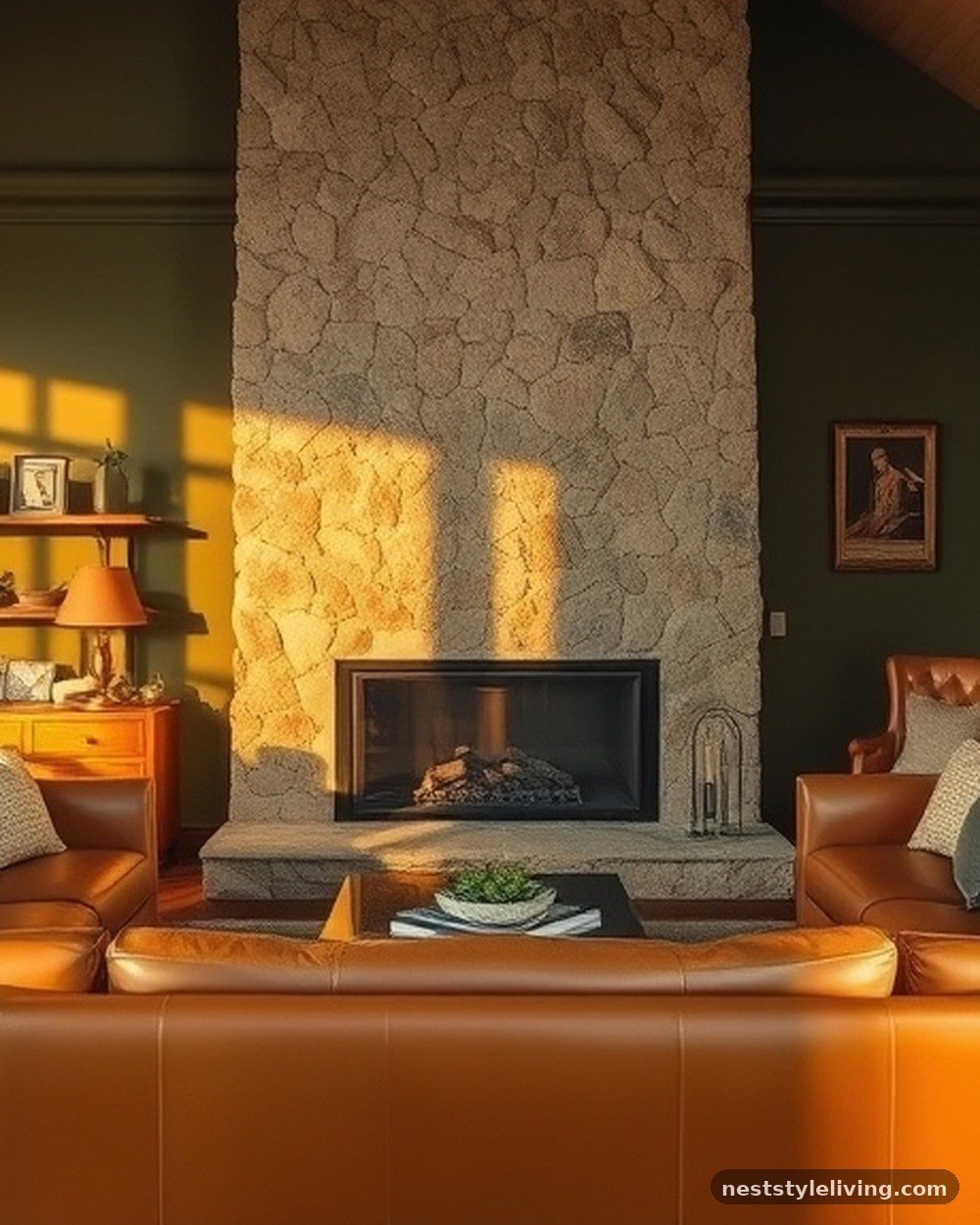
Olive green is a more muted, sophisticated alternative to forest green. Pair it with warm, cognac-colored leather to create a classic, masculine luxury look. The olive provides a soft, organic backdrop that feels calm, while the leather adds a sense of history and quality.
This combination is highly durable, as both olive and leather age gracefully. Use brass accents to tie the two together, as the warm undertones of both the green and the leather harmonize well with metal. It is a perfect palette for a room with a fireplace, as the colors complement the natural glow of a fire.
Psalm 52:8 — The olive tree is a symbol of strength and endurance, mirroring the timeless, lasting quality of this classic color combination.
13. Pebble Gray and Crisp White
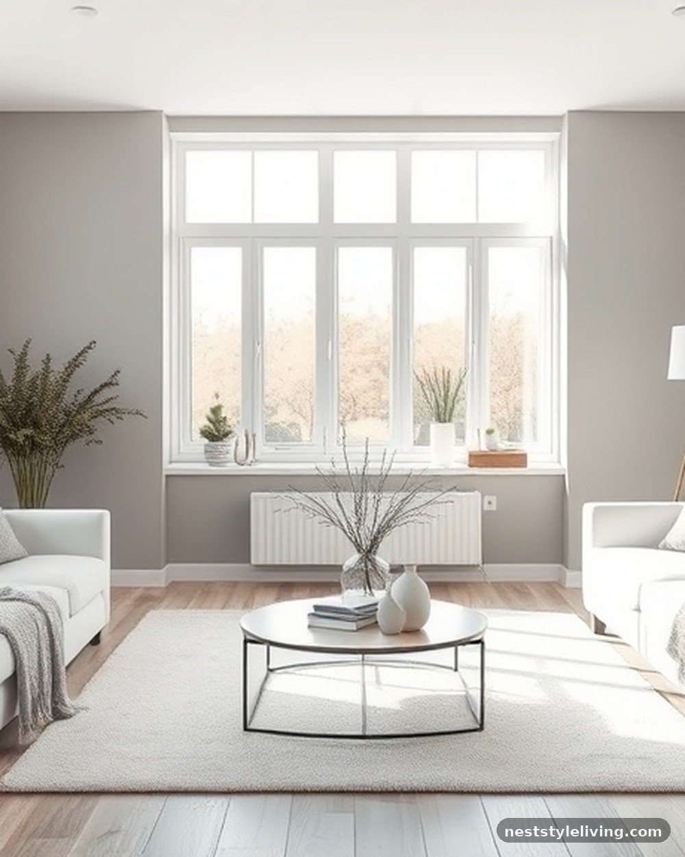
Pebble gray is a light, cool-toned neutral that feels clean and modern. By pairing it with crisp white, you create a bright, airy, and professional-looking living room. This is the ultimate “clean girl” aesthetic, focusing on minimalism and high-quality finishes.
Use white for all the major furniture pieces and pebble gray for the walls to create a subtle contrast. This palette is perfect for small rooms, as it makes the space feel much larger. To add luxury, focus on texture—layer different shades of gray and white through silk, wool, and velvet to ensure the room feels cozy rather than cold.
Psalm 12:6 — The purity of white and the steady nature of gray reflect the refined, tested quality of words that are true and lasting.
14. Muted Teal and Warm Wood
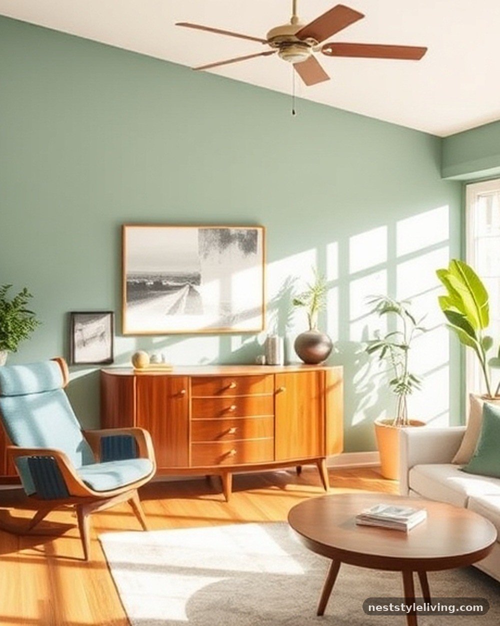
Muted teal is a sophisticated color that sits between blue and green. When paired with warm, medium-toned wood—like oak or walnut—it creates a balanced, mid-century modern luxury look. Paint the walls in a soft, muted teal and let the wood furniture serve as the primary focus.
This palette is incredibly relaxing and works well in rooms with lots of natural light. Use cream-colored textiles to brighten the space further.
The wood adds a necessary organic warmth that prevents the teal from feeling too clinical. It is a timeless choice that feels both trendy and classic, making it easy to live with for years.
Psalm 104:31 — The beauty of the earth, reflected in wood and deep water tones, remains forever, just as this palette offers lasting appeal.
15. Ochre and Deep Navy
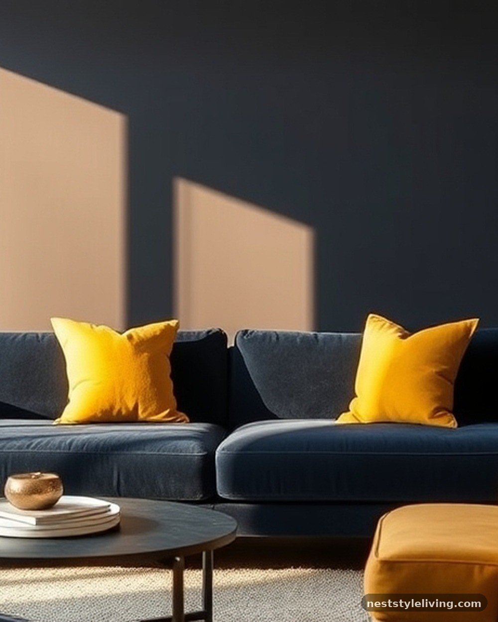
Ochre is a bold, mustard-adjacent yellow that brings instant energy and warmth to a room. When paired with deep navy, it creates a sophisticated, high-contrast look that feels both modern and traditional. Use navy for the walls or a large sofa, and bring in ochre through throw pillows, curtains, or an accent chair.
The contrast between the dark, serious navy and the bright, sunny ochre is visually arresting. This palette is perfect for those who want to add personality to their home without sacrificing luxury. Ensure the ochre is a deep, earthy yellow rather than a neon shade to keep the aesthetic elevated.
Psalm 113:3 — From the rising of the sun to its setting, the light and dark of this palette capture the rhythm of the day.
16. Soft Greige and Black
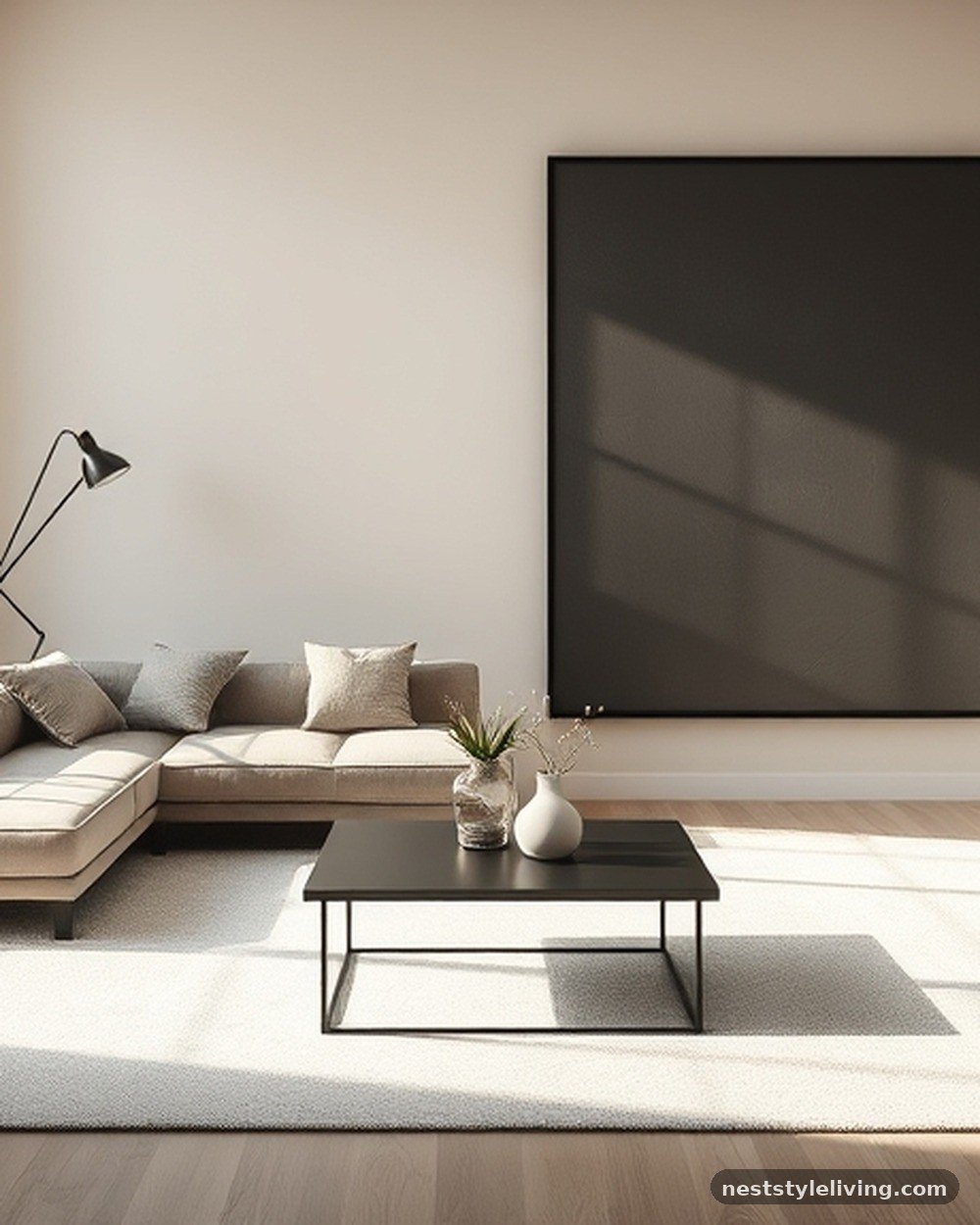
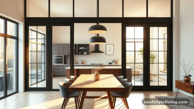
For a modern, high-contrast look, pair a soft greige on the walls with matte black accents. The greige provides a warm, neutral base, while the black adds a sharp, architectural edge. Use black for window frames, light fixtures, and coffee table legs to create a defined, graphic look.
This palette is incredibly popular in high-end, minimalist homes because it feels both clean and intentional. It is a very forgiving color scheme, as the greige hides dust well and the black accents are timeless. Use oversized art with black frames to tie the look together and create a gallery-like atmosphere in your living room.
Psalm 27:1 — The light of the greige and the depth of the black remind us that even in the darkest moments, there is a balanced perspective to be found.
17. Champagne and Taupe
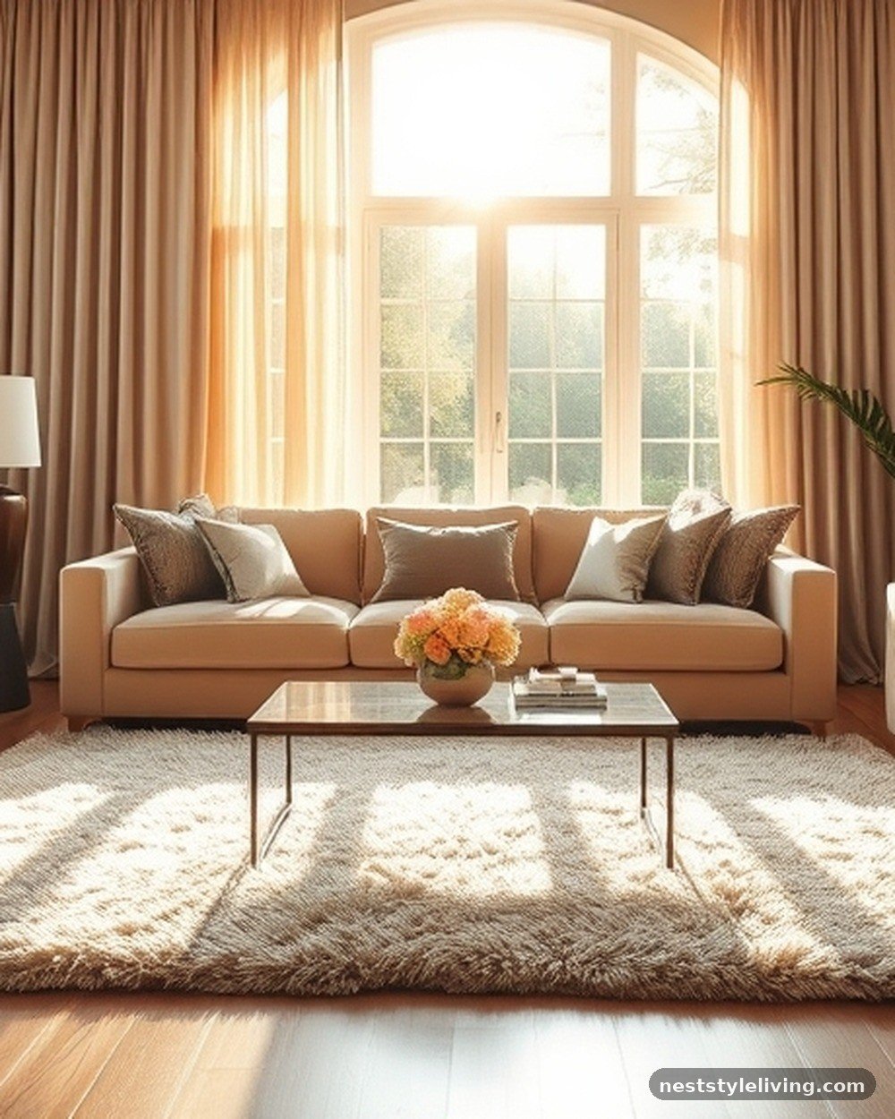
Champagne—a soft, shimmering off-white—and taupe create a monochromatic, ultra-luxurious palette that feels like a quiet, high-end sanctuary. Use taupe for the walls and champagne for the upholstery and drapery. This combination relies heavily on the quality of materials; use velvet, silk, and high-pile rugs to add depth.
Because the colors are so similar, the focus shifts to the feel of the fabrics, which is the hallmark of true luxury. This palette is incredibly calming and works best in a living room designed for quiet evenings and relaxation. It is a timeless, elegant choice that never goes out of style.
Psalm 84:11 — The brightness of champagne and the grounding of taupe reflect the favor and honor that brings light to our daily surroundings.
18. Burnt Orange and Slate
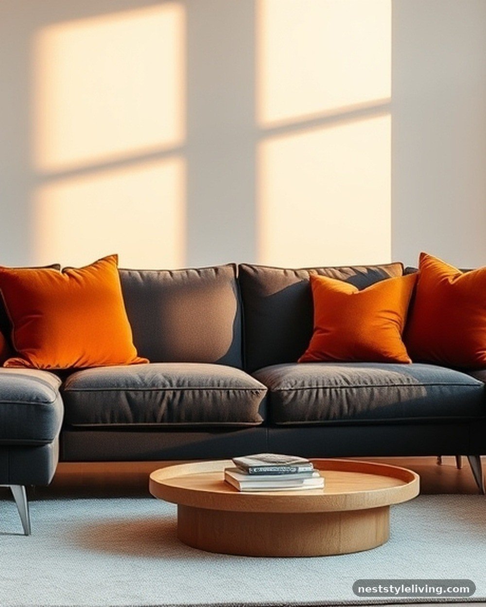
Burnt orange is an earthy, sophisticated shade that feels much more mature than standard orange. Pair it with slate gray to create a balanced, contemporary look. The slate gray tones down the intensity of the orange, while the orange adds a necessary pop of color to the gray.
Use orange in velvet cushions or a statement armchair, and keep the walls and large furniture in slate gray. This palette is excellent for a room that feels a bit too cold or industrial; the orange brings the heat. It is a warm, inviting choice that feels both modern and grounded in nature.
Psalm 104:15 — The warmth of the orange and the stability of the slate reflect the gifts of the earth that gladden the heart of man.
Frequently Asked Questions
How do I choose the right finish for my living room paint?
Choose a matte or eggshell finish for walls to hide imperfections and create a soft, high-end look. Reserve semi-gloss or high-gloss finishes for trim, doors, and moldings to create subtle contrast and add a touch of durability to high-touch areas. Matte finishes are generally preferred for luxury spaces as they absorb light rather than reflecting it, creating a more sophisticated, velvet-like appearance.
Can I mix different metals in my luxury color palette?
Yes, mixing metals is a hallmark of professional design. The key is to choose one dominant metal—like brass or silver—and use a secondary metal sparingly as an accent. For example, if your lighting is brass, you might choose silver for your cabinet hardware or picture frames. Ensure the undertones are consistent; mixing warm-toned metals with other warm tones, or cool with cool, keeps the look cohesive.
What is the best way to test colors before committing?
Never rely on small paint chips from the store. Instead, purchase sample pots and paint large swatches on poster boards. Move these boards around the room at different times of the day to see how the natural and artificial light affects the color. Pay attention to how the color shifts when the sun hits it directly versus when the room is in shadow or lit by lamps in the evening.
How do I incorporate texture into a neutral color scheme?
Texture is essential when your color palette is monochromatic or neutral. Use a variety of materials such as linen, velvet, wool, silk, and wood to add physical and visual interest. A room with beige walls and a beige sofa looks boring until you add a chunky wool throw, a silk pillow, and a leather ottoman. These different light-reflecting surfaces prevent the room from looking flat.
Should the ceiling always be white?
While white is the standard for ceilings, it is not mandatory. In luxury design, painting the ceiling a shade darker than the walls can create a cozy, cocoon-like atmosphere, especially in rooms with deep or moody color palettes. Conversely, if you have a small room, keeping the ceiling a crisp, bright white can help draw the eye upward and make the space feel taller and more open.
Achieving a high-end look through your home’s decor is about more than just picking pretty colors; it is about intentionality and balance. By carefully selecting your palette and layering textures, you can create a space that feels both luxurious and deeply personal. These luxury living room color palette ideas to copy serve as a foundation for your design journey, but don’t be afraid to adjust them to fit your unique home.
Whether you gravitate toward moody charcoals or airy creams, the key is consistency and quality in your choices. Start with a single element—a piece of art, a rug, or a favorite fabric—and build your color scheme around it to ensure a cohesive result. We invite you to experiment with these combinations and see how they transform your living space into a true sanctuary.