10 Red Brick House Color Schemes That Instantly Impress
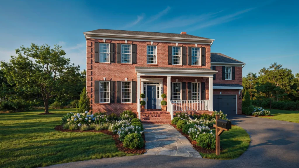
Looking for the perfect exterior color scheme for red brick house that instantly boosts curb appeal? You’re in the right place. Small color changes can completely transform the way your home looks and feels without the cost of a full renovation.
Red brick has timeless character, but choosing the right trim, shutters, doors, or accent colors can feel overwhelming. With so many options available, it’s easy to wonder which combinations will actually complement the brick instead of competing with it. In my experience, the best results come from selecting colors that enhance the home’s natural warmth while adding just enough contrast to highlight its architectural details. That’s exactly what this collection is designed to help you achieve. Whether your style leans classic, modern, farmhouse, or transitional, these ideas offer practical inspiration you can confidently use. I’ve noticed that even one thoughtful update can make a home feel brighter, more welcoming, and noticeably more polished. Save your favorites as you read and discover combinations that are both Pinterest-worthy and timeless enough to love for years
1. Soft White Trim
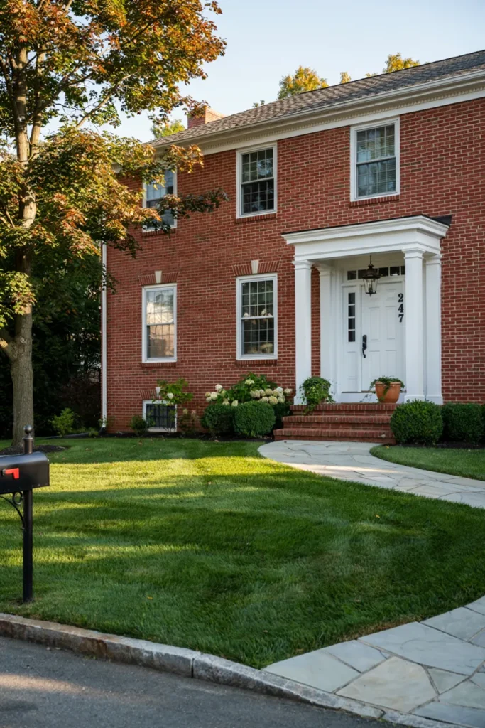
- Creates a fresh, clean contrast without overpowering the brick.
- Brightens the home’s exterior and highlights architectural details.
- Works beautifully with traditional and modern landscaping.
- Makes windows, doors, and trim appear more refined.
- Easy to pair with seasonal decorations throughout the year.
Nothing refreshes a brick exterior faster than bright white trim used with intention. The clean contrast immediately sharpens windows, doors, and rooflines while allowing the brick to remain the main feature. Homeowners often choose this approach because it feels timeless without looking outdated. When planning an exterior color scheme for red brick house, soft white creates balance instead of harsh contrast. The result feels welcoming, polished, and easy to personalize with planters, porch furniture, or colorful seasonal accents that stand out beautifully throughout every season.
A softer white usually performs better than a brilliant bright white because it blends naturally with the warm tones found in most brick. I’ve noticed this combination continues to look elegant even as landscaping matures and outdoor décor changes over time. The lighter trim also reflects more daylight, helping the entrance appear larger and brighter. Whether your home has shutters or not, this pairing creates a clean frame around architectural features, delivering a finished appearance that feels both classic and effortlessly updated.
2. Charcoal Black Accents
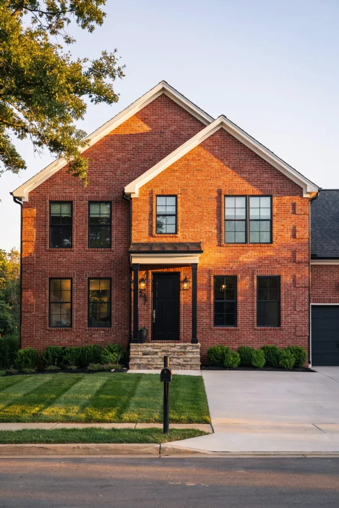
- Adds bold contrast without changing the brick itself.
- Gives the exterior a modern, upscale appearance.
- Highlights windows, entryways, and architectural lines.
- Pairs well with metal lighting and dark hardware.
- Creates a clean, designer-inspired finish.
Bold details often create the biggest transformation, and charcoal accents prove exactly why. Dark window frames, garage doors, lighting fixtures, and shutters introduce depth while allowing warm brick colors to remain the focal point. Instead of overwhelming the exterior, these darker elements define the home’s shape and create a more intentional design. Many homeowners appreciate this look because it feels current while remaining timeless. The contrast naturally draws attention to the entrance, making the entire property appear more polished from the street.
In my experience, matte charcoal finishes stay visually appealing longer because they hide minor dust and wear better than glossy black surfaces. Pairing these darker details with warm stone paths or light concrete keeps the exterior balanced rather than heavy. Small upgrades like matching house numbers, mailboxes, and outdoor lighting help tie everything together. These thoughtful touches create a cohesive appearance that feels professionally designed while remaining practical for everyday living and long-term curb appeal improvements.
3. Warm Greige Details
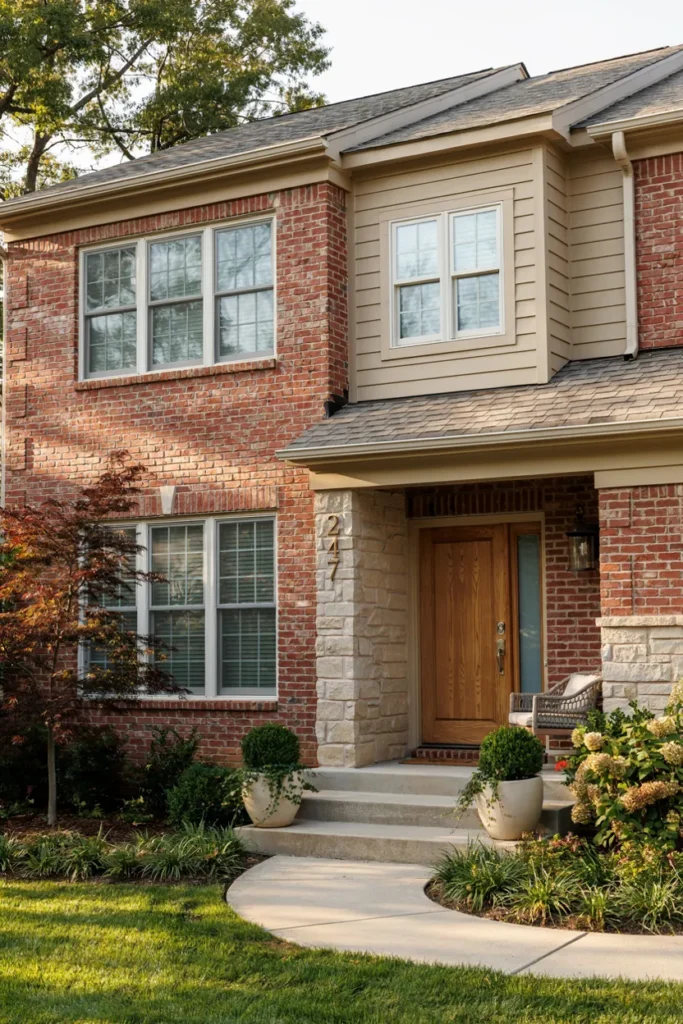
- Softens the overall appearance without reducing character.
- Blends beautifully with natural stone and wood features.
- Creates a warm, welcoming first impression.
- Complements neutral landscaping and outdoor décor.
- Offers flexibility for future exterior updates.
Warm greige creates a relaxed, welcoming look that bridges classic and contemporary styles beautifully. This versatile neutral complements the natural warmth already present in brick while adding softness around trim, siding accents, or porch features. Instead of creating strong contrast, it blends everything together into a cohesive design. That’s why many designers recommend greige for homeowners wanting an updated appearance without dramatic changes. The result feels comfortable, sophisticated, and adaptable to changing outdoor décor through every season.
Choosing the right greige depends on the undertones already found in your brick, making sample testing an important first step. I’ve seen this work well in many homes where owners wanted subtle elegance rather than bold contrast. Adding natural wood doors, woven porch furniture, or textured stone planters enhances the warmth even further. Together, these materials create an inviting exterior that feels layered, balanced, and effortlessly stylish while maintaining lasting curb appeal for years to come.
4. Sage Green Shutters
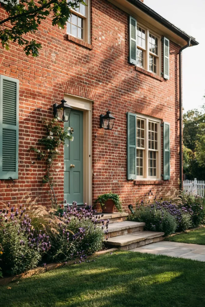
- Brings a soft natural color without overpowering the brick.
- Adds charm and blends beautifully with surrounding greenery.
- Creates a relaxed, welcoming curb appeal.
- Pairs perfectly with stone pathways and garden landscapes.
- Makes the exterior feel timeless and fresh.
A muted sage green instantly softens the bold appearance of red brick while creating a peaceful, nature-inspired palette. The gentle green tone complements warm masonry instead of competing with it, making windows and doors feel more inviting. If you want an exterior color scheme for red brick house that feels balanced and calming, sage is a dependable choice. It connects beautifully with surrounding trees, shrubs, and flowering plants, giving the property a cohesive appearance that feels thoughtfully designed rather than overly decorated or trendy.
I’ve noticed sage green looks especially attractive throughout the changing seasons because it blends naturally with both fresh spring foliage and warm autumn landscapes. Pairing it with white trim and black lighting creates enough contrast to highlight architectural details without making the home feel busy. Even simple additions like wooden planters or natural stone borders reinforce the relaxed atmosphere. This combination delivers a welcoming first impression while remaining versatile enough for traditional, farmhouse, or transitional home styles.
5. Navy Blue Entry
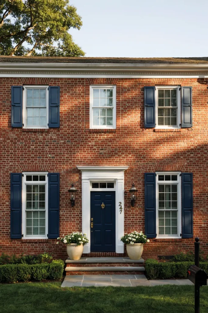
- Creates a bold focal point at the entrance.
- Gives the home a refined, classic appearance.
- Works beautifully with white trim and brass hardware.
- Enhances curb appeal without major renovations.
- Offers a timeless color that rarely goes out of style.
Sometimes a single color change can completely reshape the way visitors see your home. A navy blue front door becomes an elegant focal point that adds depth without clashing with the warmth of brick. The rich tone feels sophisticated while still remaining approachable, making the entrance more memorable. Combined with crisp trim and tasteful hardware, the overall design appears carefully planned. This simple update delivers a premium look without requiring expensive exterior remodeling or structural changes.
In my experience, navy remains one of the easiest colors to coordinate with outdoor décor throughout the year. Seasonal wreaths, planters, and porch furniture all stand out beautifully against its deep finish. Choosing satin or semi-gloss paint also helps the door resist weather while reflecting just enough light to showcase its rich color. Small details such as polished brass handles or matte black fixtures complete the look, creating an entrance that feels welcoming, elegant, and effortlessly timeless.
6. Natural Wood Door
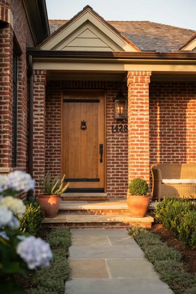
- Introduces warmth and natural texture to the exterior.
- Balances the bold character of brick with organic materials.
- Creates a welcoming and timeless entrance.
- Pairs well with stone, greenery, and neutral trim.
- Adds visual richness without overwhelming the design.
Natural wood has a warmth that painted surfaces rarely achieve, making it an excellent feature for brick homes. The visible grain introduces texture and authenticity while complementing the earthy tones already found in the masonry. Whether you choose oak, walnut, or cedar, the entrance immediately feels more inviting. The combination works especially well with neutral trim, black hardware, and stone pathways, producing an exterior that feels balanced, comfortable, and full of lasting character rather than temporary design trends.
I’ve seen this work well in many homes where owners wanted a welcoming entrance without dramatically changing the existing architecture. Protecting the wood with a quality exterior finish helps preserve its color while allowing the natural grain to remain visible. Pairing the door with matching wooden planters or porch furniture strengthens the overall design. These coordinated details create an inviting first impression that feels handcrafted, timeless, and beautifully connected to the surrounding landscape.
7. Creamy Beige Trim
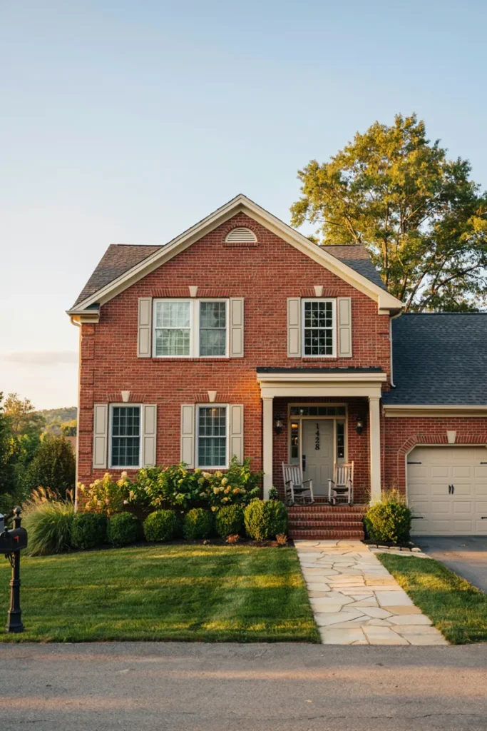
- Softens the overall contrast for a warmer appearance.
- Blends naturally with brick and stone materials.
- Creates a cozy, welcoming first impression.
- Works beautifully with wood accents and greenery.
- Adds timeless charm without feeling outdated.
Warm neutrals often create the most comfortable curb appeal, and creamy beige is a perfect example. Instead of creating sharp contrast, this gentle tone blends gracefully with brick while subtly defining windows, rooflines, and porch details. The softer finish gives the entire exterior a welcoming appearance that feels relaxed and polished. Homeowners looking for a lasting design often appreciate this color because it complements changing landscaping, seasonal decorations, and natural materials without requiring constant updates or bold design choices.
I’ve noticed creamy beige performs especially well on homes surrounded by mature trees or natural stone landscaping because the colors flow together effortlessly. Pairing it with dark lighting fixtures and a wooden front door creates just enough visual contrast to keep the design interesting. Simple additions such as woven porch seating, terracotta planters, or textured outdoor rugs further enhance the warm atmosphere. The finished look feels balanced, inviting, and timeless without relying on dramatic color combinations.
8. Olive Green Door\
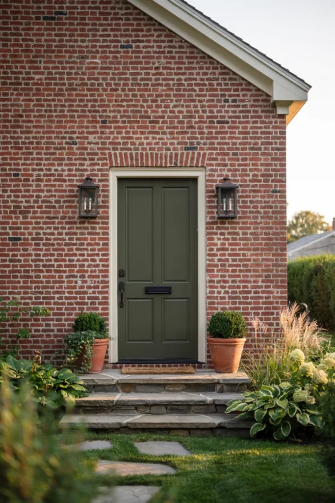
- Adds earthy color that complements warm brick tones.
- Creates a unique yet timeless front entrance.
- Blends beautifully with surrounding landscaping.
- Pairs well with black hardware and light trim.
- Gives the home a welcoming designer-inspired feel.
Earth-inspired colors continue to grow in popularity because they feel calm, welcoming, and connected to nature. An olive green front door introduces subtle personality while respecting the warm character of brick. Rather than becoming the only focal point, it works with the surrounding materials to create a balanced entrance. Rich greenery, natural stone, and simple lighting fixtures reinforce the palette, helping the exterior appear carefully coordinated. The overall effect feels sophisticated while remaining comfortable for everyday family living.
In my experience, olive green is surprisingly versatile because it complements both modern and traditional architectural styles. It also pairs beautifully with brass, bronze, or matte black hardware, allowing homeowners to personalize the entrance without overwhelming the design. Adding nearby potted plants with varying leaf textures strengthens the natural palette even further. These thoughtful combinations create a memorable first impression that feels welcoming, elegant, and visually connected to the surrounding landscape throughout the year.
9. Light Gray Siding
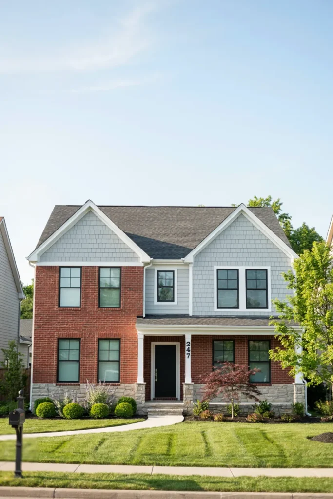
- Creates a fresh layered look with existing brick.
- Breaks up large exterior walls without overpowering them.
- Adds a modern touch while keeping classic character.
- Pairs well with black accents and white trim.
- Gives the home a brighter, updated appearance.
Mixing brick with light gray siding creates visual variety while maintaining a clean, timeless appearance. The cooler neutral helps balance the natural warmth of red masonry, preventing the exterior from feeling too heavy or monochromatic. This pairing works especially well on split-level homes, gables, or upper-story additions where different materials naturally divide the façade. The result is an updated look that feels refined, bright, and architecturally balanced while preserving the home’s original character and charm.
I’ve seen this work well in many homes where owners wanted a noticeable transformation without replacing their existing brick. Light gray siding reflects daylight beautifully, making the property appear larger and more open from the street. Black window frames, simple landscaping, and a coordinated roof color complete the design without unnecessary complexity. Together, these features create a polished exterior that remains stylish for years while adapting easily to changing outdoor décor and seasonal landscaping.
10. Matte Black Garage
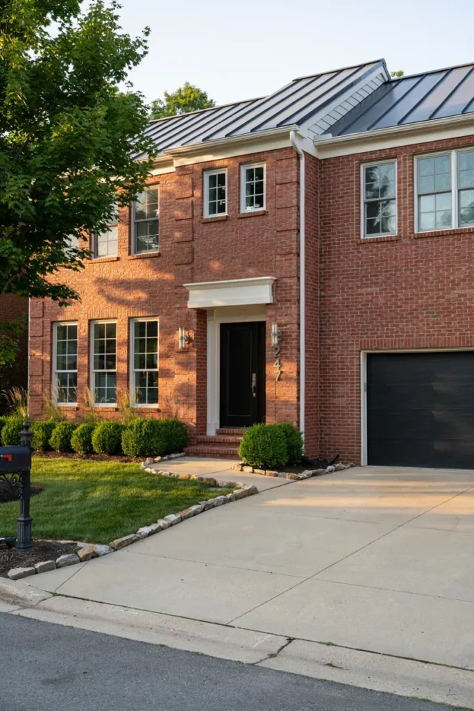
- Gives the exterior a bold, modern focal point.
- Creates strong contrast without overpowering the brick.
- Pairs beautifully with black lighting and house numbers.
- Makes the home feel more polished and upscale.
- Delivers a dramatic upgrade with minimal renovation.
A matte black garage door can completely redefine the appearance of a brick home without requiring a major renovation. Since the garage often occupies a large portion of the front elevation, updating its color has an immediate visual impact. The deep finish adds clean contrast, highlights architectural lines, and helps surrounding brick appear richer and more vibrant. Combined with coordinated lighting and simple landscaping, this approach creates a sophisticated exterior that feels intentional, balanced, and effortlessly contemporary from the very first glance.
That’s why many designers recommend repeating matte black accents across the exterior instead of limiting the color to a single feature. Matching light fixtures, house numbers, railings, or the front door creates visual consistency and makes the overall design feel professionally planned. I’ve noticed this approach works especially well when paired with warm stone pathways and healthy green landscaping, allowing the darker details to stand out without making the home feel heavy. The result is refined, timeless, and remarkably easy to maintain.
Conclusion
A beautiful exterior doesn’t always require a major renovation—sometimes the right color pairing makes all the difference. These ideas show how thoughtful choices can highlight your home’s character while creating a welcoming first impression. Whether you prefer soft neutrals, bold accents, or natural wood details, there’s an exterior color scheme for red brick house to match your style. I’ve seen how small updates like these can completely transform curb appeal with surprisingly little effort. Save this guide to Pinterest for future inspiration, try your favorite ideas, and share it with friends or family who are planning their own exterior makeover.