18 Colorful Living Rooms That Feel Stylish and Fresh
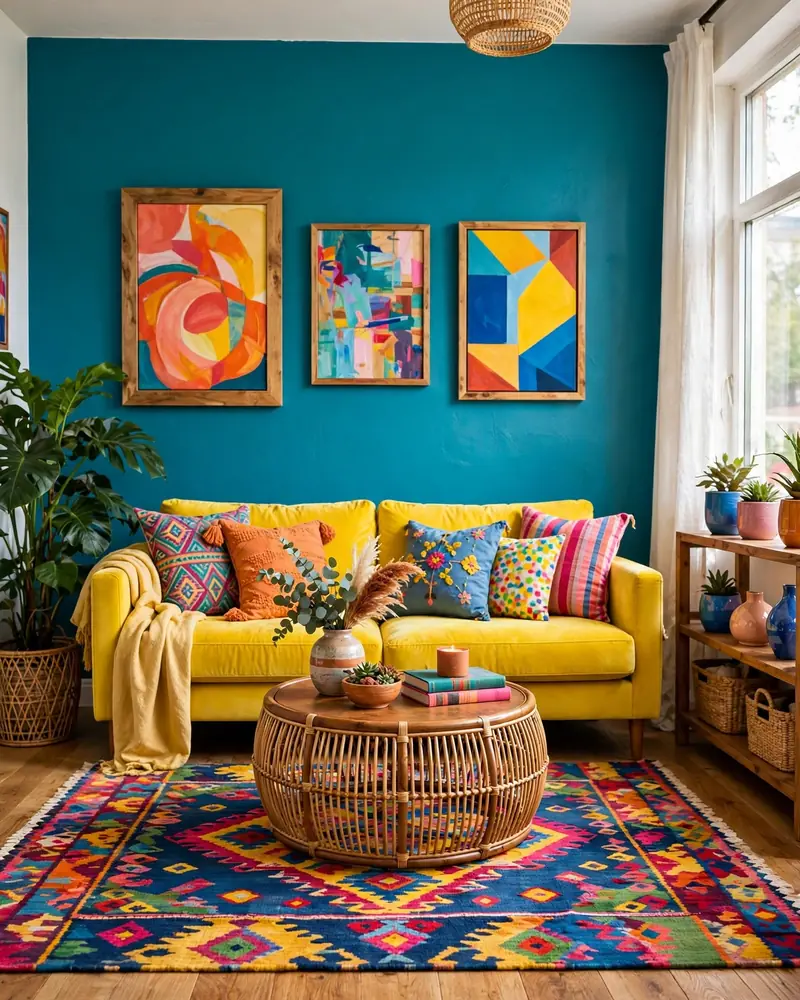
There is a reason colorful living rooms keep winning hearts on Pinterest and in real homes: few spaces lift your mood as quickly as a room that is not afraid of color. From a single teal accent wall to a sunlit sofa piled with jewel-toned cushions, a colorful living room feels joyful, personal, and full of life — never boring, never cold.
In this collection of 18 colorful living room ideas, you will find real, achievable ways to bring color home — a colorful accent wall, a bold area rug, an eclectic gallery wall, colorful throw pillows, jewel tones, and playful pairings like yellow and teal or coral and turquoise among them. Whether you want a full rainbow of saturated hues or a few brave pops against a neutral base, there is a look here that fits your space and your budget.
Each idea below is built around a styling move people actually search for, with simple notes you can copy this weekend. Pin your favorites, start with one idea that makes you smile, and watch how quickly a colorful living room starts to feel like you.
1. Bold Teal Accent Wall
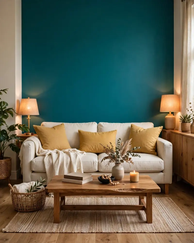
A bold teal accent wall is one of the fastest ways to wake up a plain living room. Teal sits in that sweet spot between blue and green, so it reads as rich and sophisticated rather than loud — and it pairs beautifully with warm neutrals like cream, natural wood, and rattan. Paint the wall behind your sofa or media unit and let lighter furniture sit against it so the color really sings.
Balance the intensity with soft textures: a cream boucle armchair, a jute rug, and a few mustard cushions keep the room warm and grounded. Good lighting matters too — a bold accent wall looks its best with daylight streaming in or warm lamps glowing in the evening. This single painted wall can carry the entire scheme, so the rest of the room can stay beautifully simple.
2. Sunny Yellow Sofa
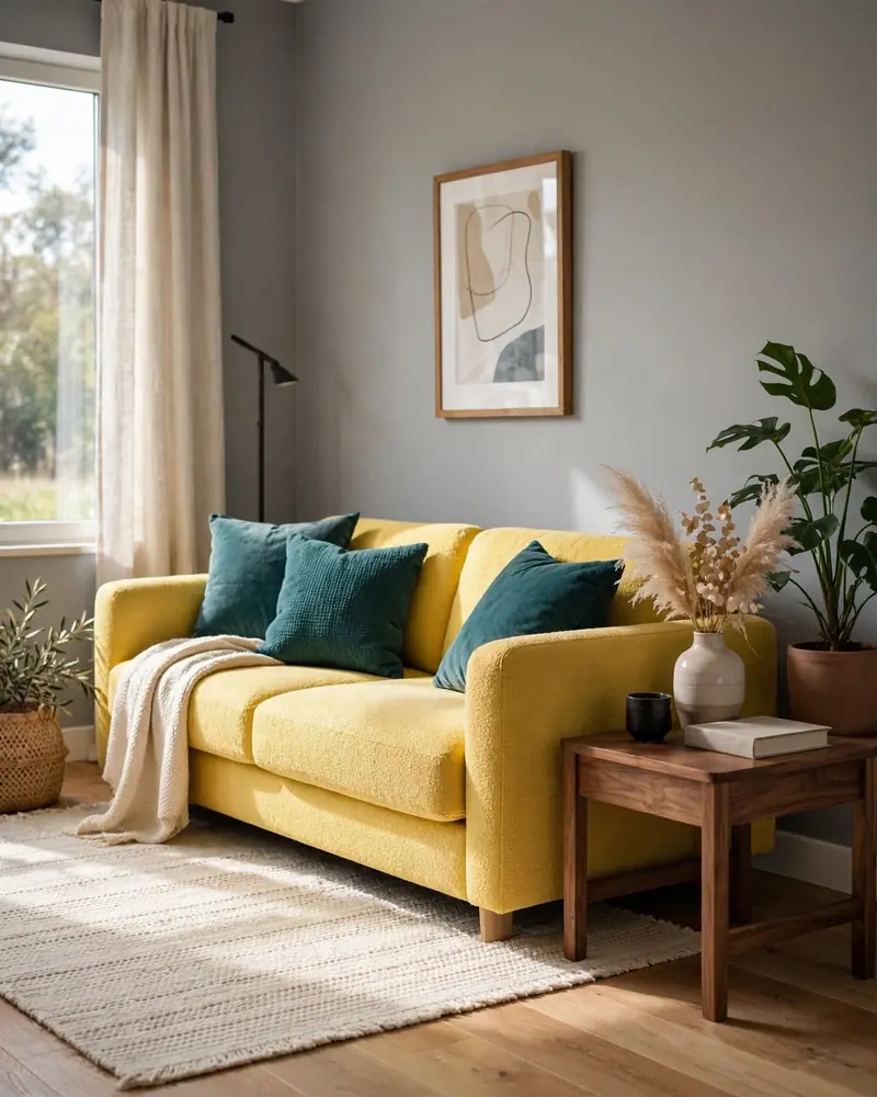
A sunny yellow sofa is pure optimism in furniture form. As a centerpiece, it brings instant warmth and energy, especially in rooms that lean modern or mid-century. Pair it with teal cushions and a cream rug — the classic yellow and teal combination — and the room feels curated rather than random. Yellow also plays wonderfully with gray, white, and natural wood tones.
Keep the supporting colors simple so the sofa stays the star: soft gray walls, a neutral rug, and one or two darker accents like a walnut side table or charcoal throw. If a full yellow sofa feels brave, start with a mustard or goldenrod tone, which is warmer and easier to live with. Either way, this one piece will make the whole room feel sunnier.
3. Coral and Turquoise Pairing
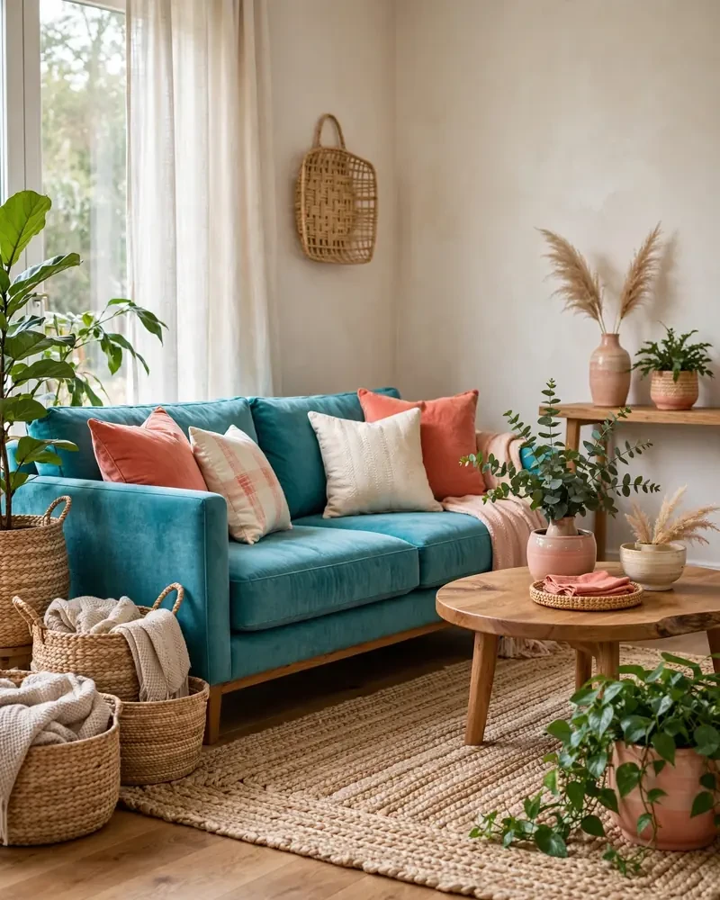
The coral and turquoise pairing is a beachy, joyful duo that never fails to feel fresh. Coral brings warmth and energy while turquoise adds a cool, watery calm — together they strike a balance that suits coastal, boho, and eclectic living rooms alike. Try a turquoise sofa dressed with coral and cream cushions, or coral curtains against a soft turquoise wall.
This palette loves natural textures: woven baskets, a jute rug, light wood furniture, and plenty of greenery make coral and turquoise feel relaxed instead of sugary. Keep one of the two colors slightly dominant and use the other as the accent, so the room feels intentional. A few neutral basics — white walls, a cream rug — give the colors room to breathe.
4. Emerald Green Velvet Sofa
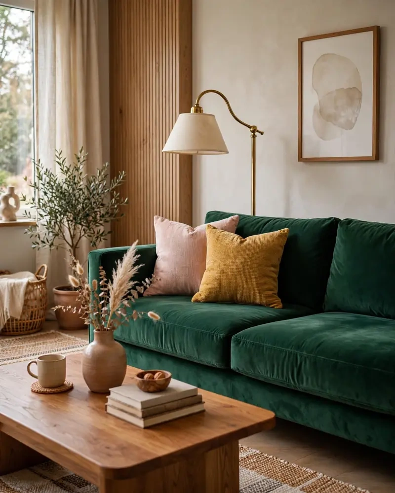
An emerald green velvet sofa is luxury and color in one irresistible piece. The deep jewel tone reads as surprisingly neutral, anchoring the room the way a navy or charcoal sofa would, while the velvet catches the light and adds a layer of richness. It suits both traditional and modern living rooms, and pairs beautifully with brass, warm woods, and blush or mustard accents.
Style it with jewel tones for a moody, glamorous look — sapphire cushions, a ruby throw — or lighten it up with cream walls, a patterned rug in soft hues, and gold-toned lighting. Because emerald is deep, layer your lighting so the sofa glows in the evening rather than going dark. This single statement piece can define the whole room’s character.
5. Color-Blocked Walls
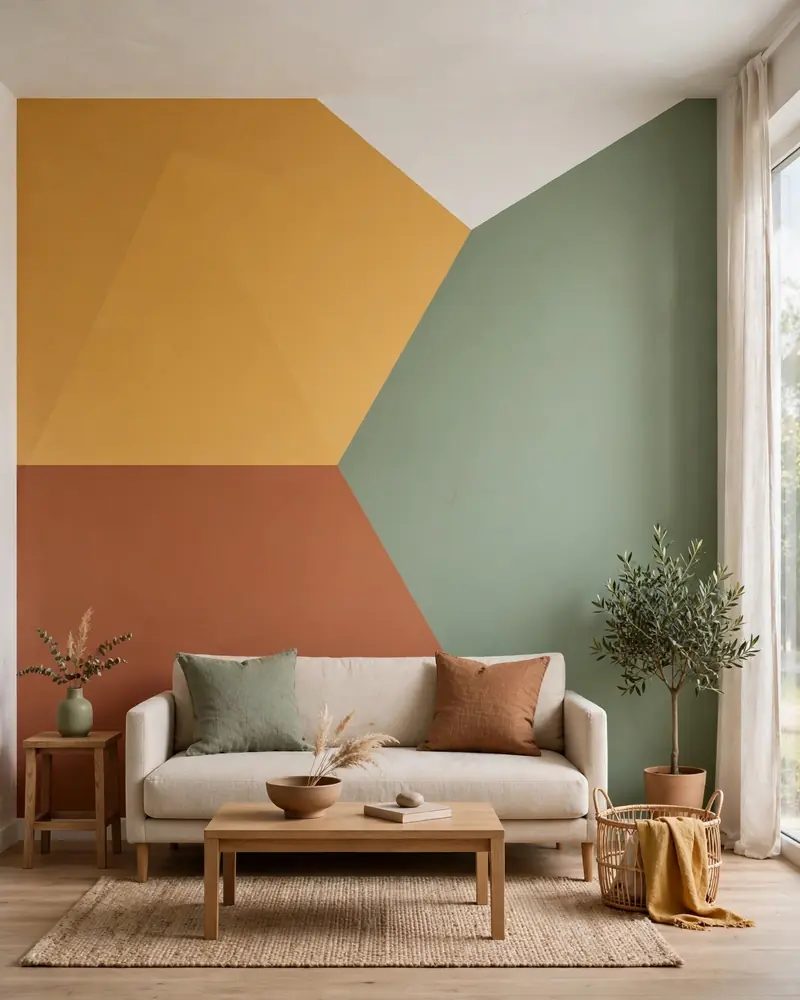
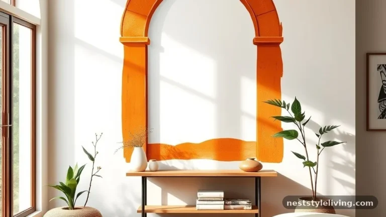
Color blocking on the walls is a bold, graphic way to bring multiple hues into one room without committing to full-wall paint. Paint large geometric sections — a half wall in mustard, a rectangle in terracotta, an arch in sage — and you get a mural-like effect that is cheap, DIY-friendly, and endlessly customizable. It works especially well behind a sofa or in an entry nook.
Pick two or three colors that share a temperature — warm tones like rust, ochre, and blush, or cool tones like teal, sky blue, and sage — so the blocks feel harmonious. Use painter’s tape for crisp edges and keep furniture in front of the blocks simple, so the wall art stays the focus. This is one of the easiest weekend projects with the biggest visual payoff.
6. Rainbow Bookshelf Display
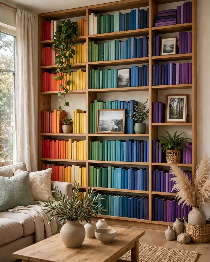
A rainbow bookshelf display turns your book collection into living color. Arranging books by spine color creates a gradient effect that is playful, eye-catching, and completely free — all it takes is an afternoon of restyling. Mix in a few plants, framed photos, and decorative objects within each color band so the shelves feel styled rather than stiff.
This works best on open shelving or a large bookcase with simple lines, where the color can be the pattern. Keep the wall behind the shelves neutral — white or pale gray — so the rainbow reads clearly. If you borrow books often, the display will drift, but that is part of its charm: a lived-in shelf that slowly shifts is a shelf that gets used.
7. Eclectic Gallery Wall
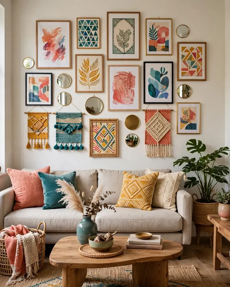
An eclectic gallery wall is how you hang a rainbow without painting a thing. Mix colorful art prints, small mirrors, woven textiles, and even painted plates in a loose salon-style arrangement, and the wall becomes the room’s personality center. Vary the sizes and frames — thin black, natural wood, and white — so the collection feels curated, not cluttered.
Plan the arrangement on the floor first, then hang from the center outward, keeping spacing even. Pull two or three repeat colors from the artwork — a shared coral, teal, or mustard — and echo them in cushions or a throw so the wall feels connected to the room. One larger anchor piece grounds the composition and gives the eye a place to rest.
8. Layered Bright Area Rugs
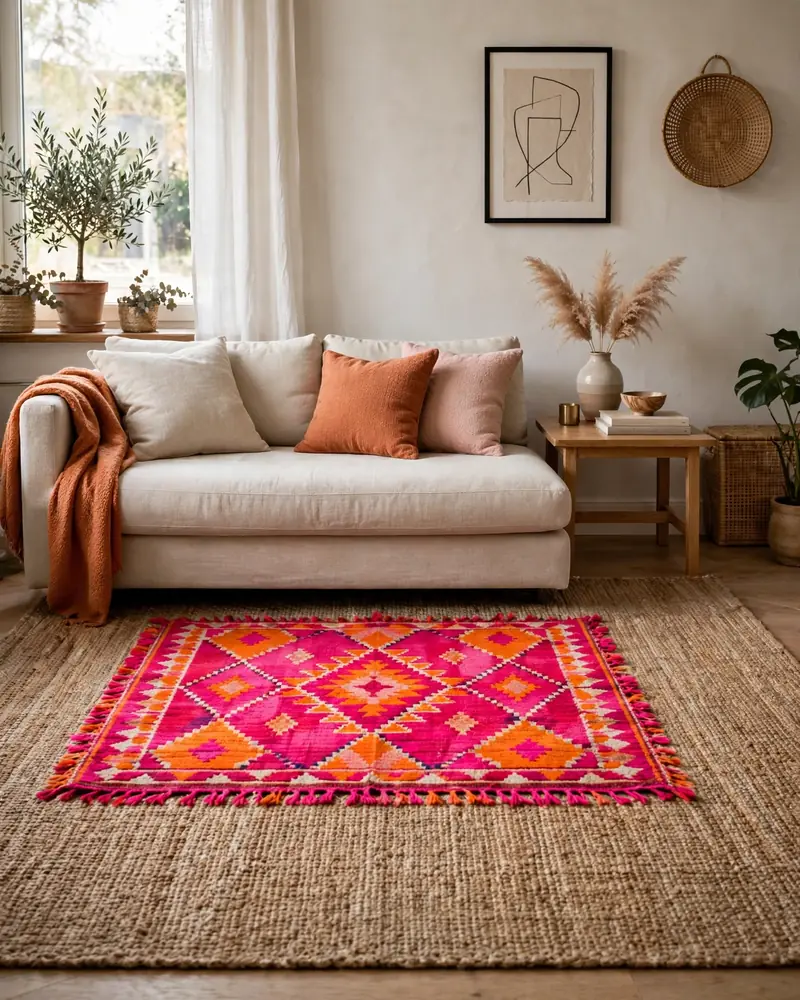
Layered bright area rugs bring color straight to the floor — and the floor is the best place to be brave. Start with a large neutral base rug, then layer a smaller bold area rug on top: a Moroccan-style print in hot pink and orange, a vintage kilim in reds and blues, or a playful geometric in rainbow hues. Layering lets you mix patterns safely because the overlap is intentional.
Make sure the top rug is large enough to hold the front legs of your seating, and use a rug pad so nothing slips. Pull one or two colors from the layered rugs into your cushions or art so the floor feels connected to the rest of the room. This is a renter-friendly move too — no paint, no commitment, all the color you could want.
9. Warm Orange Accents
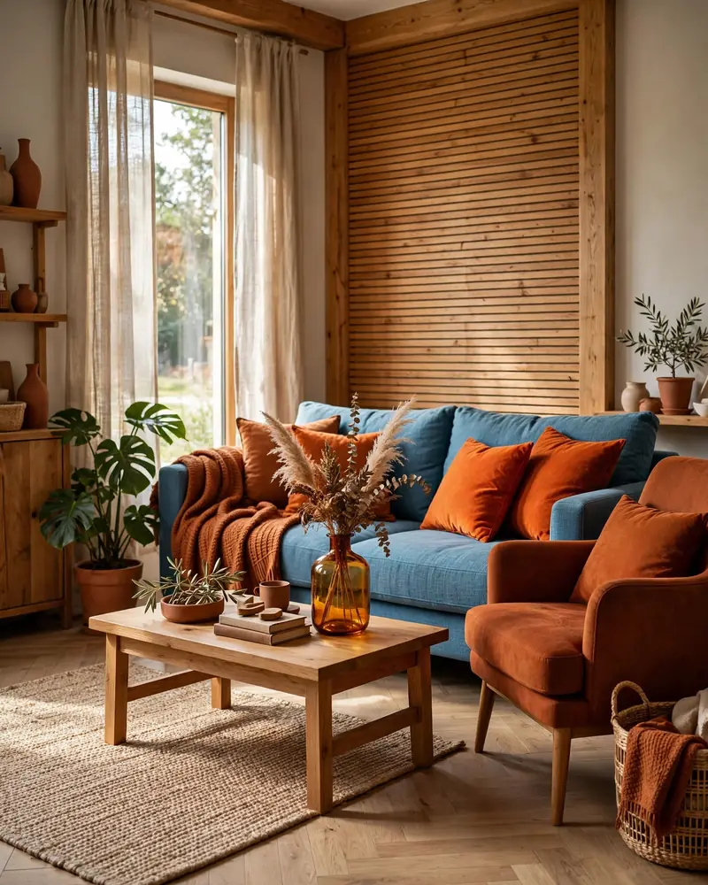
Warm orange accents are the easiest way to make a living room feel cozy and alive. Orange is a happy, welcoming color, and as an accent it brings energy without taking over: think burnt-orange cushions, a terracotta throw, an amber glass vase, or a rust-colored armchair. It pairs beautifully with blue and teal, warm neutrals, and natural wood.
Scatter orange accents in odd numbers across the room — a cushion on the sofa, a pouf in the corner, artwork on the wall — so the color feels balanced rather than random. Terracotta and rust tones are easier to live with than neon orange and suit everything from boho to mid-century styles. Even small doses of orange can shift a cool room toward warm and inviting.
10. Patterned Colorful Curtains
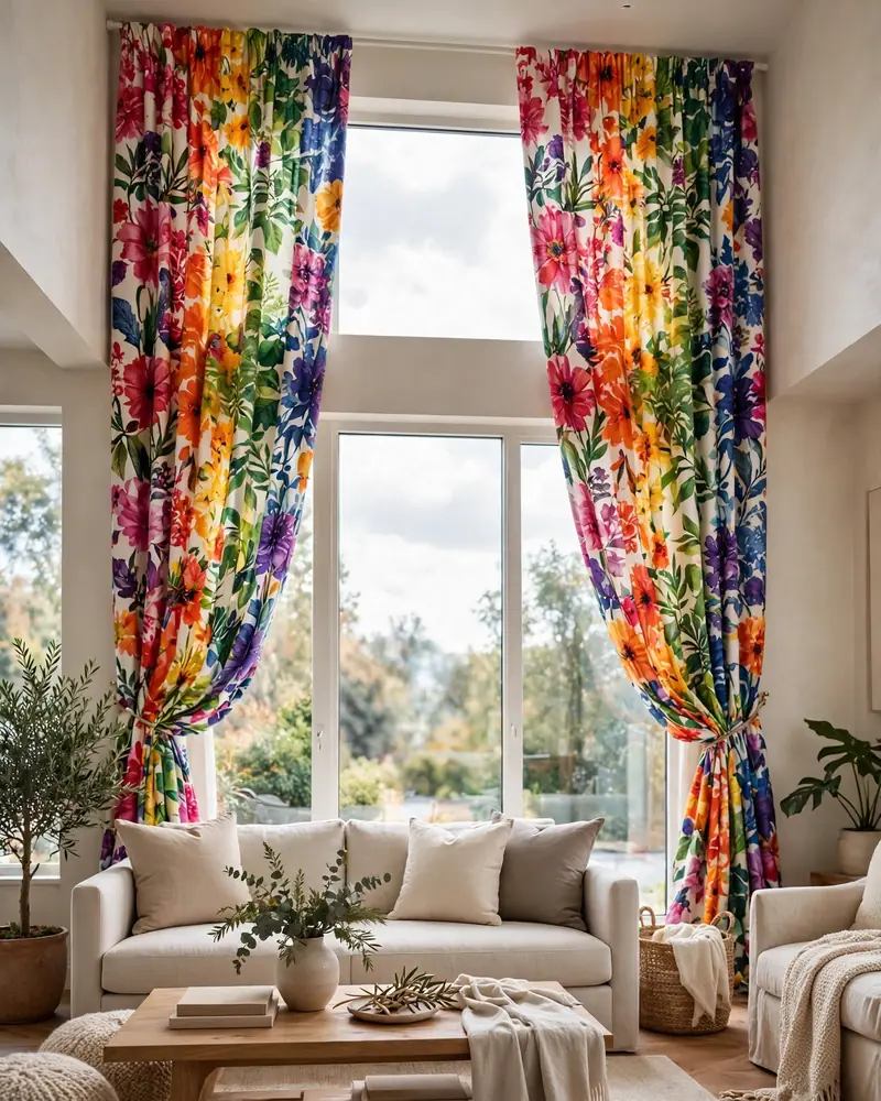
Patterned colorful curtains dress your windows like art. Florals, ikats, bold stripes, or playful geometrics in rainbow hues frame the room and add color at eye level, where it matters most. They work especially well in neutral rooms, where the curtains can be the main event without competing with anything else.
Hang them high and wide — rods mounted near the ceiling and extending past the window frame make windows feel taller and the room grander. If the pattern is busy, keep the rest of the textiles calm: solid cushions in one or two of the curtain’s colors, a simple rug. Line the curtains for a polished drape and better light control, and the windows become a design feature in their own right.
11. Ombre Painted Accent Wall
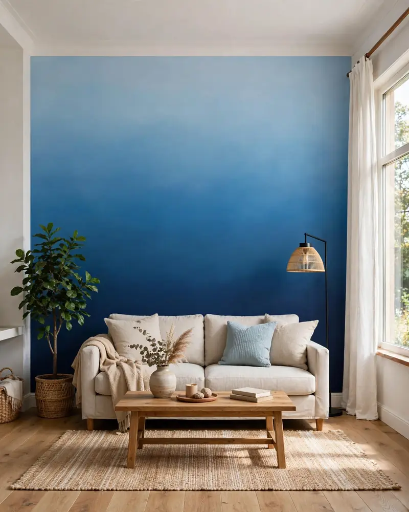
An ombre painted accent wall brings gradient color into the room with an artistic, dreamy feel. Blending from a deep saturated shade at the bottom — navy, forest green, or plum — up into a soft tint of the same hue creates a sense of height and movement that flat paint cannot match. It is a stunning backdrop for a sofa or reading nook.
You can DIY this with three shades of the same paint color and a dry-brush blending technique, or use a wall mural for a flawless result. Keep furniture in front of the ombre wall simple and solid so the gradient stays the star. Soft, diffused lighting — a floor lamp with a fabric shade — makes the blend look even more seamless and luminous.
12. Colorful Ceiling Statement
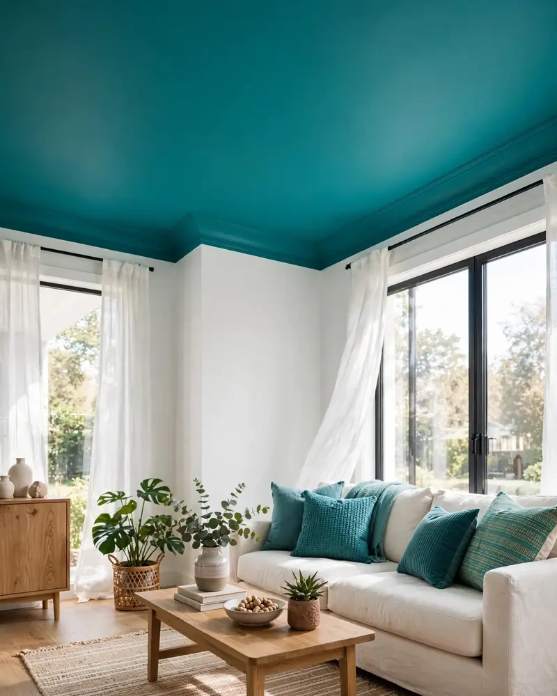
A colorful ceiling is the most unexpected place to add color — and one of the most dramatic. Painting the ceiling a bold hue — teal, terracotta, mustard, or even a soft coral — draws the eye upward and gives the whole room a wrapped, intentional feel. It is sometimes called the “fifth wall,” and in a colorful living room it can be the finishing touch that makes everything click.
Pair the ceiling color with walls in a lighter version of the same hue or a clean neutral, and echo the ceiling shade in small accents below — cushions, art, a throw — so the room feels connected from top to bottom. This works beautifully in rooms with good natural light; in darker rooms, lean toward warm mid-tones rather than deep shades.
13. Jewel Tones With Soft Pastels
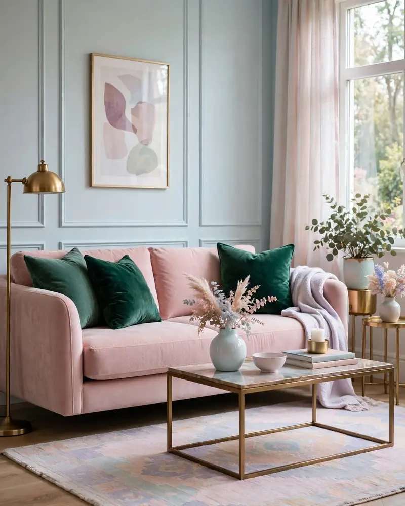
Jewel tones paired with soft pastels create a rich-yet-airy palette that feels both luxurious and liveable. Think emerald cushions against a blush chair, a sapphire throw over a cream sofa, or amethyst art on a pale-pink wall. The deep tones add drama and depth while the pastels keep the room light and welcoming — a balance that suits bedrooms and living rooms alike.
Let the jewel tones be the accents and the pastels the larger surfaces, so the room never feels heavy. Add one metallic — brass or gold — to bridge the two worlds and give the scheme a little glow. This pairing loves velvet and silk textures, which make both the rich and the soft shades look their absolute best.
14. Mixed-and-Matched Colorful Furniture
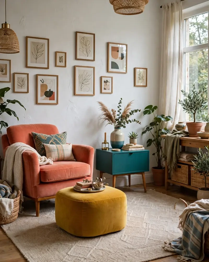
Mixed-and-matched colorful furniture is the heart of the eclectic look: a coral armchair here, a teal side table there, a mustard ottoman in the corner. Instead of a matching set, each piece brings its own color to the party, and the room feels collected over time rather than bought in a day. Thrift stores and flea markets are goldmines for this style.
The trick to keeping it stylish is a common thread — one repeated color, a shared silhouette, or a consistent wood tone — running through the mix. Keep the walls and rug relatively calm so the furniture can shine without fighting for attention. This approach is budget-friendly, sustainable, and guarantees a living room that looks like nobody else’s.
15. Vibrant Botanical Wallpaper
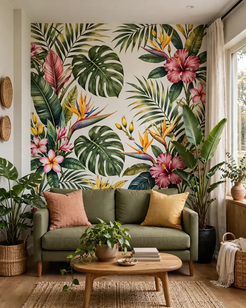
Vibrant botanical wallpaper wraps a living room in color and pattern at once. Oversized leaves, tropical blooms, and garden scenes in rich greens, pinks, and yellows turn one wall into a lush, living artwork. It works on a feature wall behind the sofa or, for the truly brave, across the whole room in a jewel-box style.
Pull your furnishings from the wallpaper’s palette: a solid sofa in one of its calmer tones, cushions in two or three of its brighter shades, and plenty of real plants to echo the botanical theme. Keep furniture silhouettes simple so they do not compete with the pattern. Because wallpaper is a commitment, order large samples and live with them for a few days in different lights before you decide.
16. Two-Tone Colorblock Curtains
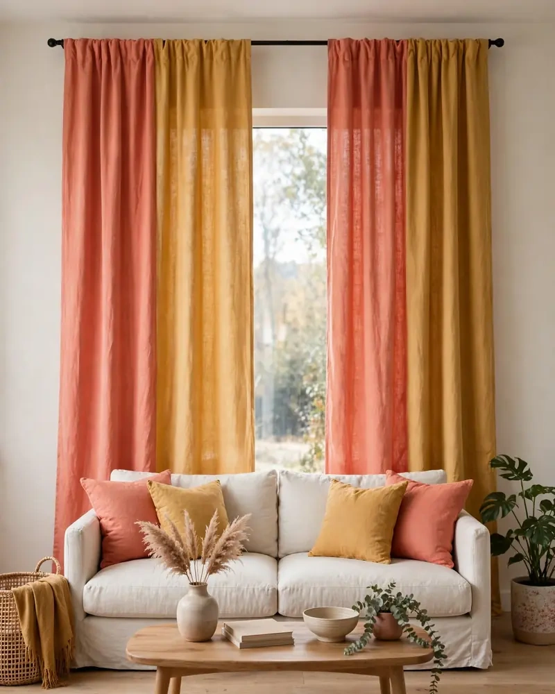
Two-tone colorblock curtains bring the color blocking trend straight to your windows. Panels split between two bold shades — coral and mustard, teal and navy, pink and orange — frame the room with graphic, modern energy. They add color at eye level and make even plain white walls feel designed and deliberate.
Match or complement the two curtain colors in the rest of the room: one in the rug, the other in cushions or art, so the palette feels intentional. Hang the panels from near the ceiling to the floor for maximum drama, and keep the walls behind them simple. Custom or DIY-dyed panels let you pick the exact two shades your room needs.
17. Colorful Art Above a Neutral Sofa
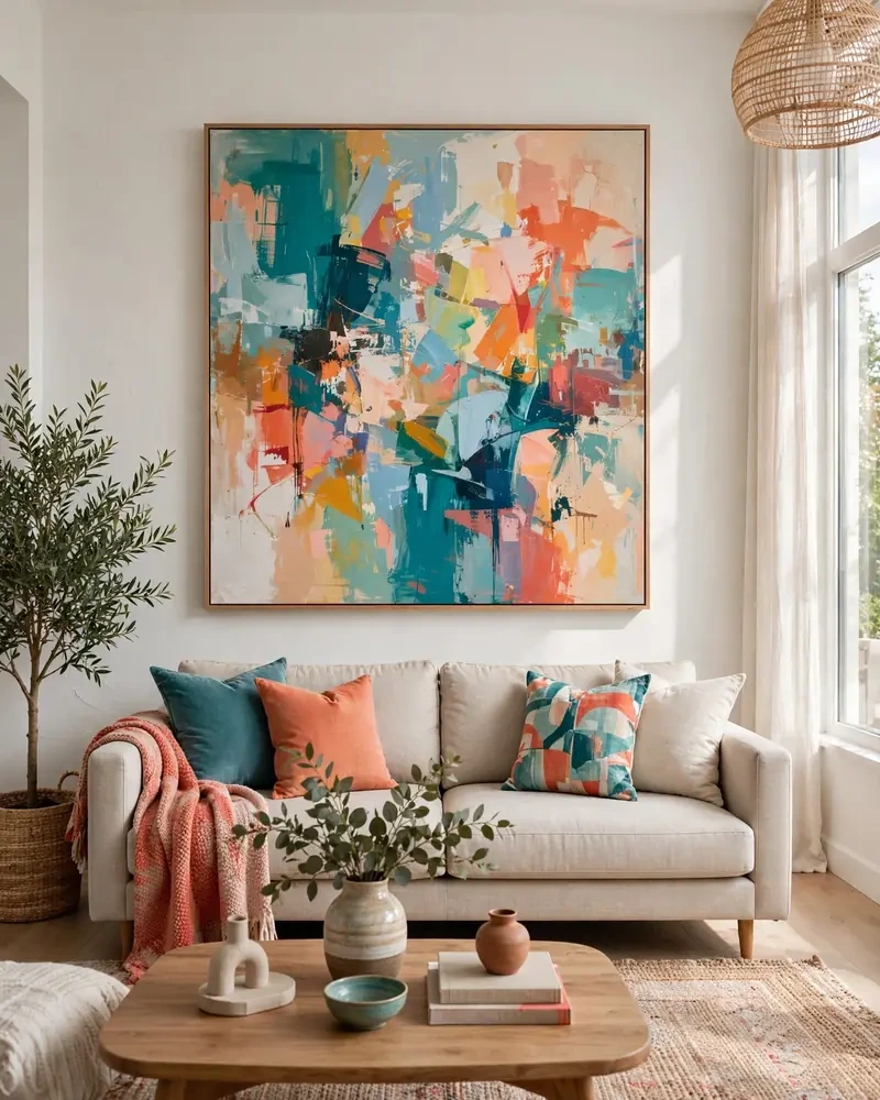
Colorful art above a neutral sofa is the lowest-risk route to a colorful living room. A large, vibrant painting or print brings every hue you love into the room at once, while the beige, gray, or white sofa beneath it keeps things calm and grounded. When you tire of a color story, swapping the art changes the whole room.
Size matters: the art should span roughly two-thirds of the sofa’s width and hang with its center at eye level. Pull two or three colors from the artwork into cushions and a throw so the palette feels pulled together rather than random. This is the perfect strategy for renters and commitment-phobes who still want a room with personality.
18. Fresh Green and White Pairing
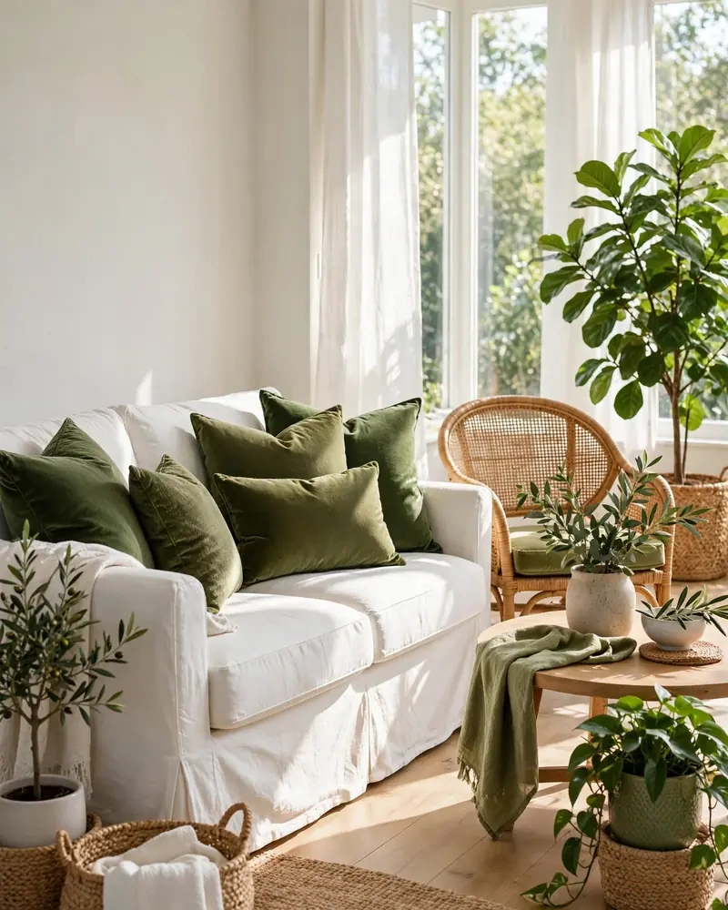
A fresh green and white pairing is the breezy, natural end of the colorful spectrum. Shades from sage to emerald against crisp white walls feel lively yet calming — think leafy plants, green velvet cushions, a botanical print, and white slipcovered seating. It is color that soothes rather than shouts, perfect for bright, sun-filled rooms.
Layer several greens — moss, olive, kelly — so the palette has depth, and add natural textures like rattan, linen, and light wood to keep it organic. A few pops of a warm accent, like mustard or terracotta, stop the scheme from feeling too cool. Green and white never goes out of style, and it is one of the easiest colorful looks to maintain.
Frequently Asked Questions
How do I add color to my living room without painting?
Start with the big soft furnishings: colorful throw pillows, a bold area rug, and vibrant curtains make the biggest difference with zero paint. Add an eclectic gallery wall of colorful art, drape a jewel-toned throw over the sofa, and bring in plants for living green color. Even small doses — orange accents, a patterned pouf, a colorful lamp — can transform how colorful the room feels. These layers are renter-friendly and easy to swap when your taste changes.
What colors go well together in a colorful living room?
Try proven pairings: yellow and teal, coral and turquoise, emerald green with blush, or orange accents against blue. Jewel tones like sapphire, ruby, and emerald look rich together, while color blocking with two or three warm shades — rust, ochre, mustard — feels cohesive. A botanical wallpaper or patterned rug can set the palette for you: pull your cushion and art colors from its design. Keep one neutral — white, cream, or natural wood — in the mix so the colors have room to breathe.
How can I make a colorful living room look stylish instead of chaotic?
Repeat colors around the room rather than introducing new ones everywhere — two or three hues, echoed in cushions, art, and rugs, read as designed. Give colorful pieces neutral breathing room: white walls, a cream sofa, or natural wood furniture. Vary the scale of patterns so they do not fight, and keep one thread consistent — a repeated color, metal finish, or style — through mixed pieces. Stylish colorful living rooms look collected and intentional, never accidental.
Can I mix patterns in a colorful living room?
Yes — pattern mixing is part of the fun. The rule is simple: vary the scale (one large-scale pattern like a bold area rug, one medium like curtains, one small like cushions), and tie the patterns together with a shared color or two. A colorful accent wall or vibrant botanical wallpaper can anchor the mix, while solid upholstery gives the eye a rest. If it ever feels like too much, remove one pattern layer at a time until the room clicks.
What is the easiest way to add color to a neutral living room?
Start with colorful throw pillows and a bold area rug — the two fastest, cheapest swaps with the biggest impact. Then add one hero piece: a large piece of colorful art above the sofa, a vibrant botanical wallpaper on one wall, or a painted colorful ceiling. Layer in orange accents, jewel tones, or a rainbow bookshelf display for personality. Because the base is neutral, every color pop will stand out beautifully.
Conclusion
Colorful living rooms are about joy — the kind of room that makes you smile when you walk in. Whether you go all-in with a painted colorful ceiling and jewel tones or start small with colorful throw pillows and a bold area rug, every idea here is a step toward a space that feels stylish, fresh, and unmistakably yours. Pick the one that excites you most and start there; color rewards the brave.
Emma Carter is a home decor writer who loves bold color, joyful rooms, and livable spaces with personality. She shares practical decorating ideas, styling tips, and room inspiration for every corner of the home.